Redesigning The Learning Experience with Bitely
Role: Product Designer
Team: CEO/Product Owner, Graphic Designer,
Developers, Content Managers
Client: Bitely
Date: July 2024 - March 2025
Bitely Mobile App
Research
While Bitely was already a published app, it didn't have a consistent user base when I started. Its daily user traffic was no more than 20 users. To begin the product redesign, I gathered previous research conducted by survey companies, the user comments and feedbacks, insights from the app's product manager and CEO, along with my own market research. Our main goal was to identify the primary user problems in the product's user flow and feature organization.
Problem & Solution
Bitely is a mobile app designed to deliver quick, bite-sized learning experiences. However, the platform struggled with low user interaction and engagement. The research team identified several usability and content-related issues and also uncovered friction points within the existing UI.
Using data-backed insights, we focused on improving usability, boosting user engagement, and reducing churn. We restructured the core user flow, eliminated unnecessary features, and introduced new, purposeful ones to create a smoother, more intuitive experience for users.
Survey and User Feedback
In June 2024, AWA Creative conducted a survey with 100 upper-middle-class users. The survey covered several question groups, ranging from demographics to reading habits and mobile learning experiences.
Based on the survey, we found that UI problems and a lack of quality content in book summary apps were significant setbacks in the market. We also identified our two major competitors in the Turkish market: “Kitup” and “Blinkist”.
User expectations indicated a definite need for interaction with the app during their progress, as well as personalized features and customization options.
In addition to the survey, supporting user feedback from the App Store/Play Store and our user email system showed that users wanted to rely on Bitely. However, the lack of content and misunderstandings about how to use certain features dampened their enthusiasm.
Defining Problems & User Needs
While Bitely was a functioning app with a modern interface, the use of multiple colors and the design of several components increased the cognitive overload for users, causing complexity and overall usability issues. Besides the cluttered interface, the user flow and the integration of several features needed improvement.
Based on user feedback, the survey, and empathy and journey maps, I pinpointed four major user pain points:
- Complex feature set and user flow: The app offered many helpful features but tried to solve too many issues at once, failing to capture user attention and build loyalty.
- Lack of personalization and a loyalty system: Bitely originated from the idea of providing users with personalized learning programs to make self-improvement easier and faster. However, the existing app lacked a program structure and personalized features.
- Low user retention rates (CRR): Users were downloading the app but abandoning it after the first use or during the onboarding process.
- Design system problems: Despite having a comprehensive design system, misalignments in the app gave it an unprofessional look. These misalignments were sometimes caused by the design system components and sometimes because the designs didn't match the system components.
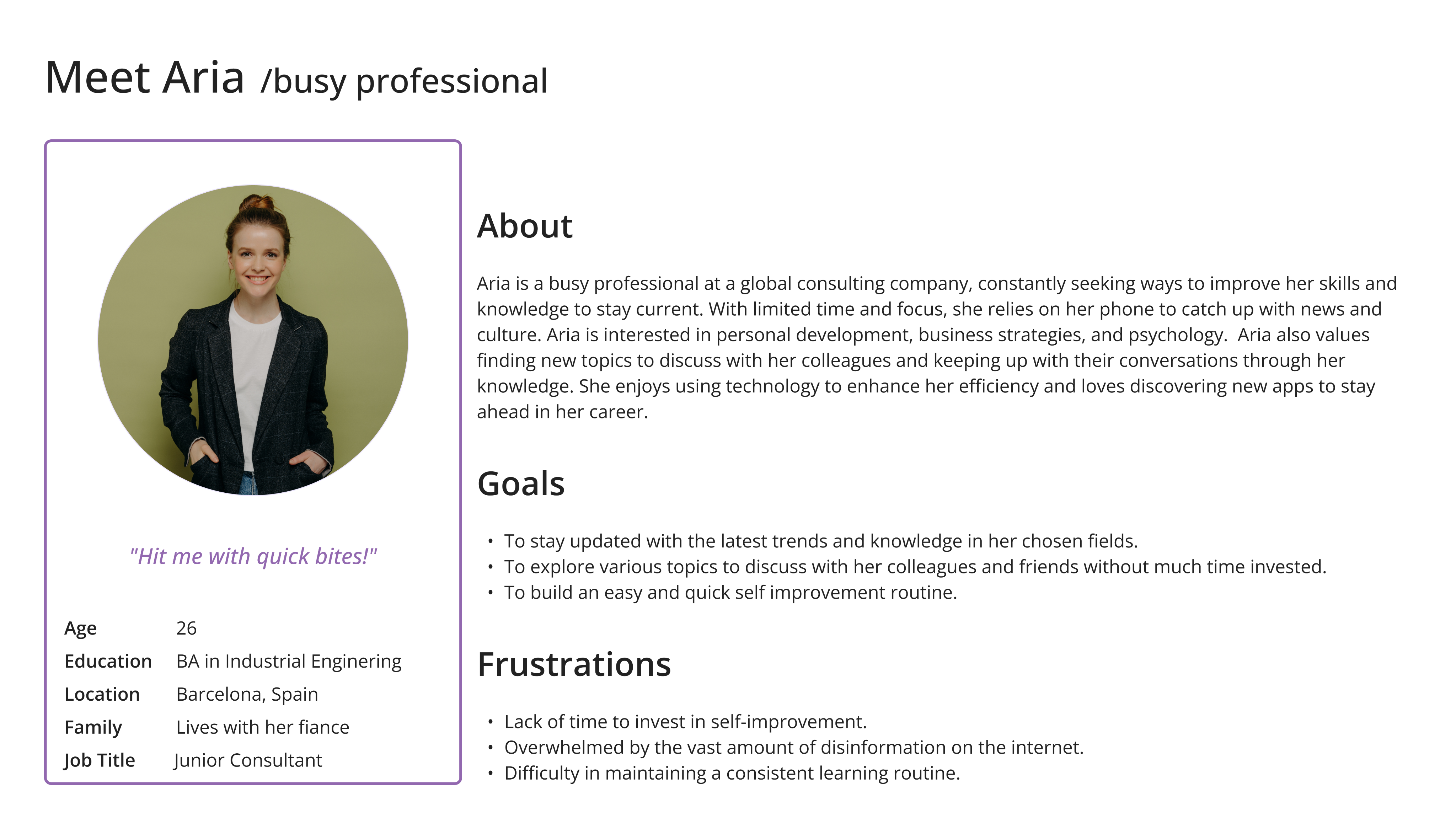
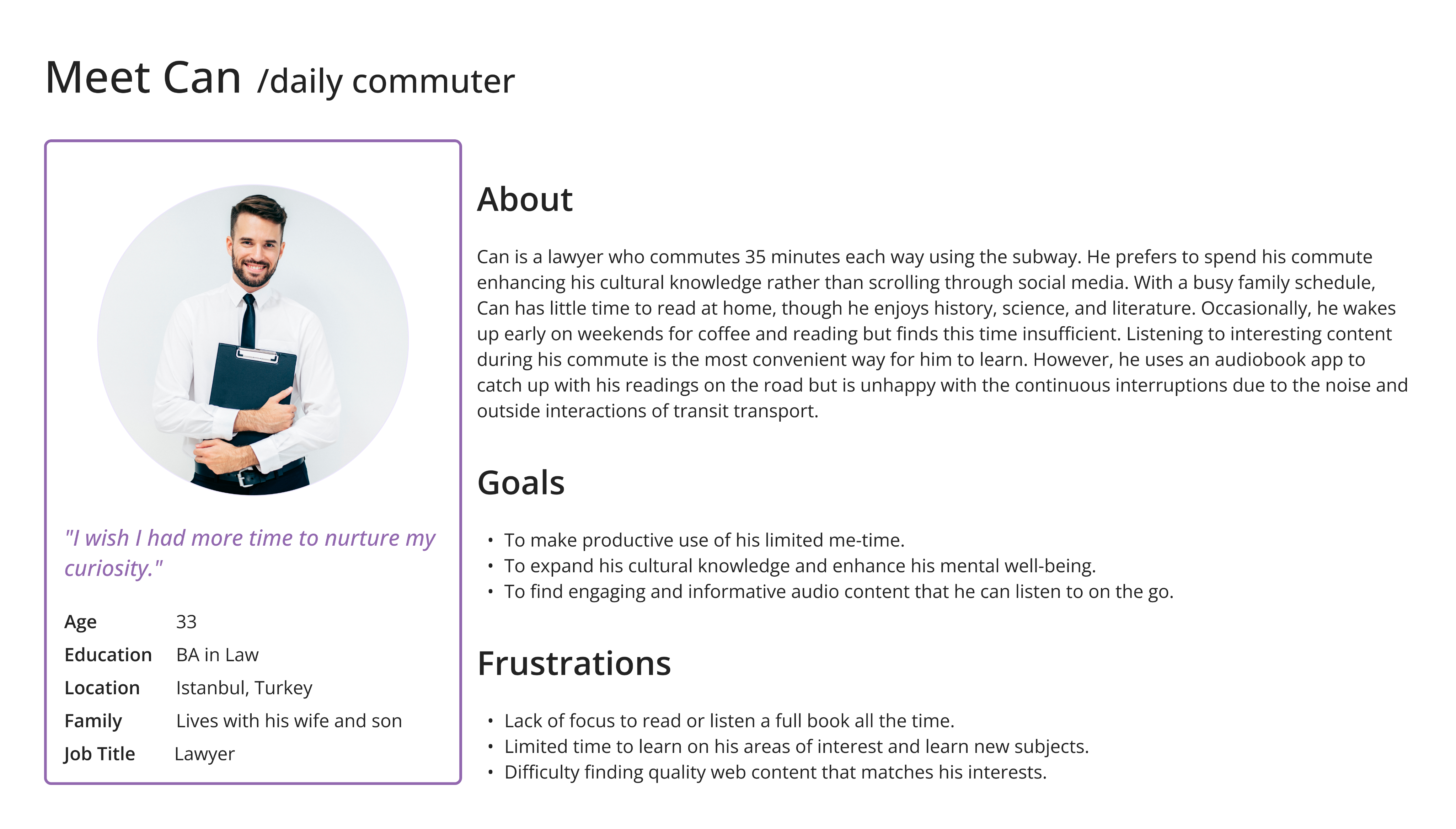
I created two personas based on our research and analyses, concentrating on our users’ challenges, narratives, objectives, and experiences.
Ideate
Competitive Analysis
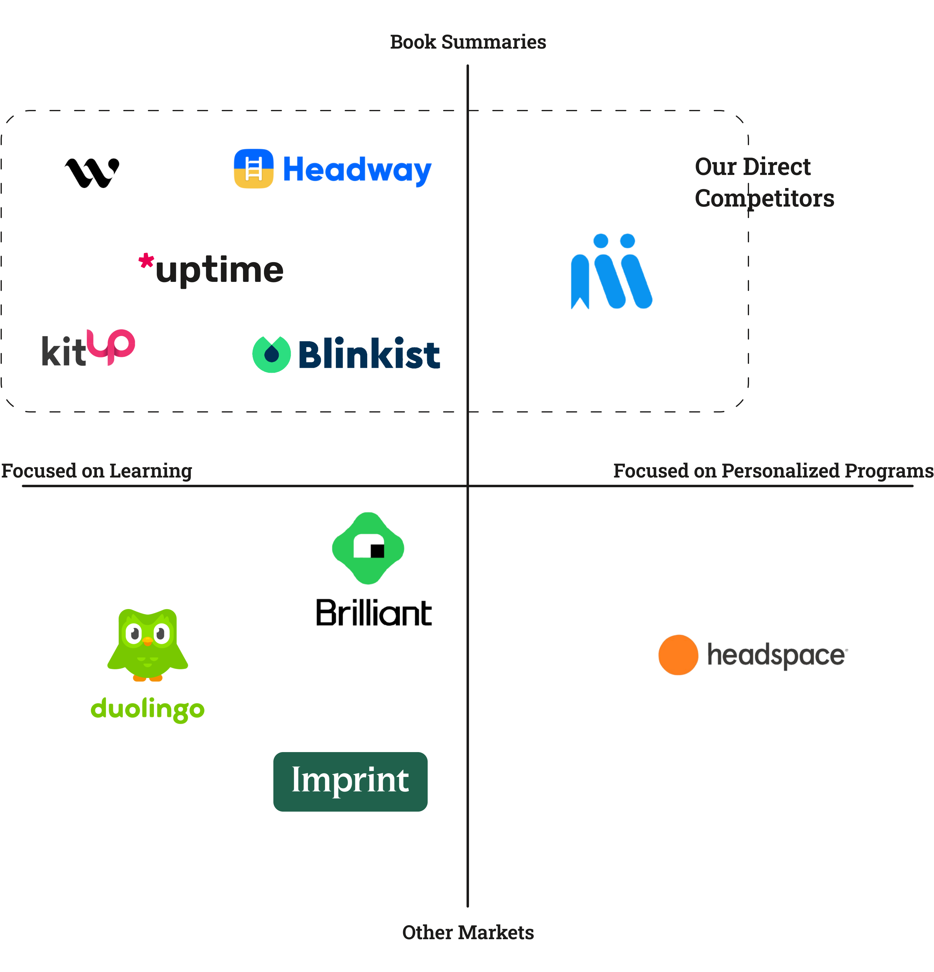
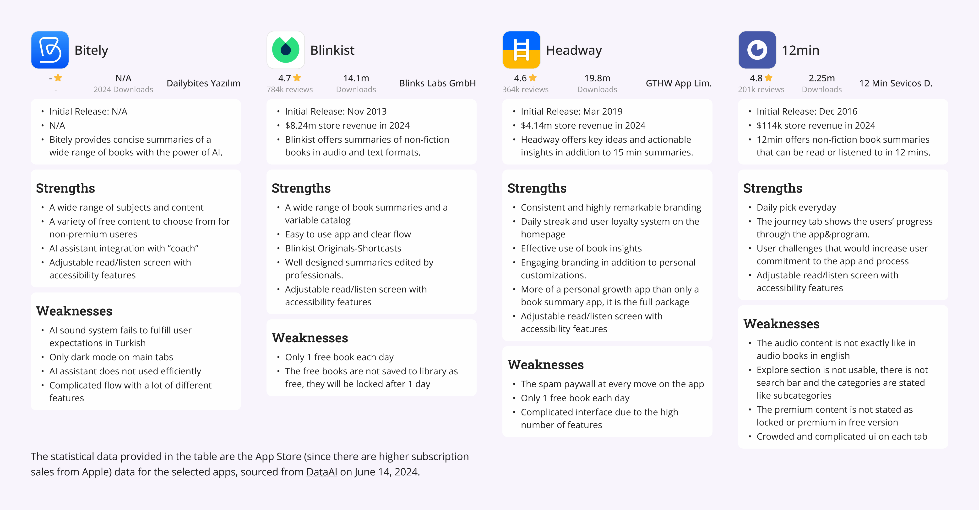
In the education and book summary category, numerous apps compete in the market. We consider several market-leading apps as direct or indirect competitors to Bitely. Identifying our competitors helped us decide on our unique value proposition, enhance our feature set, and perfect the app's user journey. Besides book summary apps, we also observed major education apps like Duolingo and self-care apps like Headspace to learn from them as our indirect competitors.
Based on our competitor search, market research, and the revenues of our direct competitors, I prepared a detailed benchmark showing their strengths and weaknesses.
Challenge 1 : Improve the design system without hurting brand consistency and the app’s design language.
Challenge 2 : Add new features to the user journey to match our competitors without complicating the existing user flow.
Design
Wireframes
To conceptualize new features and user flows, I began by writing and sketching ideas to map the user journey through the app. This iterative process started with ideation, moved to paper wireframes, and then advanced to high-fidelity designs. I compiled all the wireframes into a comprehensive set, which illustrates the evolution of the app's design.
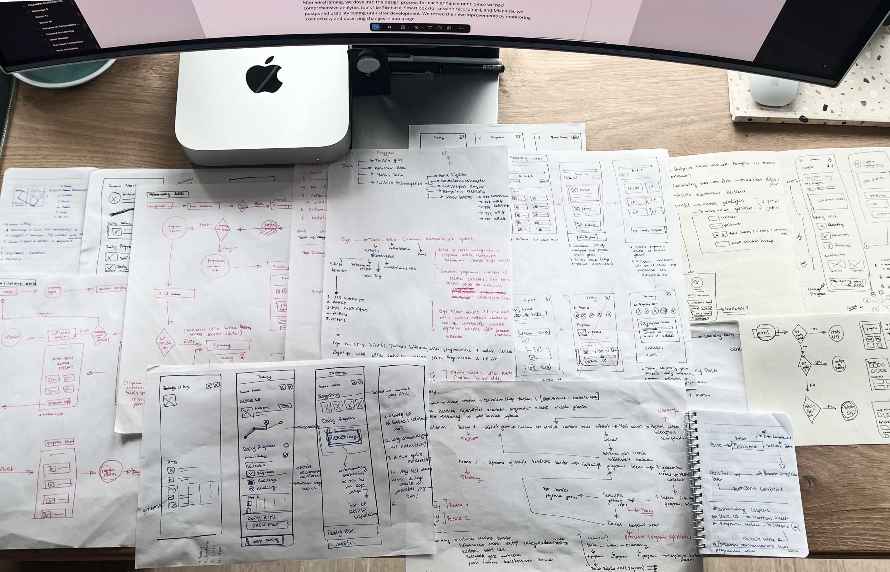
After wireframing, we dove into the design process for each enhancement. Since we had comprehensive analytics tools like Firebase, Smartlook (for session recordings), and Mixpanel, we postponed usability testing until after development. We tested the new improvements by monitoring user activity and observing changes in app usage.
Process
Starting with component and color improvements in the design system, I decreased the cognitive overload of the app. Using a simpler design language with fewer colors quickly transformed the app's look into a more professional one. Then, analyzing user behavior and pain points, we prioritized the improvements and additions to the app.
- Redesigning the User Flow

By redesigning the user flow, our aim was to simplify the user journey and increase user engagement.
Bitely offered users a moderate amount of personal growth content, as well as an AI-powered coach feature that provided content based on the user's desires or daily progress. However, the Home and Search sections had similar content, the Library section's usability was problematic, and the Profile section wasn't addressing the remaining user needs.
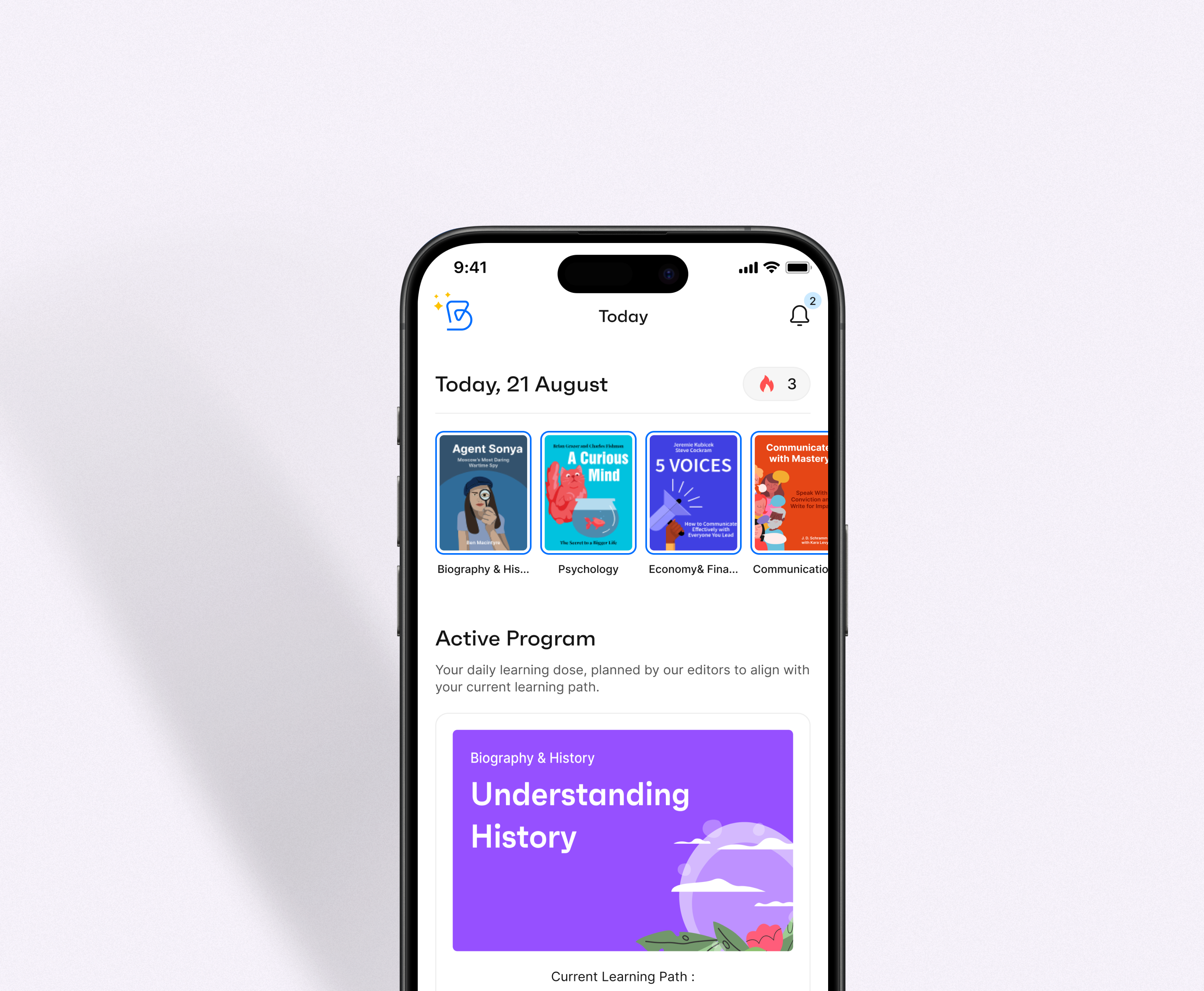
Our goal was to rebrand Bitely as a daily learning app, so we restructured the entire journey, starting with the navigation bar. We implemented four main sections in the navbar—Today, Explore, Lists, and You—with related subsections to support those pages. From previous observations and direct user feedback, we knew that our app was being compared to other book summary apps, and many users thought of it as just a summary app. By simplifying the user flow and customizing the navbar with main features, we wanted users to understand our unique value proposition and streamline their journey through the main actions. With the new simplified navbar and user navigation, we started to see an increase in user numbers and an improvement in user retention.
In the final version, the main navigation included personalized content to support users' everyday learning and exploration needs.
Before
After
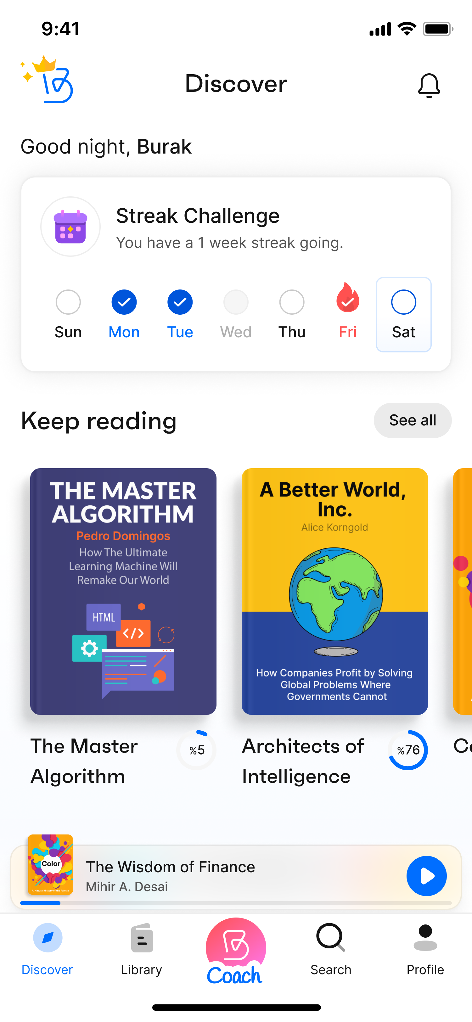
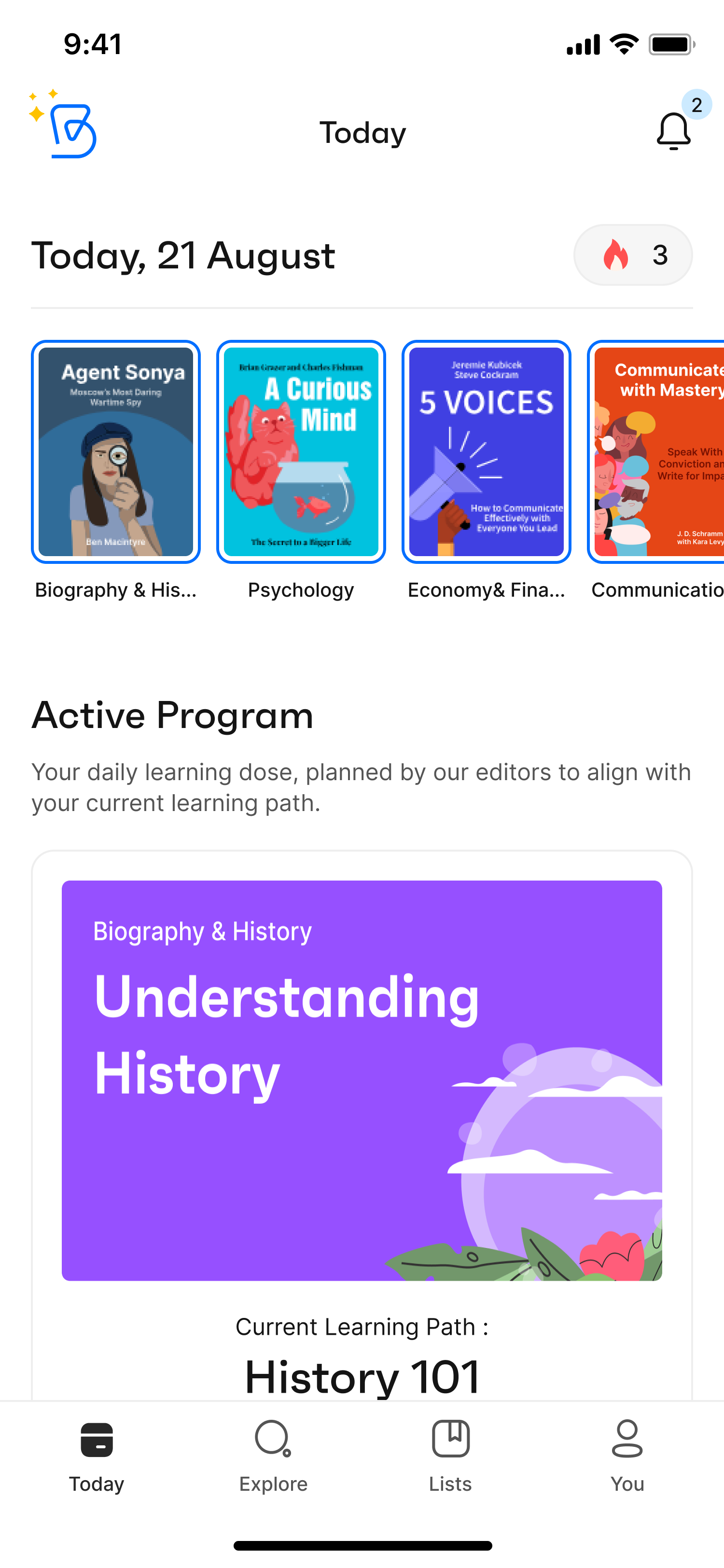
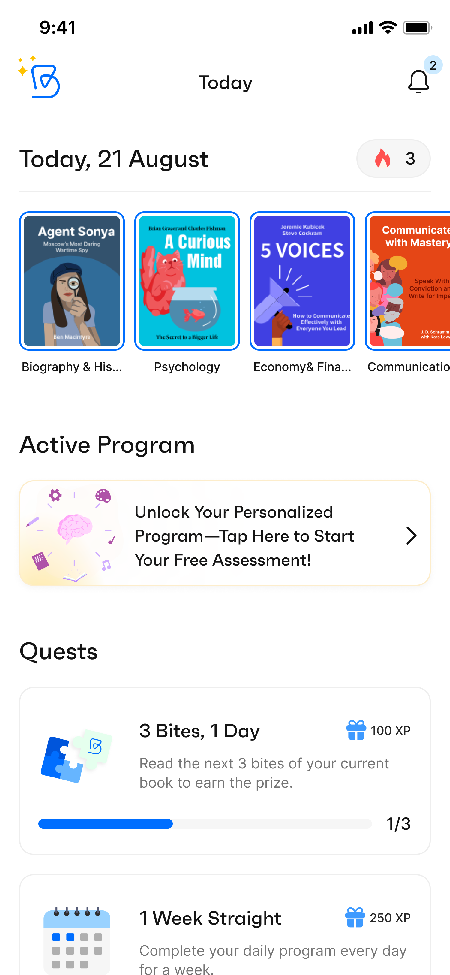
- Today
Instead of showing users a generic selection of content, the new Bitely displays their daily bites, active program, upcoming quests, and a daily insight to motivate them.
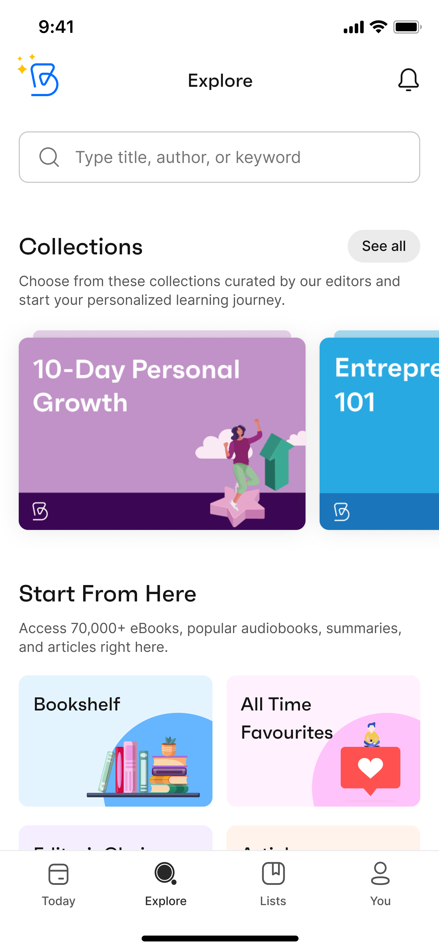
- Explore
By expanding the search feature and adding a curated selection of Bitely content, we enriched this page. We aimed for users to explore new content and spend more time in the app.
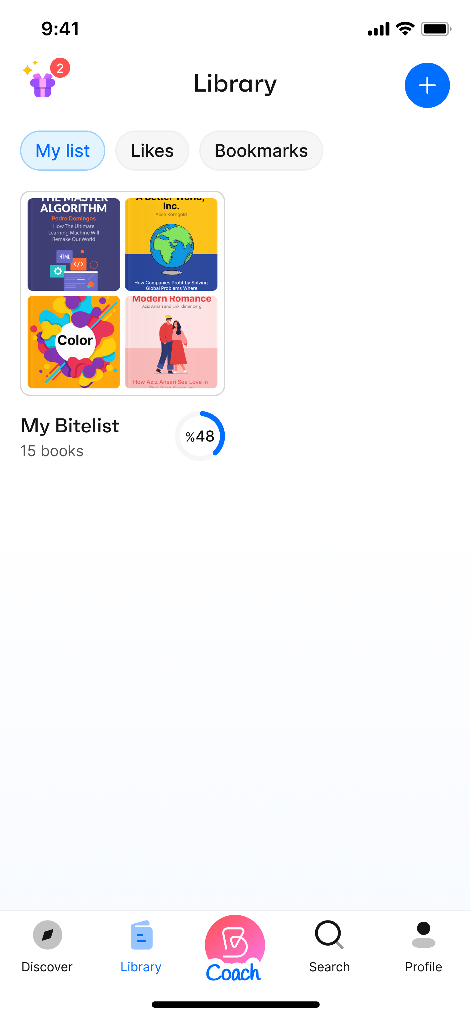
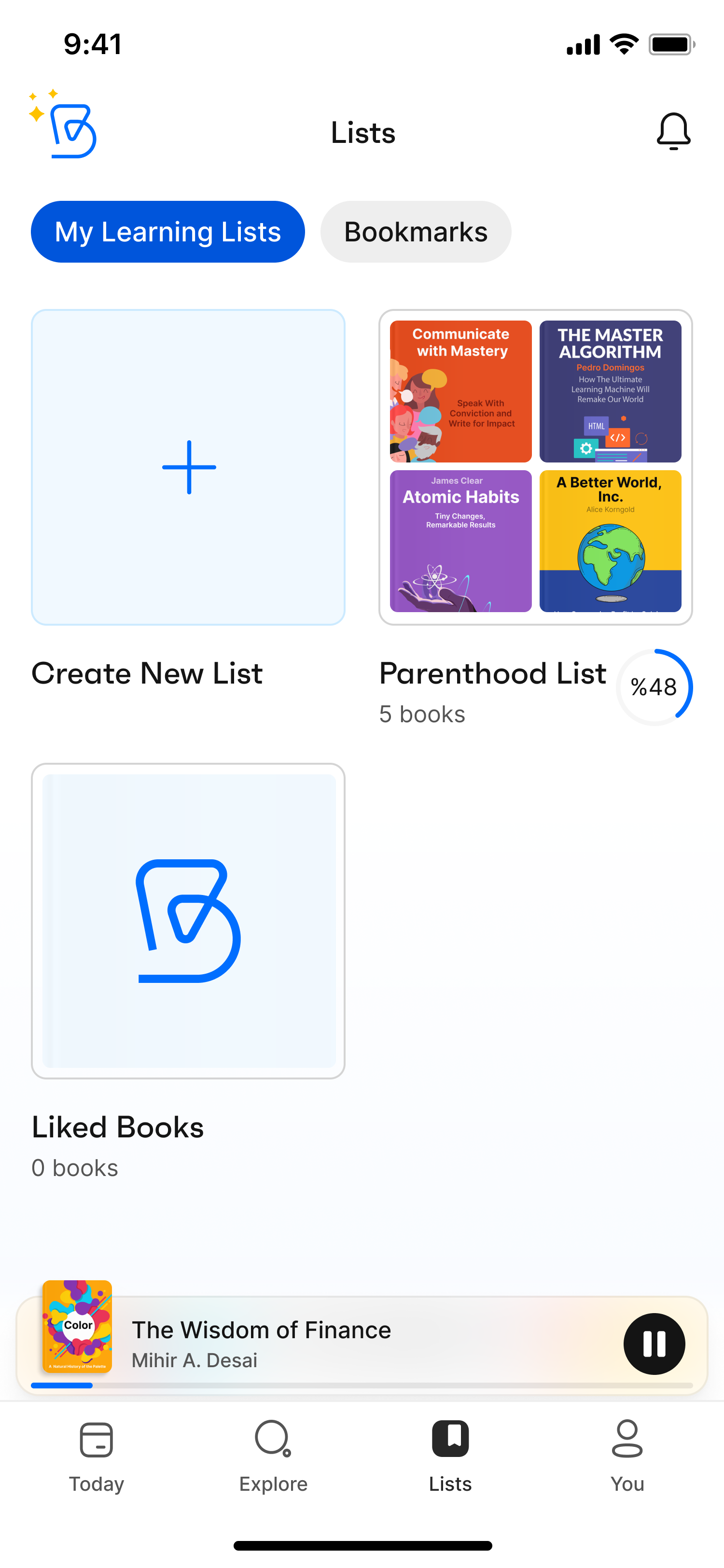
- Lists
We added Lists to the navbar as a library function for easy navigation. Users can find their liked and saved items on this page to read later or create a personal collection.
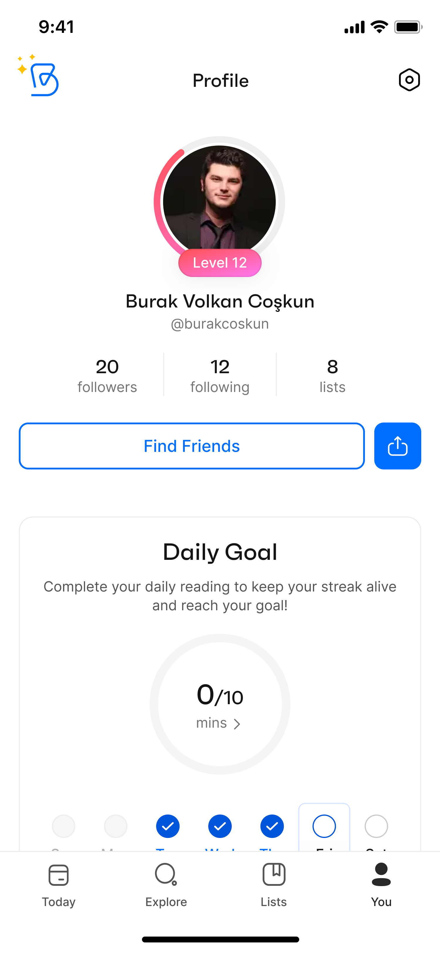
- You
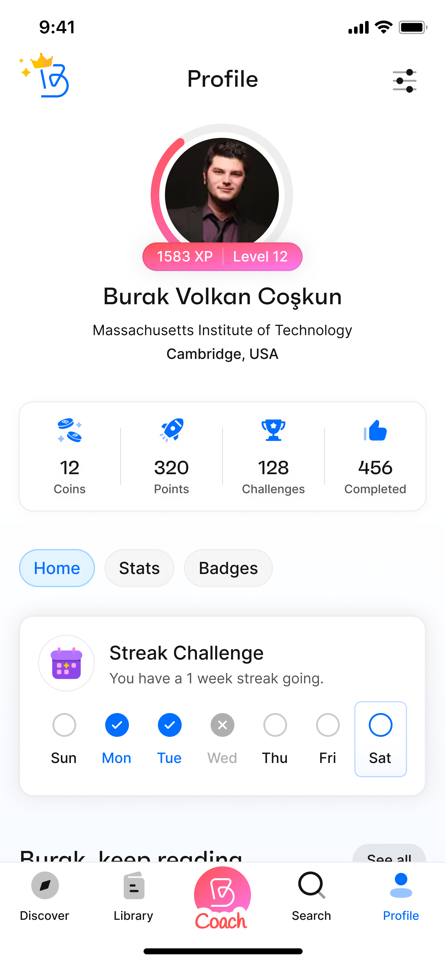
The new profile page—called “You” — includes a reward system, a public profile view, user stats and history display all in one place. This version is more than just a profile; it's users’ personal Bitely page.

- Designing A Personalized Learning Journey
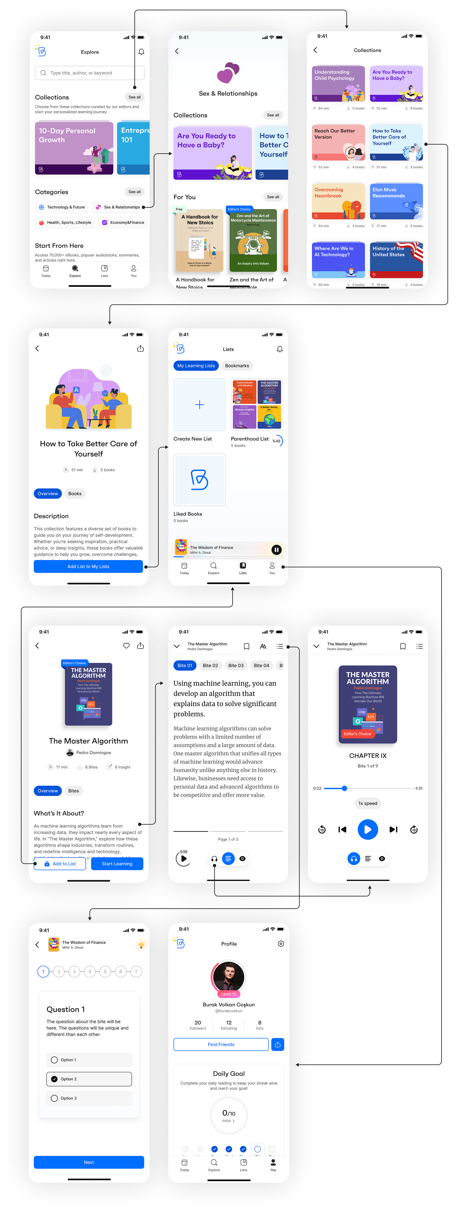
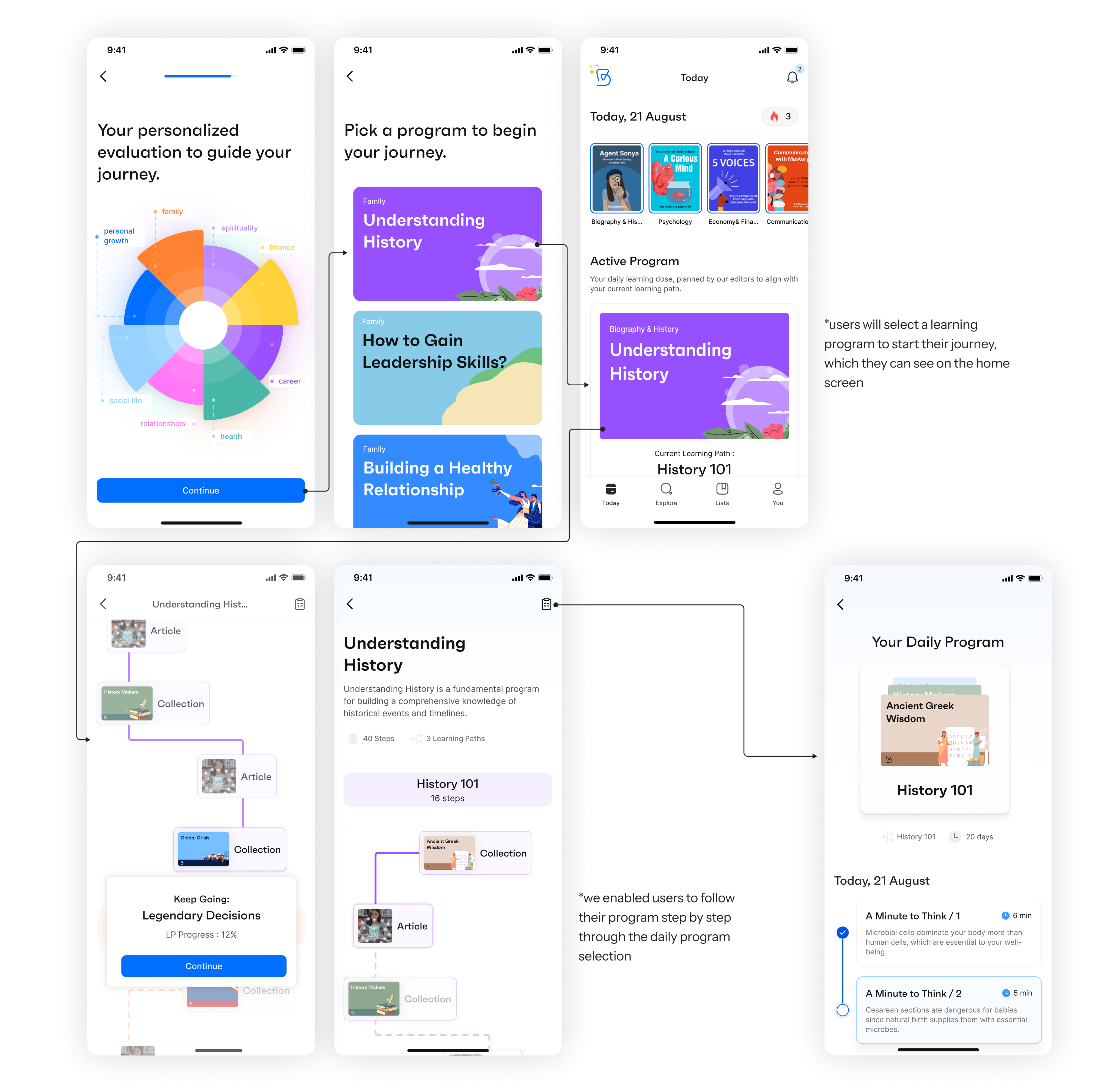
As mentioned above, Bitely is a personalized learning app; therefore, the learning features and the consistency of the learning habit were of great importance in the user journey. Considering that, we are offering our users personalized learning programs by analyzing their weaker points in the Wheel of Life.
After bringing users into the app with a basic onboarding process, we want them to go through a character analysis to understand their weaker and stronger areas and offer them an accurate learning path. With a thorough analysis we created through various checkpoints, we offer different programs based on their deficits and multiple learning paths within those programs. Completing a program will improve the user's knowledge in the selected area, and they can choose to continue in the same area or change to a different learning area to broaden their perspective.
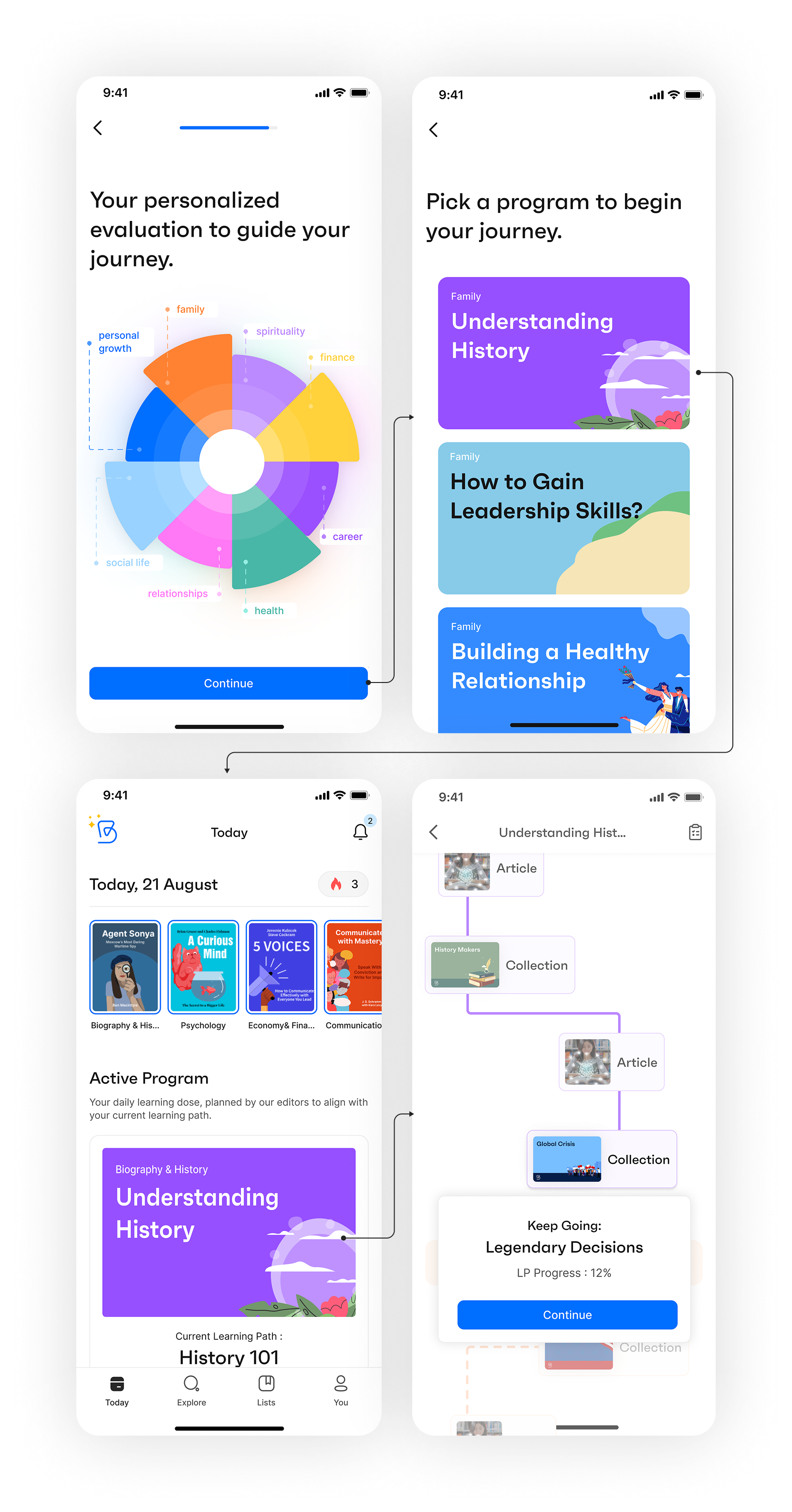
*users will select a learning program to start their journey, which they can see on the home screen
*we enabled users to follow their program step by step through the daily program selection
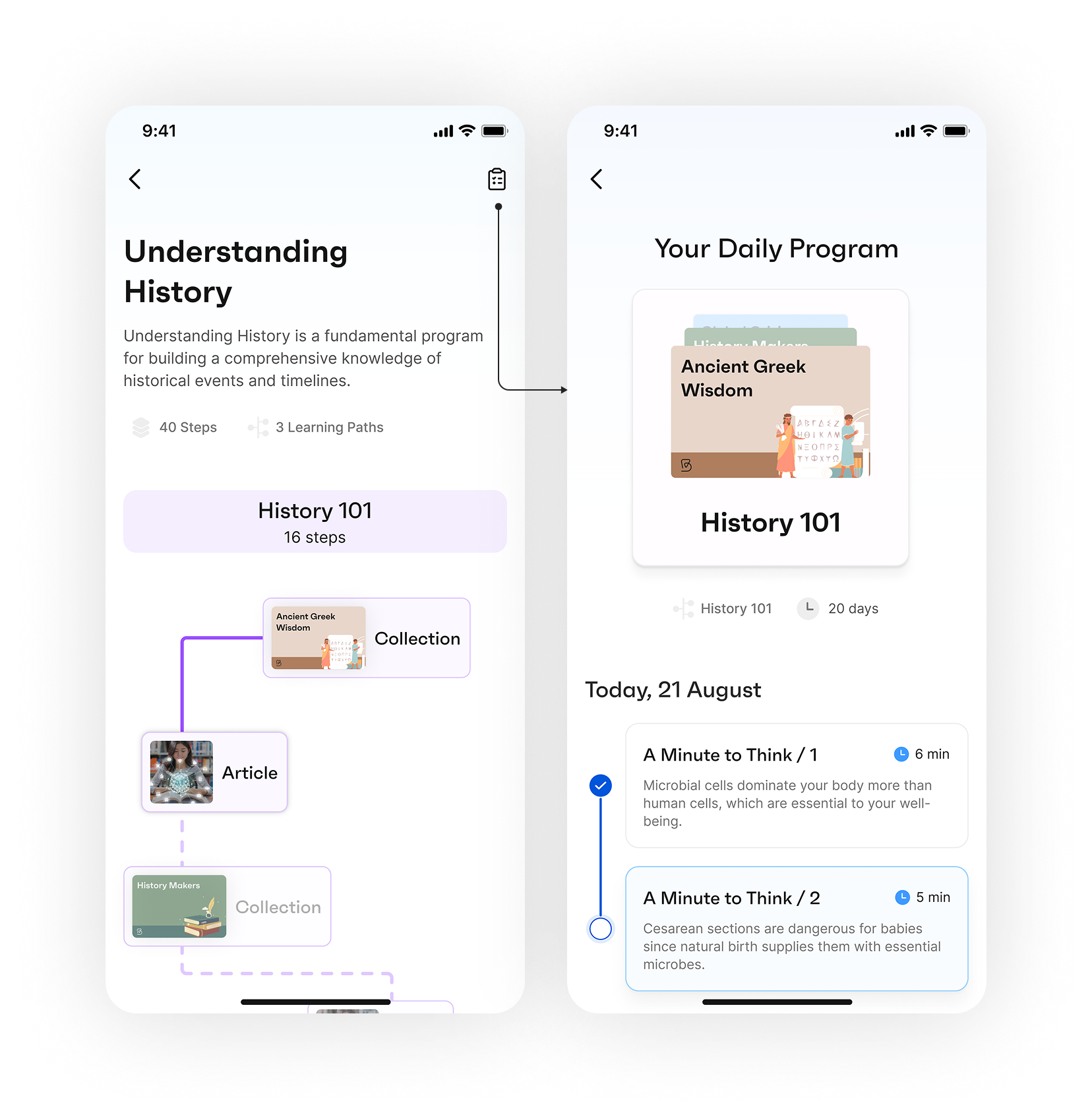
To increase user engagement, we offered users two options: one to learn at their own pace and another to follow our daily program prepared for them based on their learning speed. By switching between the learning program view (showing all the learning paths in the program and their progress) and the daily program view (showing day-specific tasks for one learning path), users could decide which way to continue learning.
- Increasing User Retention
Before the initial changes and redesigns of Bitely, both day-1 and day-7 retention rates were very low. We noticed that the first-day churn rate was approximately 50%, with 45% dropping off during or right after onboarding. We found that most users were abandoning the app before completing the initial onboarding or after a few clicks.
To decrease the churn rate, in addition to the feature and usability enhancements mentioned above, we took several other precautions. These include:
- Redesigning the onboarding process: We optimized the initial onboarding by keeping it short with more engaging screens, asking only the necessary questions, and conducting a more detailed character analysis after the user is in the app.
- Improving push notifications and adding in-app notifications: To create long-term habit formation, we redesigned the notification permission screen and showed it after several taps in the app.
- Increasing content variety and quantity.
- Keeping users engaged by asking for their feedback.
While some of these improvements are already implemented, we are still awaiting the long-term results of the complete package. However, even with the small improvements in production and after the initial user tests and feedback, we see that users are more pleased with the new Bitely. We aim to decrease the first-day churn from 50% to 25% as a short-term goal. We are monitoring the real-time results from our analytics tools.
- Increasing Premium Sales
As a subscription-based app, Bitely needed premium sales as much as any other subscription-based app. In the former version of the app, several book summaries and collections were only available to premium users, as well as ad-free usage. However, we noticed that these were not compelling enough propositions for users to purchase premium subscriptions alone. About 95% of our users were using Bitely with the basic subscription.
Therefore, we worked on a new distinction between premium and basic subscriptions. By allowing basic users to continue only one program, hiding several profile widgets and analyses, increasing the number and quality of both readable and audio content for premium users, and restricting offline tools for basic users, we aimed to increase the value proposition of Bitely Premium.
Before
After A
After B
In addition to the value proposition, the usability of the paywall flow was highly problematic. The former paywalls of Bitely required users to navigate through three taps from different screens to reach the premium subscription, and the cognitive overload of each page was high. Simplifying the paywalls and optimizing the components on the page by following our competitive benchmark and subscription-based app trends was important.
To address this, we prepared two versions of the in-app and onboarding paywalls to test and are still running A/B tests for both screens. After the initial tests and results, we will decide on the best version and direct our further tests accordingly.
Conclusion
Impacts
Throughout the Bitely project, we regularly gathered feedback from test users to assess the impact of our UX enhancements. Overall, the responses were encouraging—the app felt more intuitive, and the updated flows improved user navigation and engagement. Users particularly appreciated the app’s core value: helping them build a sustainable learning habit through daily bite-sized content.
That said, some issues remained. A number of users highlighted frustrations around limited content volume and minor technical bugs, such as visibility and functionality issues with the paywall, as well as occasional app crashes on specific devices. These insights were crucial in identifying areas for future improvement that fell outside the original project scope.
Next Steps
Although our official engagement with Bitely ended after the design delivery, I’ve continued to follow the product's progress as a user. While the design updates have been implemented in couple of months, the team is now focusing more on marketing efforts and collecting user feedback. I'm eager to see how the app performs in the long term—especially with the redesigned paywall, which is expected to support both user growth and subscription revenue.
Redesigning The Learning Experience with Bitely
Role: Product Designer
Team: CEO/Product Owner, Graphic Designer, Developers, Content Managers
Client: Bitely
Date: July 2024 - March 2025
Bitely Mobile App
Research
While Bitely was already a published app, it didn't have a consistent user base when I started. Its daily user traffic was no more than 20 users. To begin the product redesign, I gathered previous research conducted by survey companies, the user comments and feedbacks, insights from the app's product manager and CEO, along with my own market research. Our main goal was to identify the primary user problems in the product's user flow and feature organization.
Problem & Solution
Bitely is a mobile app designed to deliver quick, bite-sized learning experiences. However, the platform struggled with low user interaction and engagement. The research team identified several usability and content-related issues and also uncovered friction points within the existing UI.
Using data-backed insights, we focused on improving usability, boosting user engagement, and reducing churn. We restructured the core user flow, eliminated unnecessary features, and introduced new, purposeful ones to create a smoother, more intuitive experience for users.
Survey and User Feedback
In June 2024, AWA Creative conducted a survey with 100 upper-middle-class users. The survey covered several question groups, ranging from demographics to reading habits and mobile learning experiences.
Based on the survey, we found that UI problems and a lack of quality content in book summary apps were significant setbacks in the market. We also identified our two major competitors in the Turkish market: “Kitup” and “Blinkist”.
User expectations indicated a definite need for interaction with the app during their progress, as well as personalized features and customization options.
In addition to the survey, supporting user feedback from the App Store/Play Store and our user email system showed that users wanted to rely on Bitely. However, the lack of content and misunderstandings about how to use certain features dampened their enthusiasm.
Defining Problems & User Needs
While Bitely was a functioning app with a modern interface, the use of multiple colors and the design of several components increased the cognitive overload for users, causing complexity and overall usability issues. Besides the cluttered interface, the user flow and the integration of several features needed improvement.
Based on user feedback, the survey, and empathy and journey maps, I pinpointed four major user pain points:
- Complex feature set and user flow: The app offered many helpful features but tried to solve too many issues at once, failing to capture user attention and build loyalty.
- Lack of personalization and a loyalty system: Bitely originated from the idea of providing users with personalized learning programs to make self-improvement easier and faster. However, the existing app lacked a program structure and personalized features.
- Low user retention rates (CRR): Users were downloading the app but abandoning it after the first use or during the onboarding process.
- Design system problems: Despite having a comprehensive design system, misalignments in the app gave it an unprofessional look. These misalignments were sometimes caused by the design system components and sometimes because the designs didn't match the system components.
I created two personas based on our research and analyses, concentrating on our users’ challenges, narratives, objectives, and experiences.
Ideate
Competitive Analysis
In the education and book summary category, numerous apps compete in the market. We consider several market-leading apps as direct or indirect competitors to Bitely. Identifying our competitors helped us decide on our unique value proposition, enhance our feature set, and perfect the app's user journey. Besides book summary apps, we also observed major education apps like Duolingo and self-care apps like Headspace to learn from them as our indirect competitors.
Based on our competitor search, market research, and the revenues of our direct competitors, I prepared a detailed benchmark showing their strengths and weaknesses.
Challenge 1 : Improve the design system without hurting brand consistency and the app’s design language.
Challenge 2 : Add new features to the user journey to match our competitors without complicating the existing user flow.
Design
Wireframes
To conceptualize new features and user flows, I began by writing and sketching ideas to map the user journey through the app. This iterative process started with ideation, moved to paper wireframes, and then advanced to high-fidelity designs. I compiled all the wireframes into a comprehensive set, which illustrates the evolution of the app's design.
After wireframing, we dove into the design process for each enhancement. Since we had comprehensive analytics tools like Firebase, Smartlook (for session recordings), and Mixpanel, we postponed usability testing until after development. We tested the new improvements by monitoring user activity and observing changes in app usage.
Process
Starting with component and color improvements in the design system, I decreased the cognitive overload of the app. Using a simpler design language with fewer colors quickly transformed the app's look into a more professional one. Then, analyzing user behavior and pain points, we prioritized the improvements and additions to the app.
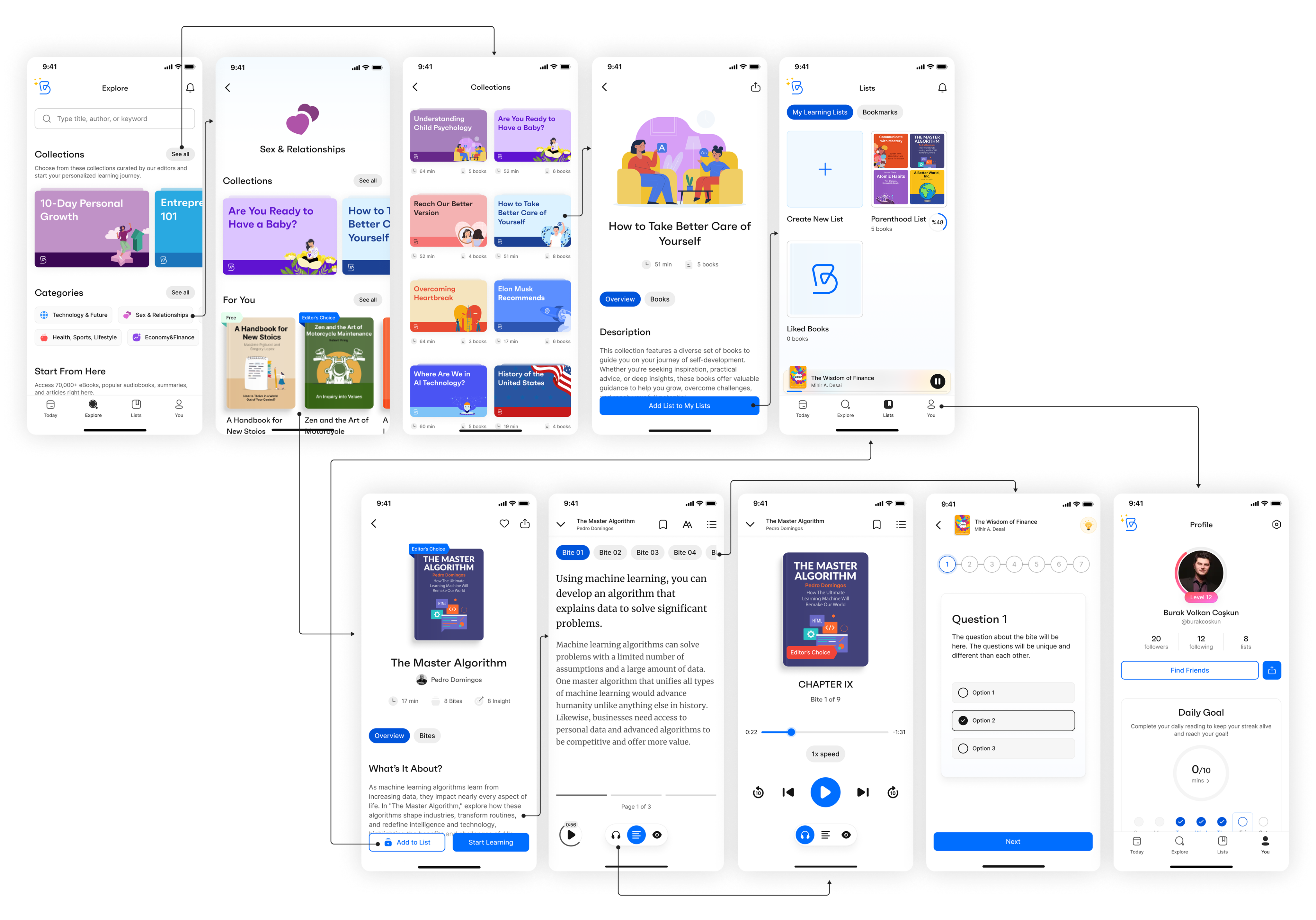
- Redesigning the User Flow
By redesigning the user flow, our aim was to simplify the user journey and increase user engagement.
Bitely offered users a moderate amount of personal growth content, as well as an AI-powered coach feature that provided content based on the user's desires or daily progress. However, the Home and Search sections had similar content, the Library section's usability was problematic, and the Profile section wasn't addressing the remaining user needs.
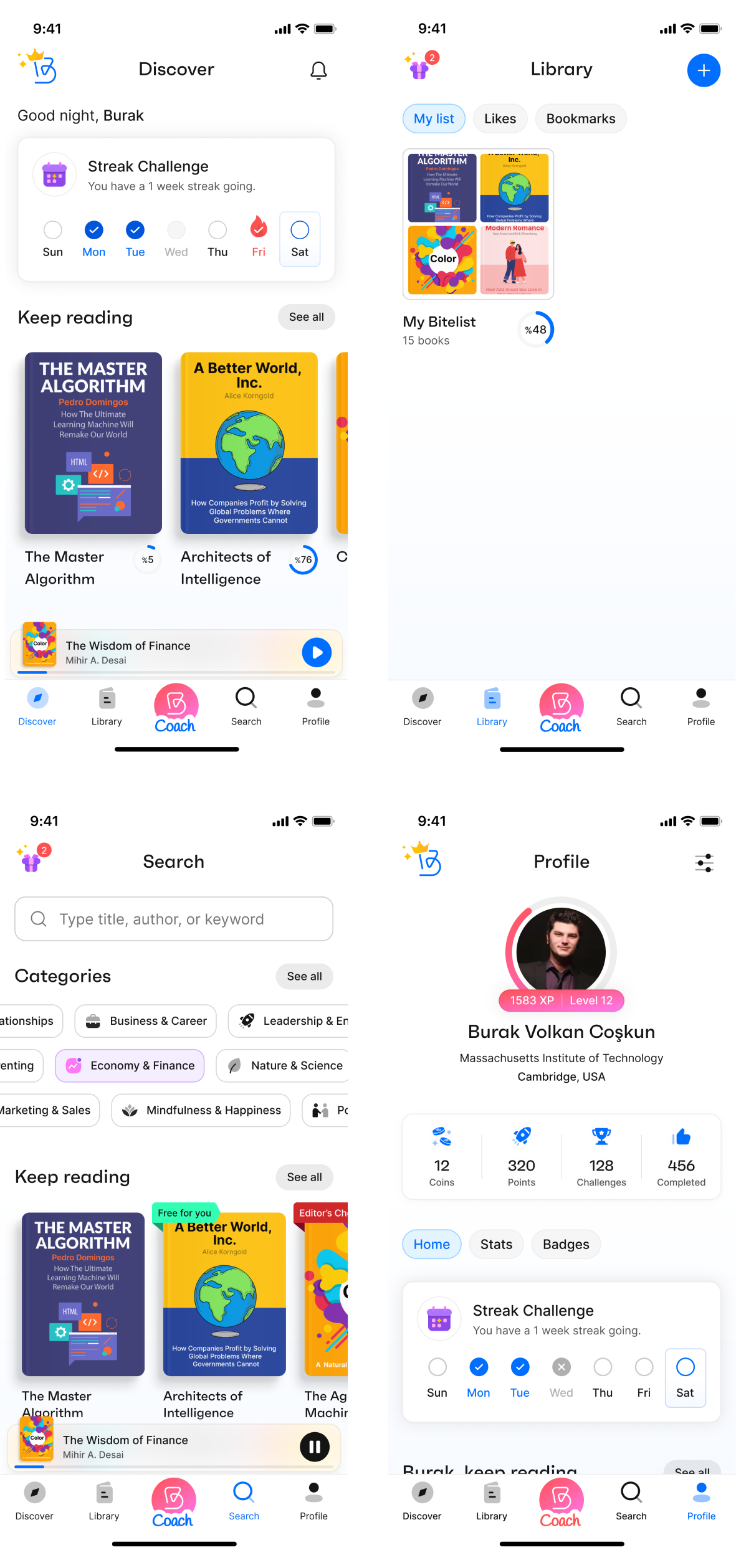
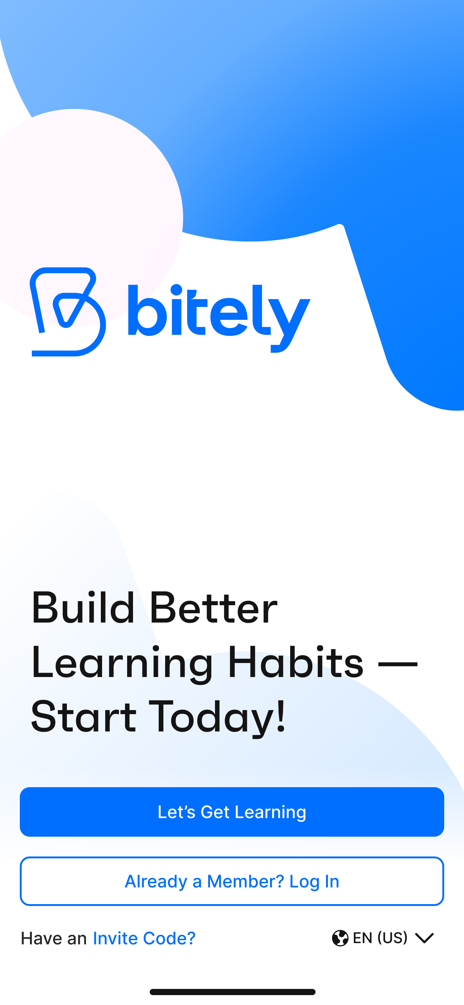
Our goal was to rebrand Bitely as a daily learning app, so we restructured the entire journey, starting with the navigation bar. We implemented four main sections in the navbar—Today, Explore, Lists, and You—with related subsections to support those pages. From previous observations and direct user feedback, we knew that our app was being compared to other book summary apps, and many users thought of it as just a summary app. By simplifying the user flow and customizing the navbar with main features, we wanted users to understand our unique value proposition and streamline their journey through the main actions. With the new simplified navbar and user navigation, we started to see an increase in user numbers and an improvement in user retention.
In the final version, the main navigation included personalized content to support users' everyday learning and exploration needs.
Before
After
- Today
Instead of showing users a generic selection of content, the new Bitely displays their daily bites, active program, upcoming quests, and a daily insight to motivate them.
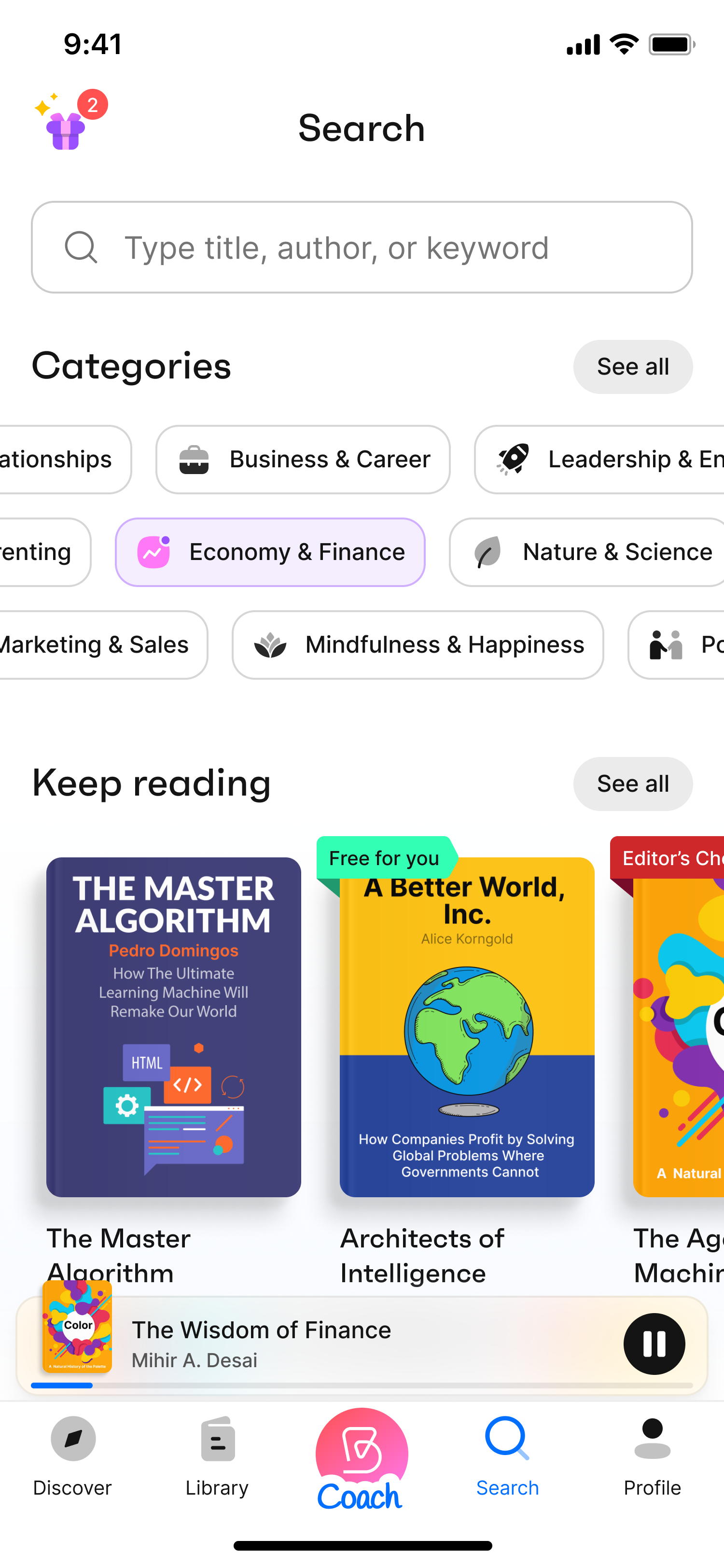
- Explore
By expanding the search feature and adding a curated selection of Bitely content, we enriched this page. We aimed for users to explore new content and spend more time in the app.
- Lists
We added Lists to the navbar as a library function for easy navigation. Users can find their liked and saved items on this page to read later or create a personal collection.
- You
The new profile page—called “You” — includes a reward system, a public profile view, user stats and history display all in one place. This version is more than just a profile; it's users’ personal Bitely page.
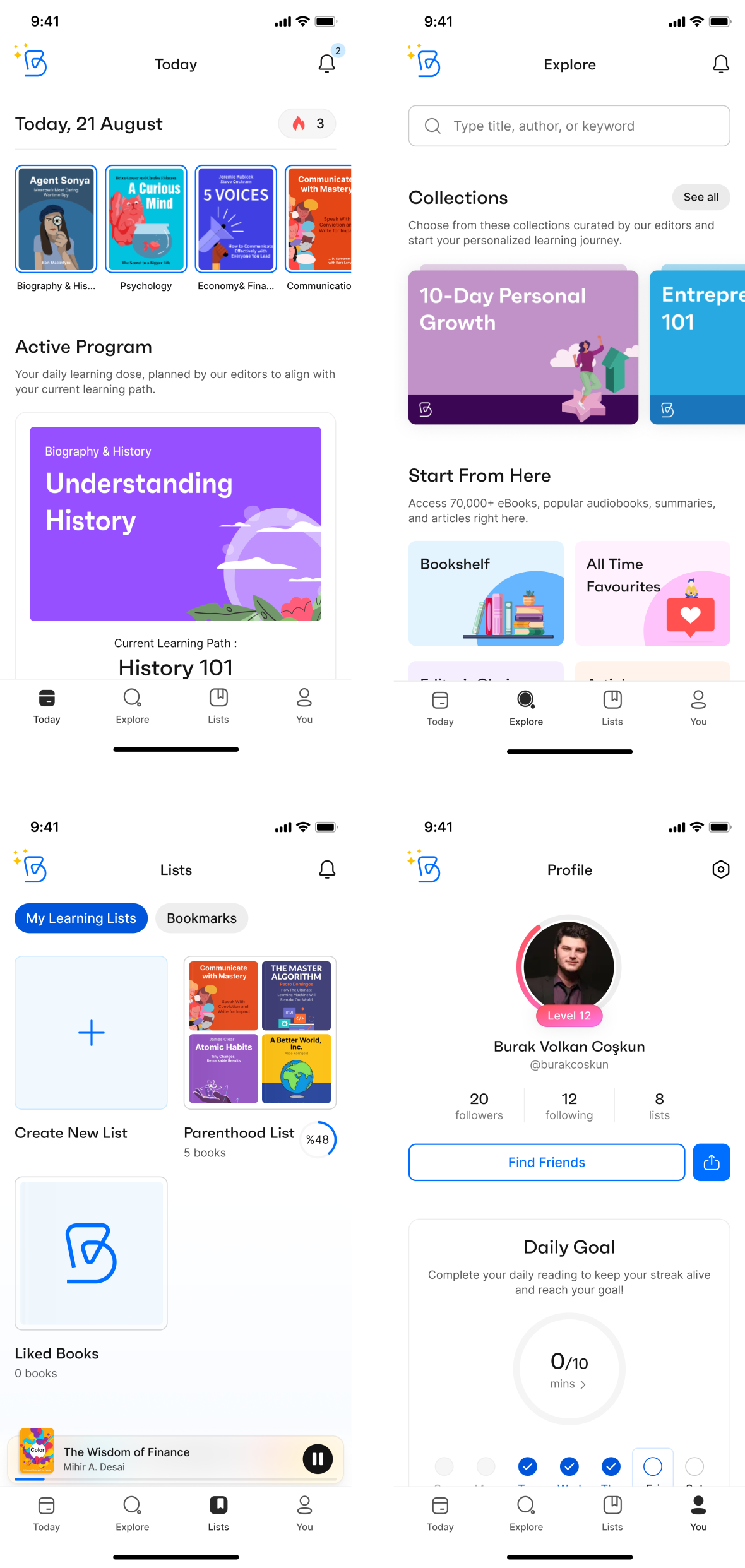
- Designing A Personalized Learning Journey
As mentioned above, Bitely is a personalized learning app; therefore, the learning features and the consistency of the learning habit were of great importance in the user journey. Considering that, we are offering our users personalized learning programs by analyzing their weaker points in the Wheel of Life.
After bringing users into the app with a basic onboarding process, we want them to go through a character analysis to understand their weaker and stronger areas and offer them an accurate learning path. With a thorough analysis we created through various checkpoints, we offer different programs based on their deficits and multiple learning paths within those programs. Completing a program will improve the user's knowledge in the selected area, and they can choose to continue in the same area or change to a different learning area to broaden their perspective.
To increase user engagement, we offered users two options: one to learn at their own pace and another to follow our daily program prepared for them based on their learning speed. By switching between the learning program view (showing all the learning paths in the program and their progress) and the daily program view (showing day-specific tasks for one learning path), users could decide which way to continue learning.
- Increasing User Retention
Before the initial changes and redesigns of Bitely, both day-1 and day-7 retention rates were very low. We noticed that the first-day churn rate was approximately 50%, with 45% dropping off during or right after onboarding. We found that most users were abandoning the app before completing the initial onboarding or after a few clicks.
To decrease the churn rate, in addition to the feature and usability enhancements mentioned above, we took several other precautions. These include:
- Redesigning the onboarding process: We optimized the initial onboarding by keeping it short with more engaging screens, asking only the necessary questions, and conducting a more detailed character analysis after the user is in the app.
- Improving push notifications and adding in-app notifications: To create long-term habit formation, we redesigned the notification permission screen and showed it after several taps in the app.
- Increasing content variety and quantity.
- Keeping users engaged by asking for their feedback.
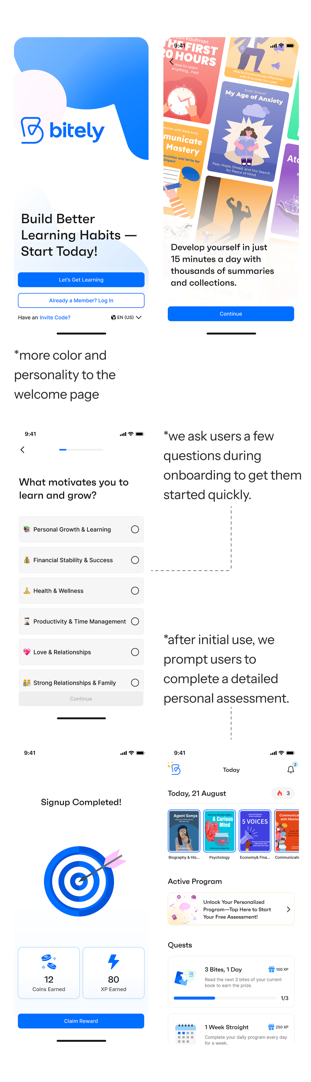
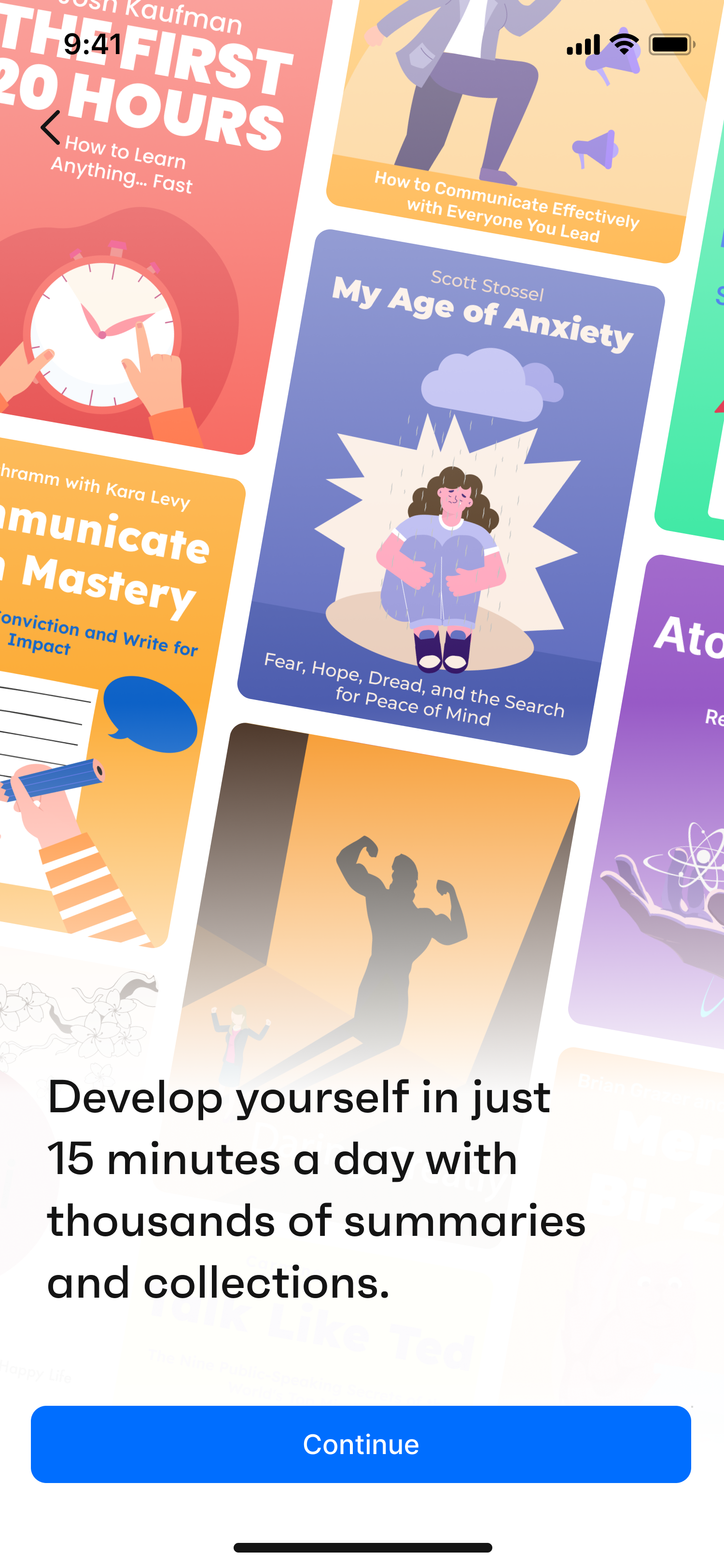
*more color and personality to the welcome page
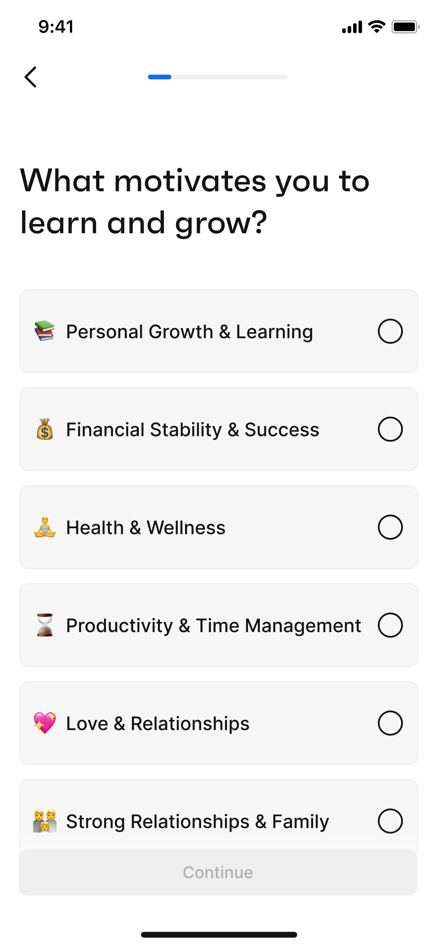
*we ask users a few questions during onboarding to get them started quickly.
*after initial use, we prompt users to complete a detailed personal assessment.
While some of these improvements are already implemented, we are still awaiting the long-term results of the complete package. However, even with the small improvements in production and after the initial user tests and feedback, we see that users are more pleased with the new Bitely. We aim to decrease the first-day churn from 50% to 25% as a short-term goal. We are monitoring the real-time results from our analytics tools.
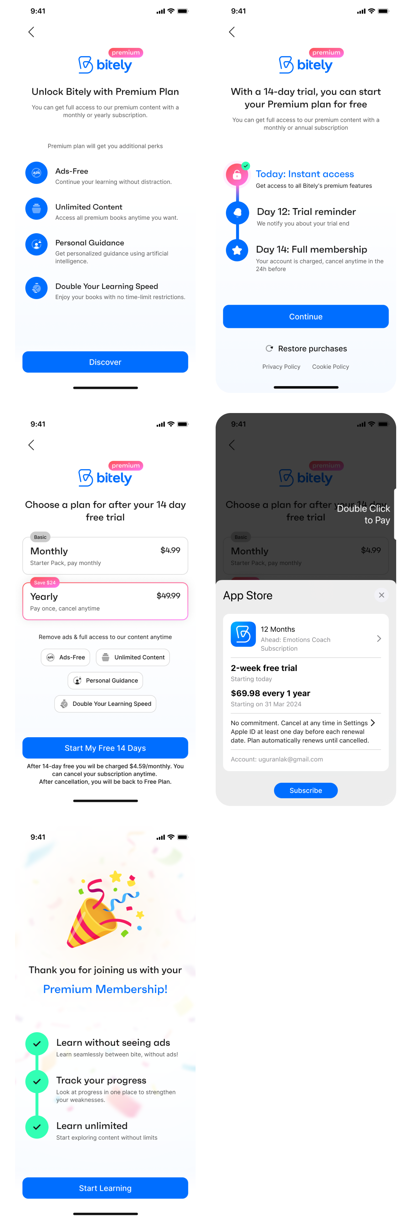
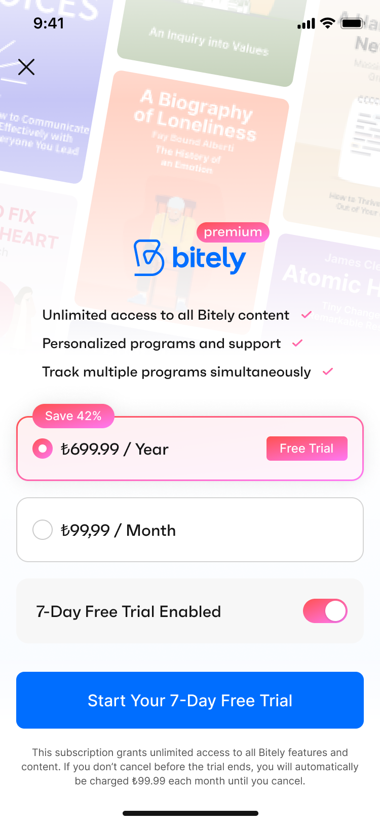
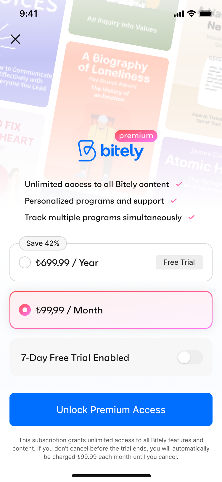
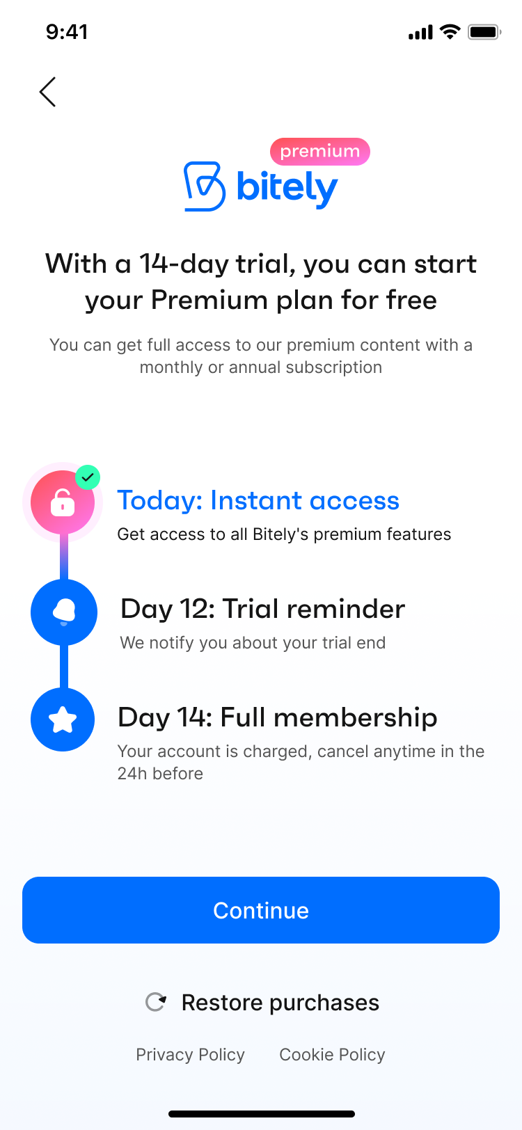
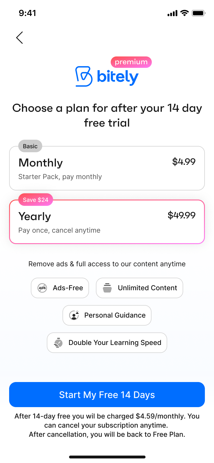
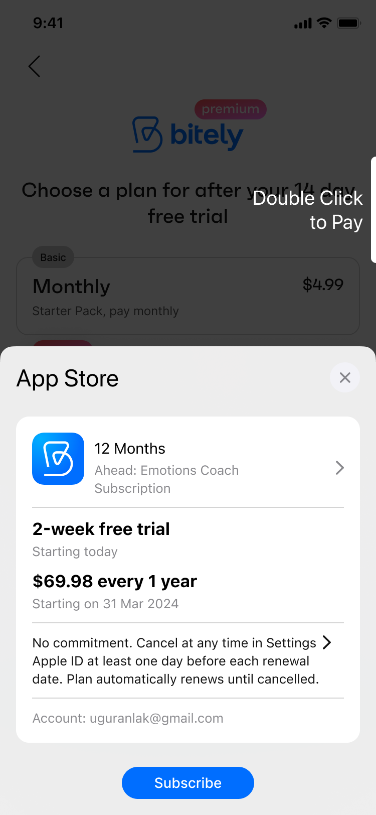
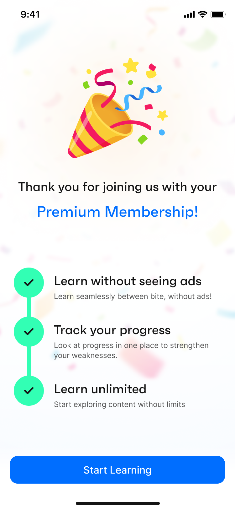
- Increasing Premium Sales
As a subscription-based app, Bitely needed premium sales as much as any other subscription-based app. In the former version of the app, several book summaries and collections were only available to premium users, as well as ad-free usage. However, we noticed that these were not compelling enough propositions for users to purchase premium subscriptions alone. About 95% of our users were using Bitely with the basic subscription.
Therefore, we worked on a new distinction between premium and basic subscriptions. By allowing basic users to continue only one program, hiding several profile widgets and analyses, increasing the number and quality of both readable and audio content for premium users, and restricting offline tools for basic users, we aimed to increase the value proposition of Bitely Premium.
Before
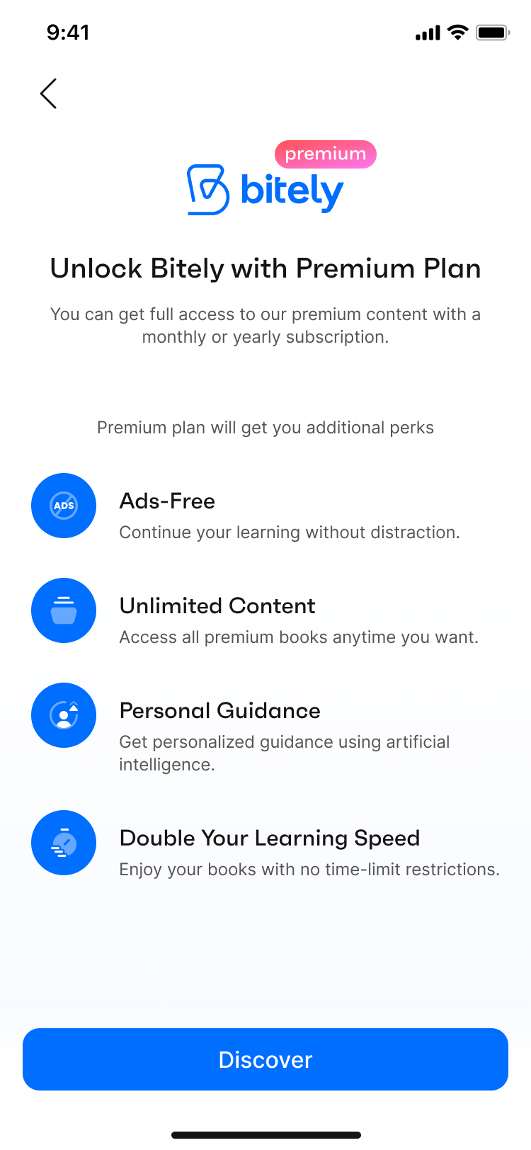
After / A
After / B
In addition to the value proposition, the usability of the paywall flow was highly problematic. The former paywalls of Bitely required users to navigate through three taps from different screens to reach the premium subscription, and the cognitive overload of each page was high. Simplifying the paywalls and optimizing the components on the page by following our competitive benchmark and subscription-based app trends was important.
To address this, we prepared two versions of the in-app and onboarding paywalls to test and are still running A/B tests for both screens. After the initial tests and results, we will decide on the best version and direct our further tests accordingly.
Conclusion
Impacts
Throughout the Bitely project, we regularly gathered feedback from test users to assess the impact of our UX enhancements. Overall, the responses were encouraging—the app felt more intuitive, and the updated flows improved user navigation and engagement. Users particularly appreciated the app’s core value: helping them build a sustainable learning habit through daily bite-sized content.
That said, some issues remained. A number of users highlighted frustrations around limited content volume and minor technical bugs, such as visibility and functionality issues with the paywall, as well as occasional app crashes on specific devices. These insights were crucial in identifying areas for future improvement that fell outside the original project scope.
Next Steps
Although our official engagement with Bitely ended after the design delivery, I’ve continued to follow the product's progress as a user. While the design updates have been implemented in couple of months, the team is now focusing more on marketing efforts and collecting user feedback. I'm eager to see how the app performs in the long term—especially with the redesigned paywall, which is expected to support both user growth and subscription revenue.
Redesigning The Learning Experience with Bitely
Role: Product Designer
Team: CEO/Product Owner, Graphic Designer,
Developers, Content Managers
Client: Bitely
Date: July 2024 - March 2025
Bitely Mobile App
Research
While Bitely was already a published app, it didn't have a consistent user base when I started. Its daily user traffic was no more than 20 users. To begin the product redesign, I gathered previous research conducted by survey companies, the user comments and feedbacks, insights from the app's product manager and CEO, along with my own market research. Our main goal was to identify the primary user problems in the product's user flow and feature organization.
Problem & Solution
Bitely is a mobile app designed to deliver quick, bite-sized learning experiences. However, the platform struggled with low user interaction and engagement. The research team identified several usability and content-related issues and also uncovered friction points within the existing UI.
Using data-backed insights, we focused on improving usability, boosting user engagement, and reducing churn. We restructured the core user flow, eliminated unnecessary features, and introduced new, purposeful ones to create a smoother, more intuitive experience for users.
Survey and User Feedback
In June 2024, AWA Creative conducted a survey with 100 upper-middle-class users. The survey covered several question groups, ranging from demographics to reading habits and mobile learning experiences.
Based on the survey, we found that UI problems and a lack of quality content in book summary apps were significant setbacks in the market. We also identified our two major competitors in the Turkish market: “Kitup” and “Blinkist”.
User expectations indicated a definite need for interaction with the app during their progress, as well as personalized features and customization options.
In addition to the survey, supporting user feedback from the App Store/Play Store and our user email system showed that users wanted to rely on Bitely. However, the lack of content and misunderstandings about how to use certain features dampened their enthusiasm.
Defining Problems & User Needs
While Bitely was a functioning app with a modern interface, the use of multiple colors and the design of several components increased the cognitive overload for users, causing complexity and overall usability issues. Besides the cluttered interface, the user flow and the integration of several features needed improvement.
Based on user feedback, the survey, and empathy and journey maps, I pinpointed four major user pain points:
- Complex feature set and user flow: The app offered many helpful features but tried to solve too many issues at once, failing to capture user attention and build loyalty.
- Lack of personalization and a loyalty system: Bitely originated from the idea of providing users with personalized learning programs to make self-improvement easier and faster. However, the existing app lacked a program structure and personalized features.
- Low user retention rates (CRR): Users were downloading the app but abandoning it after the first use or during the onboarding process.
- Design system problems: Despite having a comprehensive design system, misalignments in the app gave it an unprofessional look. These misalignments were sometimes caused by the design system components and sometimes because the designs didn't match the system components.
I created two personas based on our research and analyses, concentrating on our users’ challenges, narratives, objectives, and experiences.
Ideate
Competitive Analysis
In the education and book summary category, numerous apps compete in the market. We consider several market-leading apps as direct or indirect competitors to Bitely. Identifying our competitors helped us decide on our unique value proposition, enhance our feature set, and perfect the app's user journey. Besides book summary apps, we also observed major education apps like Duolingo and self-care apps like Headspace to learn from them as our indirect competitors.
Based on our competitor search, market research, and the revenues of our direct competitors, I prepared a detailed benchmark showing their strengths and weaknesses.
Challenge 1 : Improve the design system without hurting brand consistency and the app’s design language.
Challenge 2 : Add new features to the user journey to match our competitors without complicating the existing user flow.
Design
Wireframes
To conceptualize new features and user flows, I began by writing and sketching ideas to map the user journey through the app. This iterative process started with ideation, moved to paper wireframes, and then advanced to high-fidelity designs. I compiled all the wireframes into a comprehensive set, which illustrates the evolution of the app's design.
After wireframing, we dove into the design process for each enhancement. Since we had comprehensive analytics tools like Firebase, Smartlook (for session recordings), and Mixpanel, we postponed usability testing until after development. We tested the new improvements by monitoring user activity and observing changes in app usage.
Process
Starting with component and color improvements in the design system, I decreased the cognitive overload of the app. Using a simpler design language with fewer colors quickly transformed the app's look into a more professional one. Then, analyzing user behavior and pain points, we prioritized the improvements and additions to the app.
- Redesigning the User Flow
By redesigning the user flow, our aim was to simplify the user journey and increase user engagement.
Bitely offered users a moderate amount of personal growth content, as well as an AI-powered coach feature that provided content based on the user's desires or daily progress. However, the Home and Search sections had similar content, the Library section's usability was problematic, and the Profile section wasn't addressing the remaining user needs.
Our goal was to rebrand Bitely as a daily learning app, so we restructured the entire journey, starting with the navigation bar. We implemented four main sections in the navbar—Today, Explore, Lists, and You—with related subsections to support those pages. From previous observations and direct user feedback, we knew that our app was being compared to other book summary apps, and many users thought of it as just a summary app. By simplifying the user flow and customizing the navbar with main features, we wanted users to understand our unique value proposition and streamline their journey through the main actions. With the new simplified navbar and user navigation, we started to see an increase in user numbers and an improvement in user retention.
In the final version, the main navigation included personalized content to support users' everyday learning and exploration needs.
Before
After
- Today
Instead of showing users a generic selection of content, the new Bitely displays their daily bites, active program, upcoming quests, and a daily insight to motivate them.
- Explore
By expanding the search feature and adding a curated selection of Bitely content, we enriched this page. We aimed for users to explore new content and spend more time in the app.
- Lists
We added Lists to the navbar as a library function for easy navigation. Users can find their liked and saved items on this page to read later or create a personal collection.
- You
The new profile page—called “You” — includes a reward system, a public profile view, user stats and history display all in one place. This version is more than just a profile; it's users’ personal Bitely page.
- Designing A Personalized Learning Journey
As mentioned above, Bitely is a personalized learning app; therefore, the learning features and the consistency of the learning habit were of great importance in the user journey. Considering that, we are offering our users personalized learning programs by analyzing their weaker points in the Wheel of Life.
After bringing users into the app with a basic onboarding process, we want them to go through a character analysis to understand their weaker and stronger areas and offer them an accurate learning path. With a thorough analysis we created through various checkpoints, we offer different programs based on their deficits and multiple learning paths within those programs. Completing a program will improve the user's knowledge in the selected area, and they can choose to continue in the same area or change to a different learning area to broaden their perspective.
To increase user engagement, we offered users two options: one to learn at their own pace and another to follow our daily program prepared for them based on their learning speed. By switching between the learning program view (showing all the learning paths in the program and their progress) and the daily program view (showing day-specific tasks for one learning path), users could decide which way to continue learning.
- Increasing User Retention
Before the initial changes and redesigns of Bitely, both day-1 and day-7 retention rates were very low. We noticed that the first-day churn rate was approximately 50%, with 45% dropping off during or right after onboarding. We found that most users were abandoning the app before completing the initial onboarding or after a few clicks.
To decrease the churn rate, in addition to the feature and usability enhancements mentioned above, we took several other precautions. These include:
- Redesigning the onboarding process: We optimized the initial onboarding by keeping it short with more engaging screens, asking only the necessary questions, and conducting a more detailed character analysis after the user is in the app.
- Improving push notifications and adding in-app notifications: To create long-term habit formation, we redesigned the notification permission screen and showed it after several taps in the app.
- Increasing content variety and quantity.
- Keeping users engaged by asking for their feedback.
*more color and personality to the welcome page
*we ask users a few questions during onboarding to get them started quickly.
*after initial use, we prompt users to complete a detailed personal assessment.
While some of these improvements are already implemented, we are still awaiting the long-term results of the complete package. However, even with the small improvements in production and after the initial user tests and feedback, we see that users are more pleased with the new Bitely. We aim to decrease the first-day churn from 50% to 25% as a short-term goal. We are monitoring the real-time results from our analytics tools.
- Increasing Premium Sales
As a subscription-based app, Bitely needed premium sales as much as any other subscription-based app. In the former version of the app, several book summaries and collections were only available to premium users, as well as ad-free usage. However, we noticed that these were not compelling enough propositions for users to purchase premium subscriptions alone. About 95% of our users were using Bitely with the basic subscription.
Therefore, we worked on a new distinction between premium and basic subscriptions. By allowing basic users to continue only one program, hiding several profile widgets and analyses, increasing the number and quality of both readable and audio content for premium users, and restricting offline tools for basic users, we aimed to increase the value proposition of Bitely Premium.
Before
After / A
After / B
In addition to the value proposition, the usability of the paywall flow was highly problematic. The former paywalls of Bitely required users to navigate through three taps from different screens to reach the premium subscription, and the cognitive overload of each page was high. Simplifying the paywalls and optimizing the components on the page by following our competitive benchmark and subscription-based app trends was important.
To address this, we prepared two versions of the in-app and onboarding paywalls to test and are still running A/B tests for both screens. After the initial tests and results, we will decide on the best version and direct our further tests accordingly.
Conclusion
Impacts
Throughout the Bitely project, we regularly gathered feedback from test users to assess the impact of our UX enhancements. Overall, the responses were encouraging—the app felt more intuitive, and the updated flows improved user navigation and engagement. Users particularly appreciated the app’s core value: helping them build a sustainable learning habit through daily bite-sized content.
That said, some issues remained. A number of users highlighted frustrations around limited content volume and minor technical bugs, such as visibility and functionality issues with the paywall, as well as occasional app crashes on specific devices. These insights were crucial in identifying areas for future improvement that fell outside the original project scope.
Next Steps
Although our official engagement with Bitely ended after the design delivery, I’ve continued to follow the product's progress as a user. While the design updates have been implemented in couple of months, the team is now focusing more on marketing efforts and collecting user feedback. I'm eager to see how the app performs in the long term—especially with the redesigned paywall, which is expected to support both user growth and subscription revenue.