Re/Designing Tourist’s Mobile App and Website
Role: UX/UI Designer
Team: Project Manager, Mobile and Web Developers
Client: Tourist Applicaiton
Date: October 2023 - April 2024
Research
Problem & Solution
Tourist App is a travel app used to explore cities and plan trips. The app had several usability issues and lacked designs for new features.
With careful consideration, the two co-founders and I identified the user pain points and business needs. We then looked for possible solutions to these design and usability challenges through an iterative process.
Although there was no dedicated UX Researcher, I occasionally conducted user testing. The app's co-founders supplied me with usability statistics from Firebase and Google Analytics. They also provided me with the results of manual user testing on our existing or newly implemented features. I actively participated in identifying the main user problems and struggles during the process, considering the analyzed data. I examined our competitors' products to gain perspective and conducted literature searches to gain overall insight.
Defining Problems & User Needs
We encountered several key issues with the user flow that complicated the user journey. Also, the users needed more guidance through the app because it had a comprehensive feature set.
- Nav Bar and App Navigation: The existing app navigation and the design of the nav bar concealed the most important features and failed to keep the users’ attention.
- Trip Planning: The planning process was limited to a single page and lacked interactive elements between steps, giving users a sense of non-progressiveness.
- Destination Discovery: Users found the process of discovering destinations within a city from multiple different lists complicated and confusing.
Three main business issues also has been brought to my attention:
- Low user retention rates (CRR)
- Low attention to premium features
- The need for a representative website
Ideate
Competitive Analysis
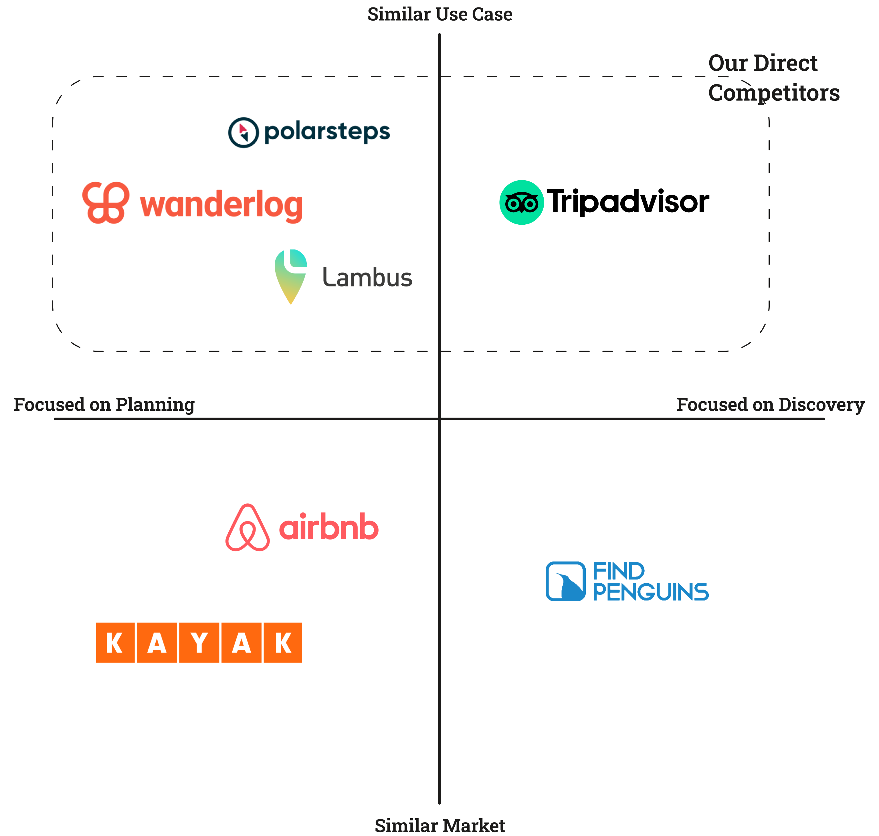
Since the app’s main features were already defined, I didn’t conduct a traditional usability study. Instead, I listed our direct and indirect competitors, dividing them into four groups. This helped me clearly understand the competitive landscape and determine our main competitors for each feature. During the process, I frequently referred back to this analysis to guide the design and redesign of relevant features.
Challenge 1 : Redesigning selected flows with a modernized look while keeping the visual designs consistent with the former designs and the branding.
Challenge 2 : Trying to cut off additional development costs. In order to do so, I needed to preserve some of the already implemented components in my designs.
Design
Wireframes
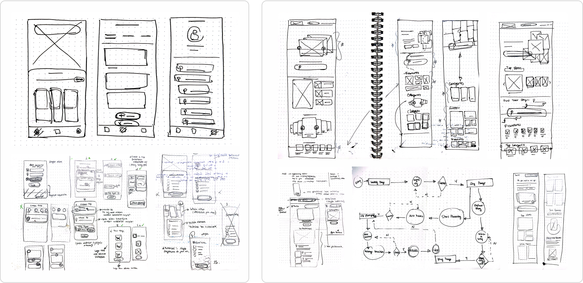
I began my design process by identifying usability gaps in the Tourist App, considering live app user data, Firebase analyses, and user feedback. I also studied competitor products and conducted literature searches to gain an overall perspective. Then, I refined my findings, sketched some drafts, tested them, and made revisions as necessary. Below are some of my sketches for a quick overview of my design process.
The Mobile App Process
The design process was quick and iterative. Since the app was already live, we needed to find quick and effective solutions for each problem. Besides solving the above mentioned problems, we added several new features to improve the app's functionality and usability. We also modified several features to align better with the new design.
I addressed each design issue individually, iterating several times with a focus on user feedback, app analytics, and structural adjustments. Throughout this process, I refined numerous UI components to ensure consistency and accessibility.

- Redesigning the App Navigation
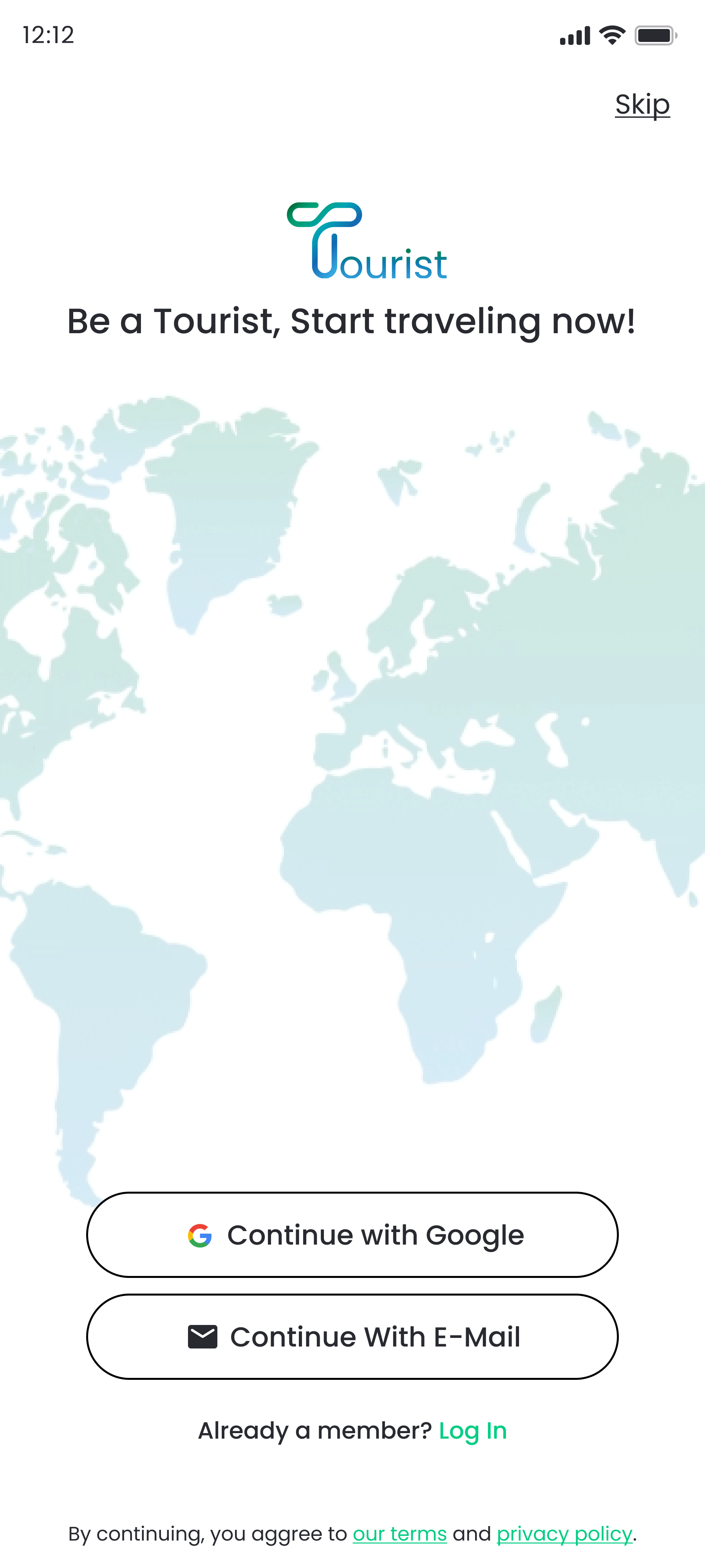
After a detailed review with my project manager, we agreed to revise the primary user navigation to enhance usability, particularly for key features like trip planning and destination discovery. The user data indicated that the current flow was confusing for many users. In addition to the navigation flow, the color choice of the existing navigation menu was also not accessible and even not recognizable. I first started by changing the accent color used in the menu to the app’s primary green to enhance readability, then began to redesign the overall navigation flow.
When users first opened the app, they were presented with a homepage featuring a hamburger menu, a bottom navigation bar, and a plus sign button for quick actions. The design was intended to make all features accessible within one click. However, the number of created trips was noticeably lower than the number of active users. This realization led us to analyze the Firebase data of the related page. The analysis revealed that a significant number of users were struggling to find the "create new trip" feature via the plus sign in the bottom menu. With this insight, I streamlined the homepage and user flow to highlight two main features:
- Starting a new plan
- Exploring new destinations
We streamlined the bottom navigation to focus on these main actions and decluttered the homepage to guide users directly to these functions.
Before
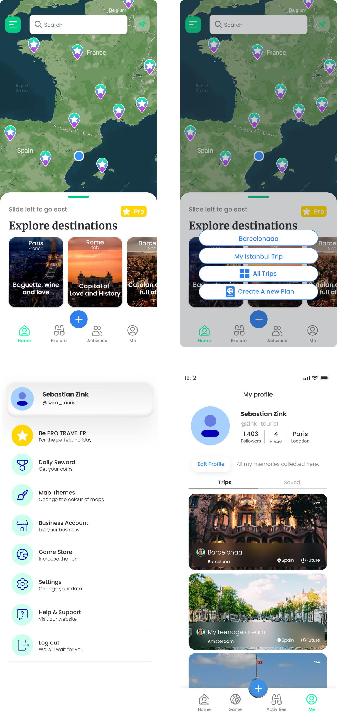
After
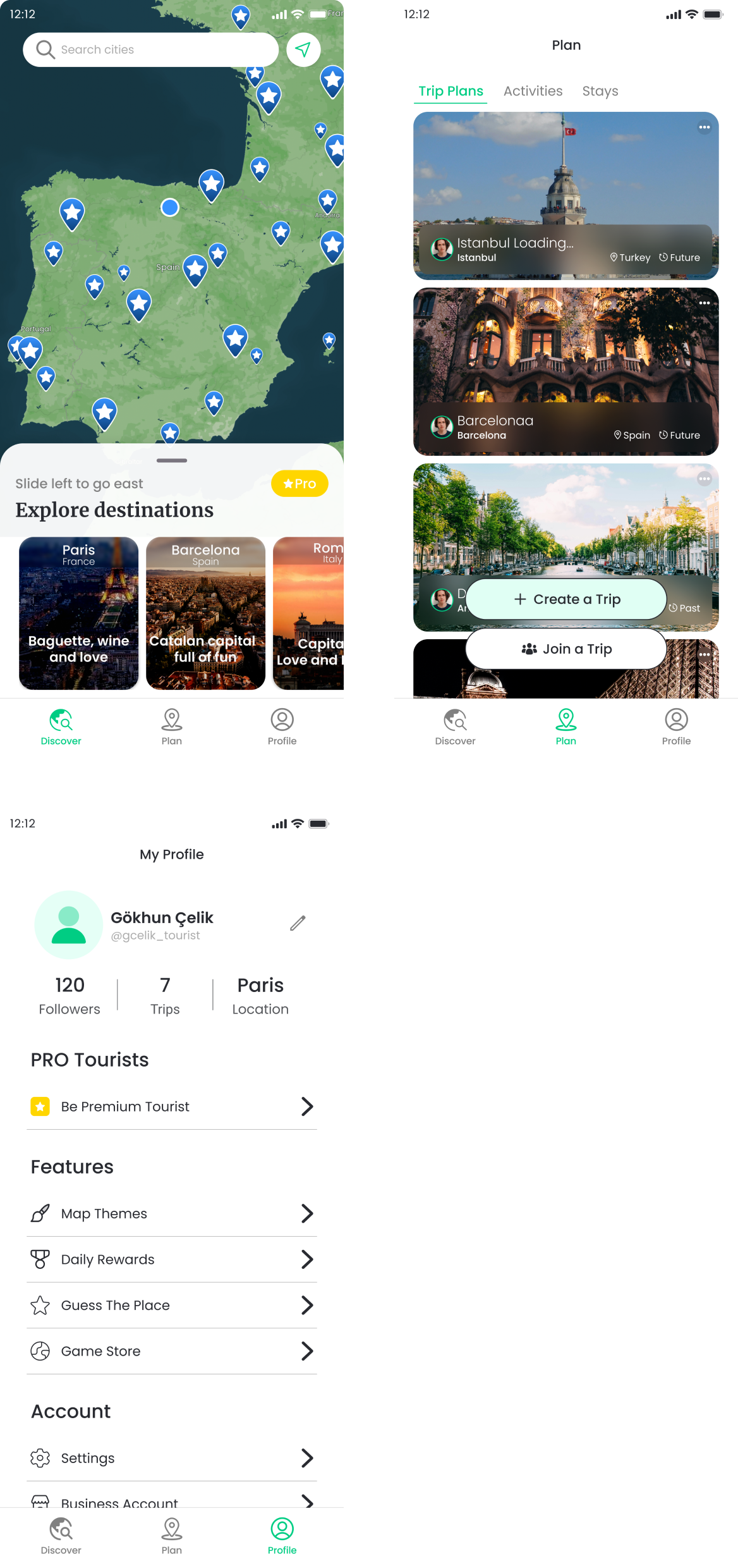
As a result, we introduced three main pages in the new user navigation:
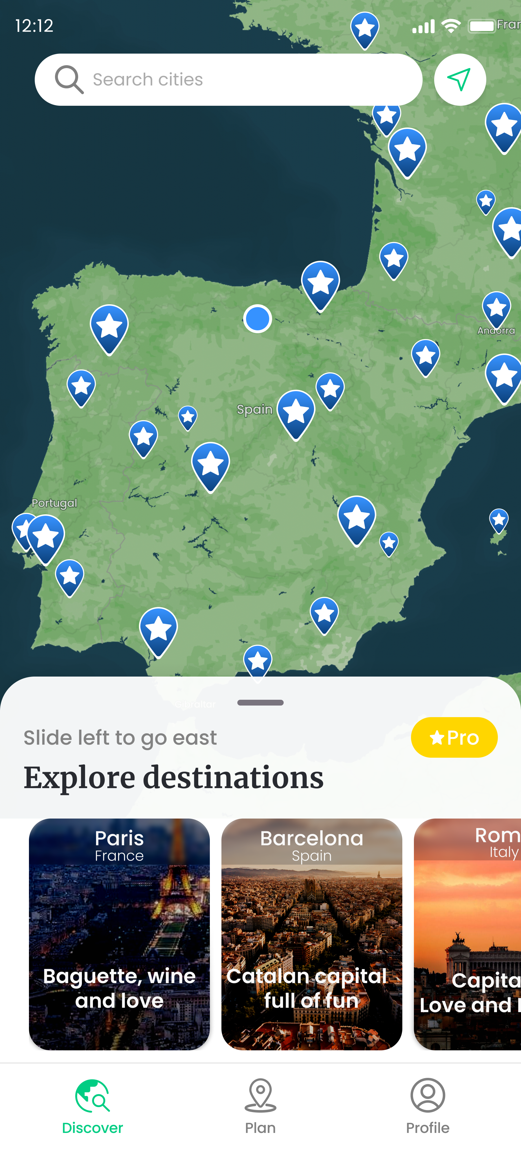
- Discover
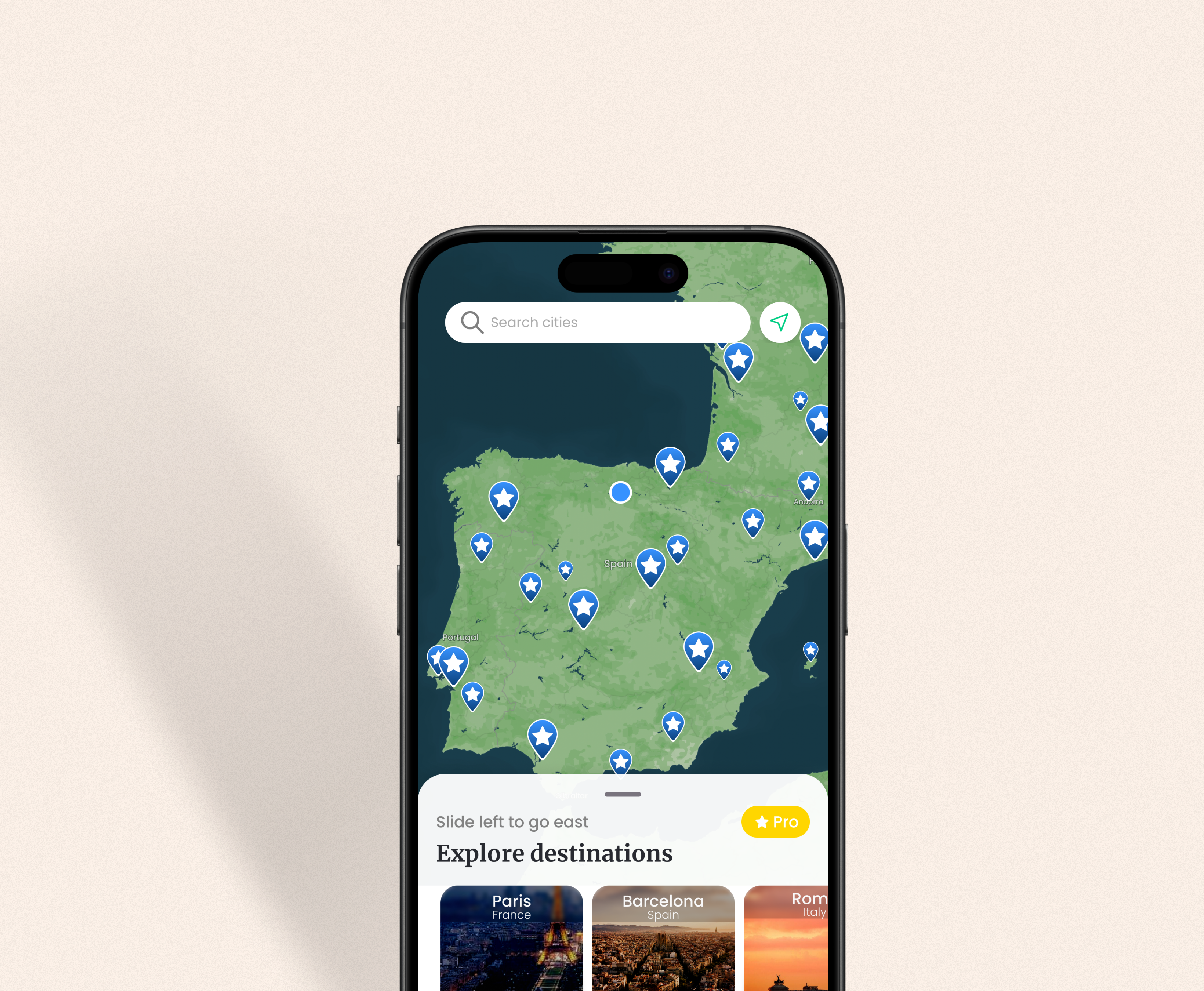
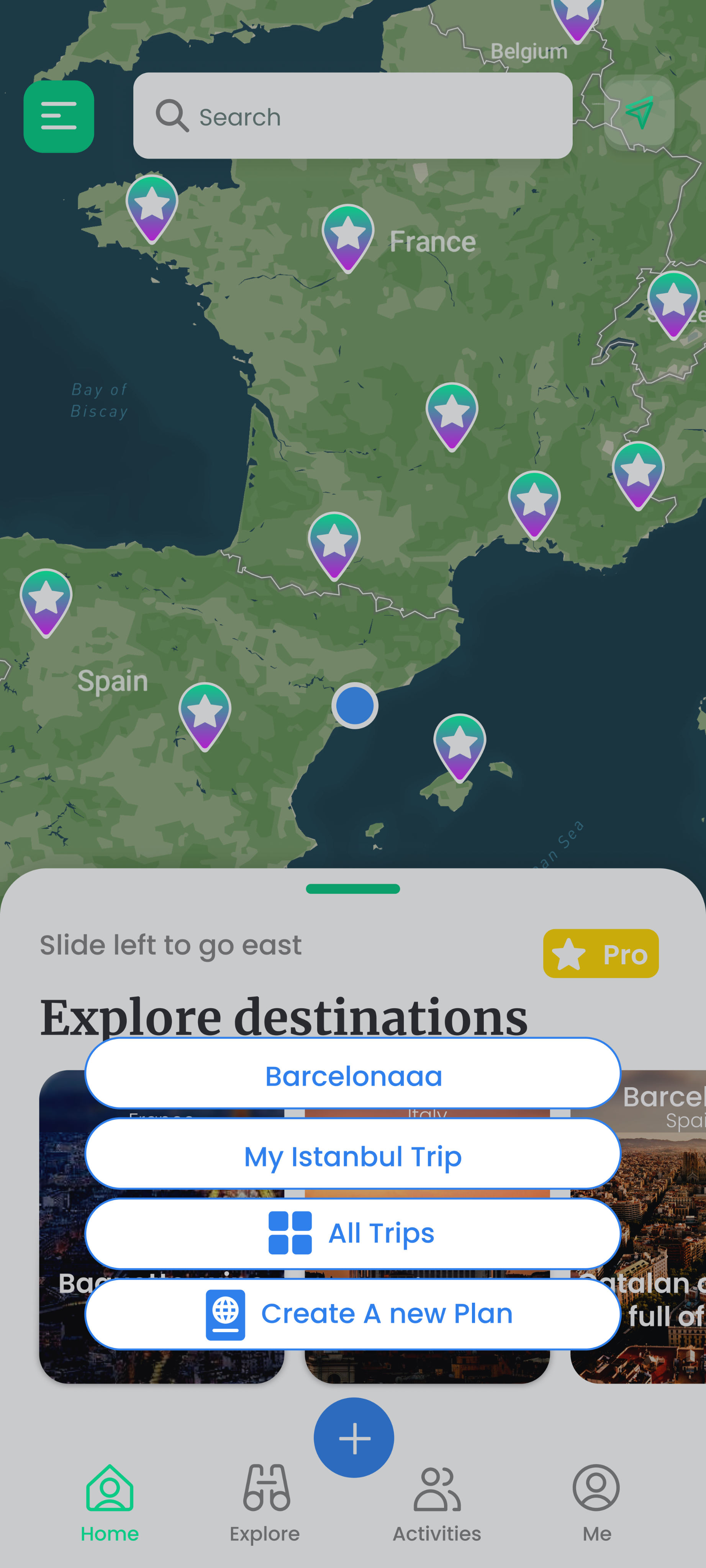
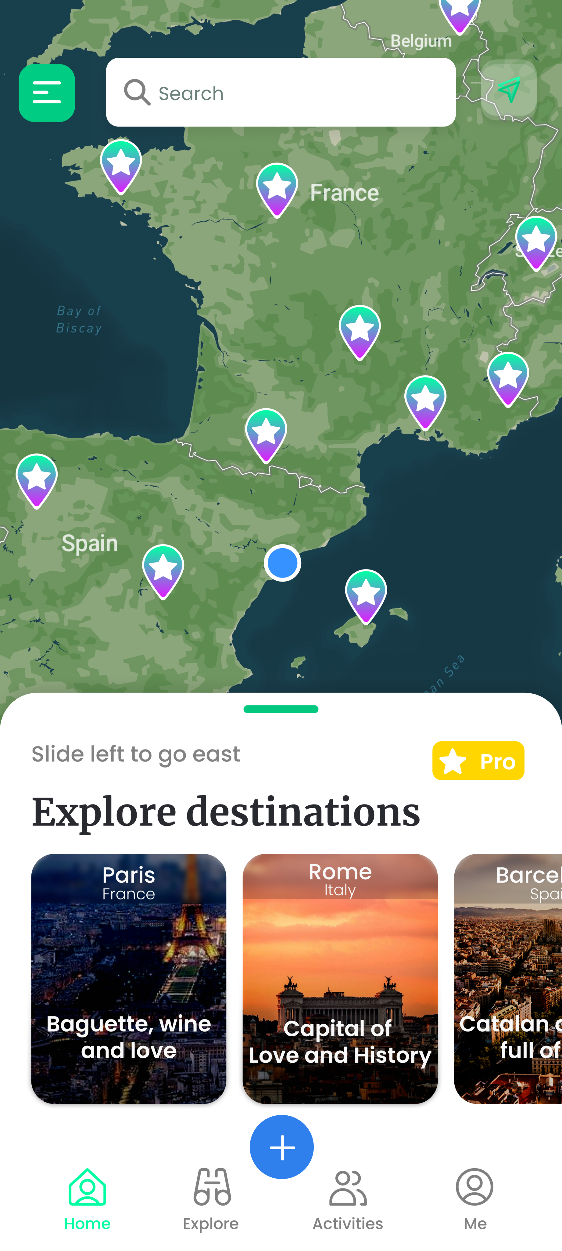
This page directs users to their needs. They can search for a new destination, select one of the featured destinations to explore, or use the bottom menu to plan a new trip or access their existing trips.
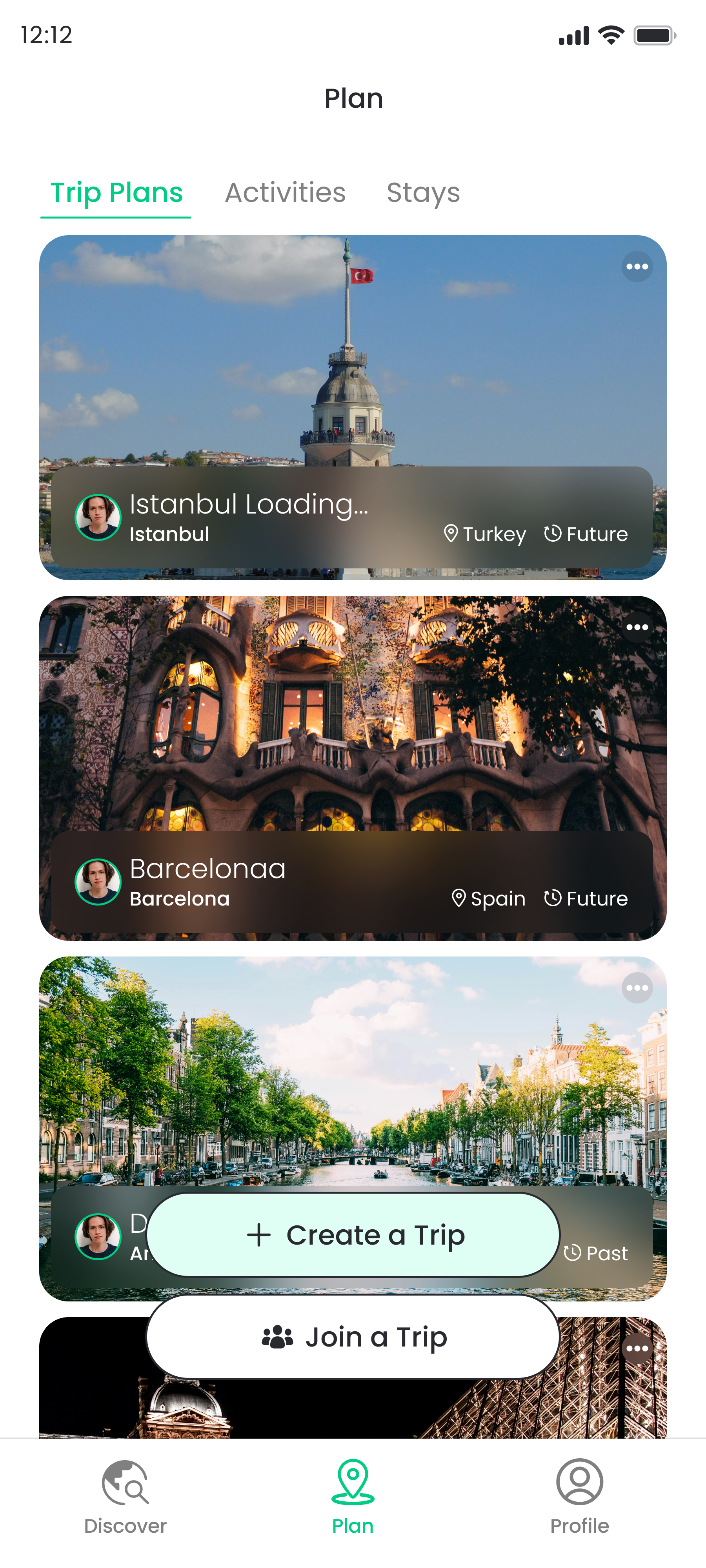
- Plan
The redesign visually lists users' existing trip plans, including booked activities and accommodations. Crucially, when users decide to take action regarding a trip, the "create trip" button is prominently placed visibly at the center for quick action.
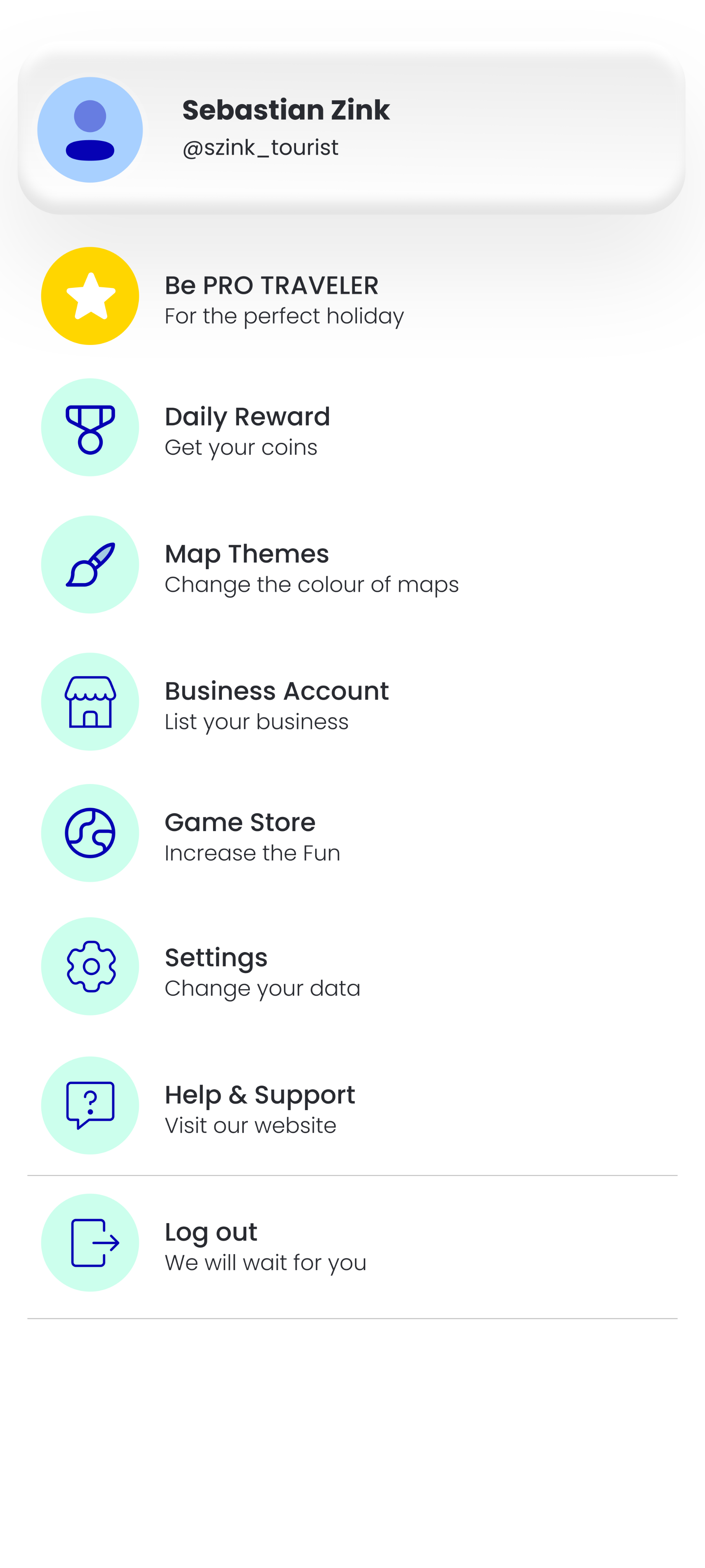
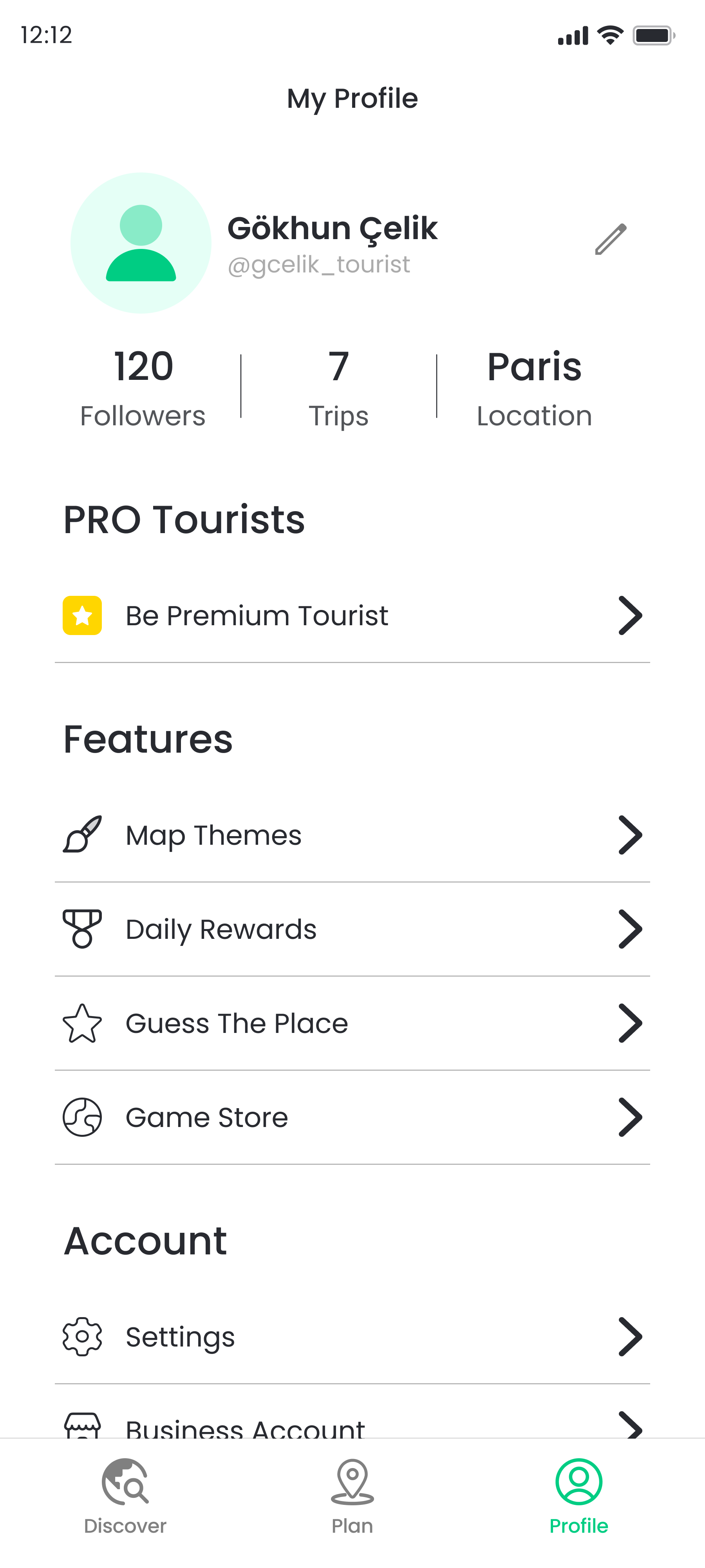
- Profile
We merged the former homepage's side menu with the profile section. This change allowed us to integrate profile actions with the formerly underused side menu features in a clear, hierarchical structure.
- Designing a User-Centered Trip Planning Process
The trip planning process needed to be simple, intuitive, and engaging. Previously, the app had no significant design for this process, so I created a new flow that allows users to act directly on their objectives.
I consolidated all essential information -destination, dates, privacy- on a single page. Then, I collected the required information from users by changing the states of the information boxes with relevant animations.
- Restructuring the Destination Flow
There were multiple usability challenges within the destination flow. When users began exploring places to visit in a city, they encountered overly complex lists and an excessive number of locations within those lists, leading to an overwhelming experience. The Firebase and Google Analytics results proved that this approach was not working well since a high ratio of users visiting this page were selecting one of the first three destination lists in each category. Therefore, I introduced a filtering system to the destination flow. Our aim was to narrow down the suggested locations to better match users' preferences. I redesigned the destination flow, making minor adjustments to the overall process and replacing the category list system with the new filtering system.
Before
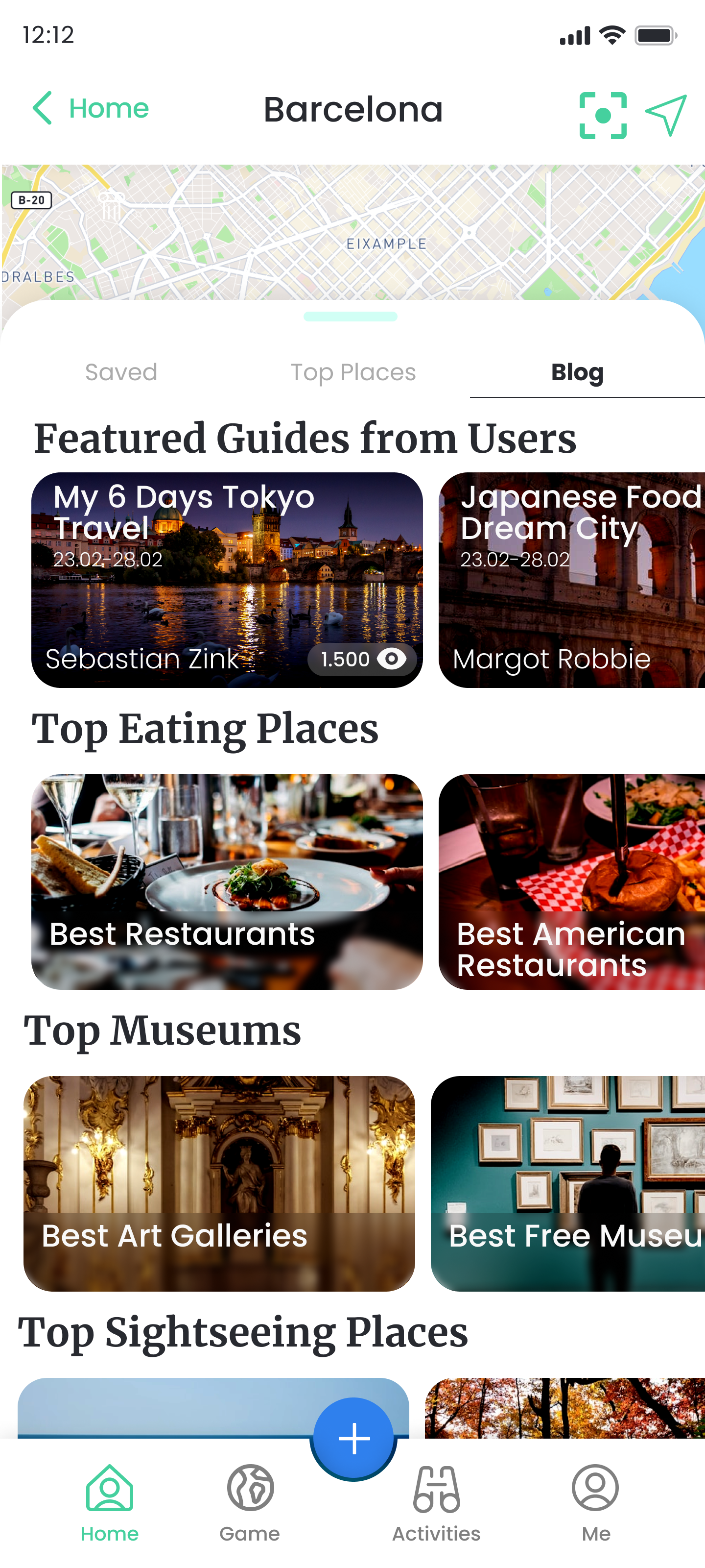
After
- Usability Enhancements on Planned Trip Flow
Since the Tourist App was already published and there were numerous usability problems, we made a priority list by analyzing the user pain points within the flow obtained from the overall user data and tests. We then, discussed the highest priority points throughout the flow to enhance the user journey overall and brainstormed potential solutions to address these issues.
Problem & Solution
Users were having difficulties to use the plan sub-menu with its horizontal scrolling. Therefore, some features on the menu were staying invisible.
I designed a new submenu that integrates icons with related labels, ensuring all features stay together on the screen.
Problem & Solution
The rearrange feature wasn’t eye-catching enough.
I designed an interactive rearrange button as well as reorganizing the whole rearrange structure. I focused on changing the user journey into an easier one by showing the users what they are doing simultaneously.
Before
After
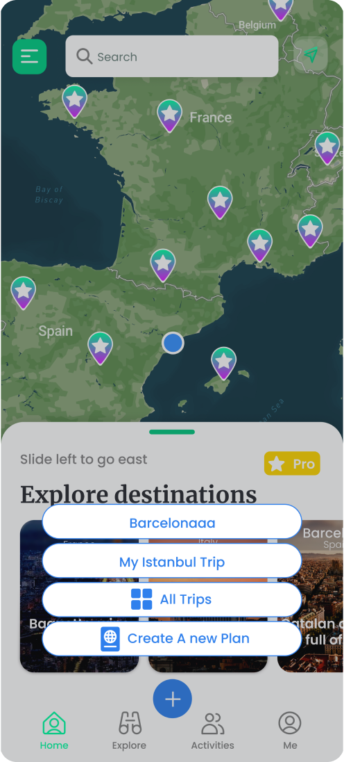
I, additionally proposed a new use case for the map feature, which previously displayed only pins without explanations. My suggestion was a new design that included the names of added locations, similar to the rearrange page, combined with the map page.
With these modifications, we noticed a substantial rise in the click rate of the rearrange button and a more balanced allocation of places across trip days.
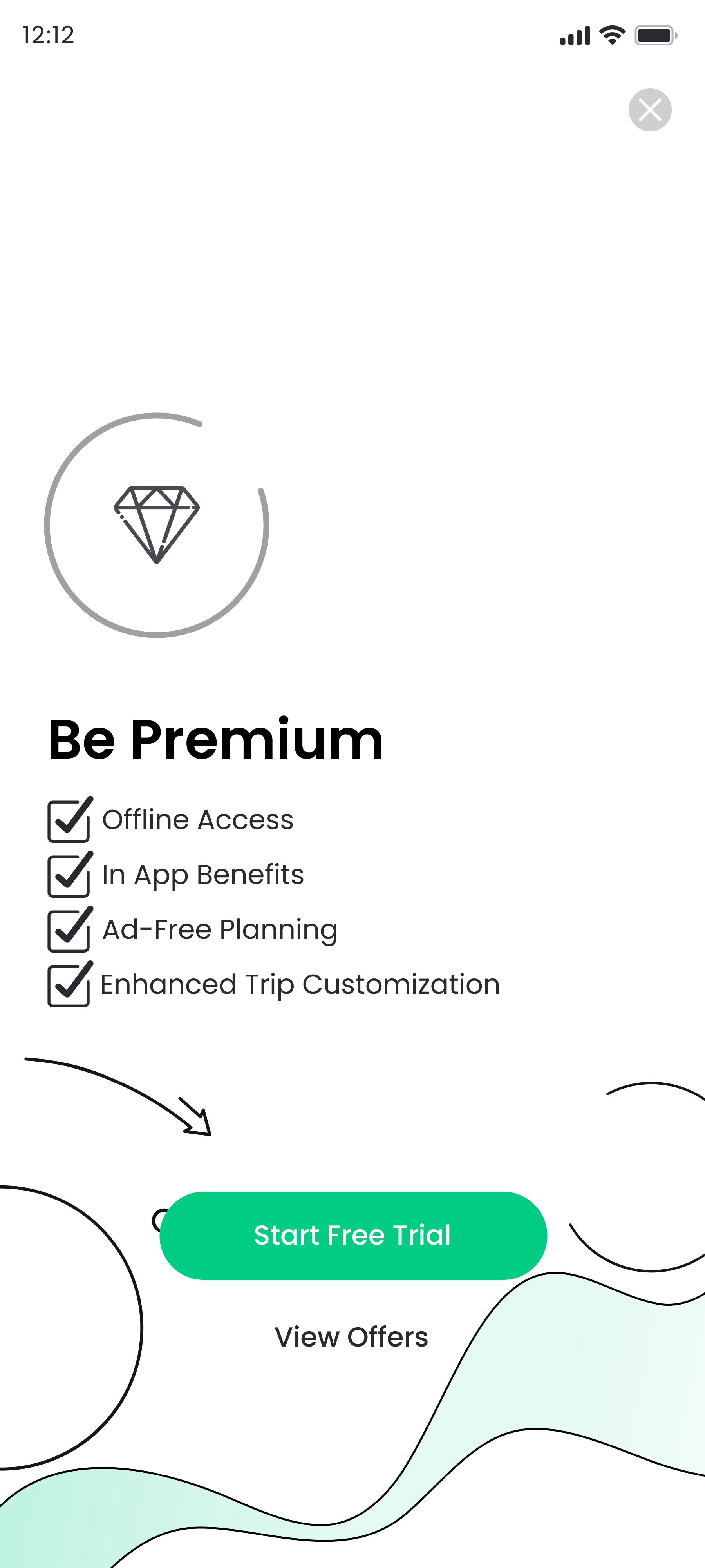
- Promoting Premium Features to Increase Membership Numbers
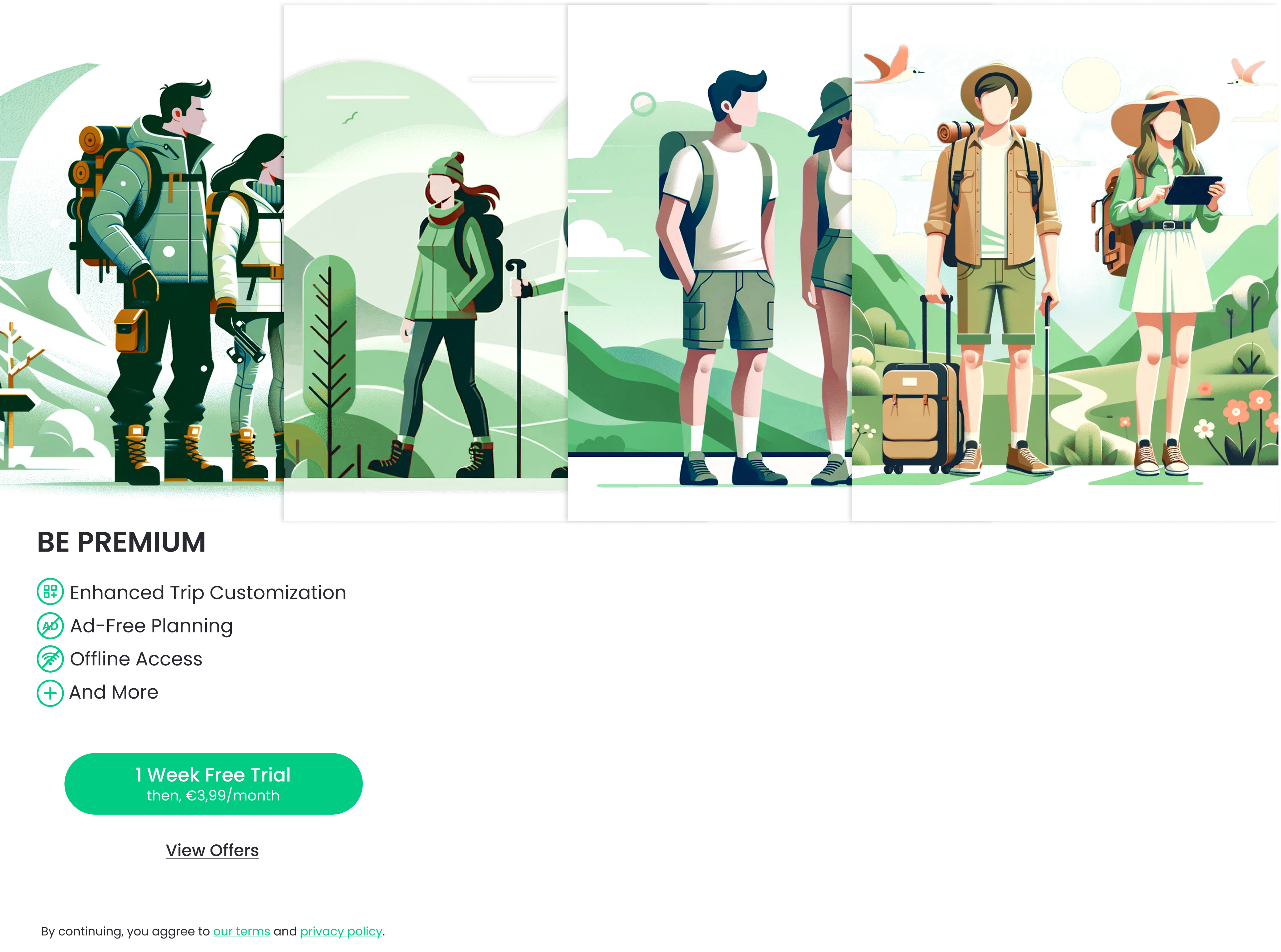
This was the most challenging task I faced during my tenure at the company. We had to introduce new premium paywalls and convey to users that we offer over 10 pro features without listing them individually. After three to four rounds of design iterations and brainstorming sessions, we devised a strategy to categorize the features into four groups, list these groups, and then represent them with an engaging illustration. I designed different screens to be shown at separate times to the users for two reasons:
- Catching the users’ attention each time they encounter the paywalls
- Personalizing the paywalls to increase the conversion rates.
Additionally, to offer a comprehensive view of all our premium features, I developed a sliding system that encompasses all our premium features. Even in a short time after the paywalls' implementation in the app, we’ve already observed a 350% increase in subscription ratios per user.
As well as the main paywall and premium offer screens’ design, I have designed a set of specific screens as in-app popups. These popups are designed to engage users during specific activities, providing detailed insights into our premium features. By varying these popups, I again aimed to catch users’ attention and to avoid boring them by showing the same screens repeatedly.
- Working On the User Retention
Based on Firebase and Google Analytics data, the first session churn rate was 79%. After assessing the situation, we concluded that our onboarding process failed to engage users effectively or demonstrate the app's value. To address this, I completely redesigned the onboarding experience, incorporating video animations and a following paywall screen. By keeping the onboarding process dynamic and direct, in the initial observation, we found a slight but visible decrease in the first session churn rates.
Before
After
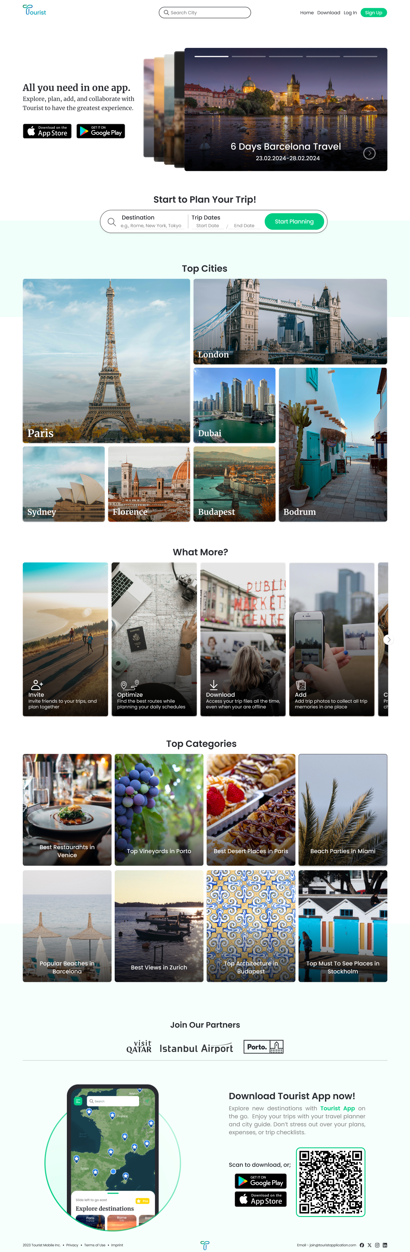
The Website Process
As another important task, I designed a website to perform the most important tasks of the app on a different platform. The app previously had a promotional website featuring a landing page that introduced the app along with a download button. However, the co-founders approached me with the request for a revamped structure that also included several features from the app itself.
I was provided with a base sitemap, previously determined in alignment with the business needs and goals by my project manager. Based on this sitemap, I developed user flows for the specified features:
- Introducing the app and its features
- Showcasing destinations as they appear in the app
- Enabling trip creation from a web browser
For the most crucial pages, I designed a responsive layout that displayed both the desktop and mobile versions of the pages.
- Introducing the App and Its Features - Homepage Design
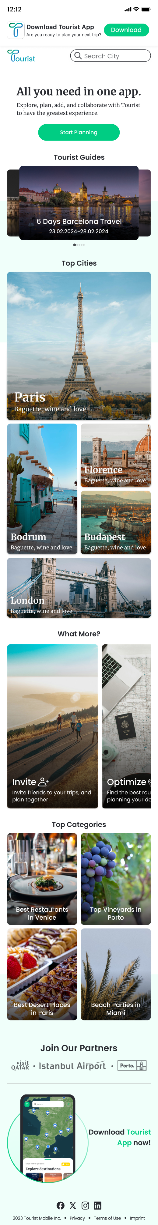
Even though there was a landing page on the published website, it wasn’t a good fit for our brand and mainly served as an introductory page. Therefore, I designed a new homepage from scratch. While preserving the introductory content, I integrated it with information about our app's key features to emphasize them at the beginning of the user journey. The revamped homepage now showcases example trips, top cities to visit, and top categories from various cities, alongside a brief overview of in-app features.
- Designing the Destination Pages
To enhance the promotion of the Tourist App and the destinations featured within it, I developed a layout for a destination page. This layout acts as a condensed version of the destination features available in the app. It includes lists of the best categories across different segments, top attractions, and guides from other users listed on the destination page to engage users and encourage them to explore the website further.
Regarding the responsive layout, my project manager and I discussed how the extensive space required by destination categories and the horizontal scrolling might overwhelm or disinterest users. Therefore, similar to the app’s existing approach, we decided to guide users to related categories through filters rather than displaying them directly as lists. We aimed to create a more streamlined and engaging user experience.
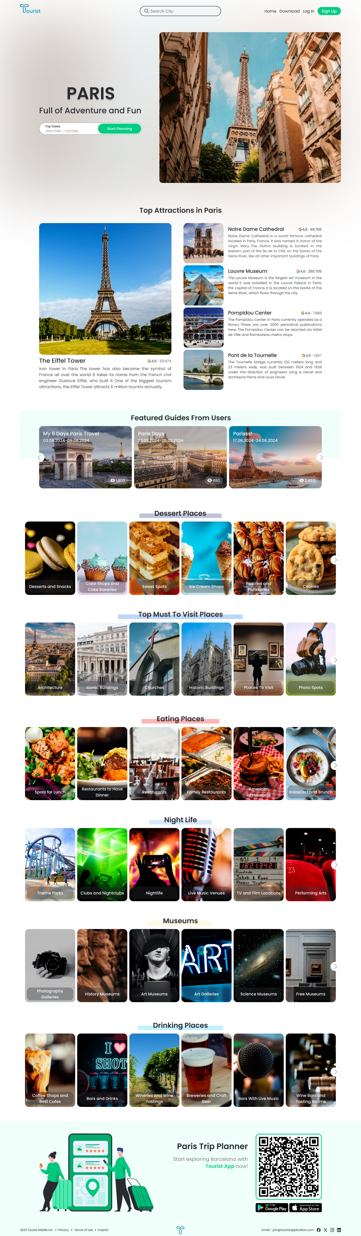
- Showing the Locations in a Destination List
We aimed to retain user interest for those eager to uncover new spots within a chosen destination. To achieve this, we offered a detailed list of locations users could explore, accessible through the destination page by selecting a list. This approach was designed to facilitate discovery and engagement by simplifying access to a wide array of interesting places.
After
- Designing the Flow to Create a Trip
I've completed the initial design phase for the key pages involved in the user flow. The homepage and destination pages have been constructed and planned to undergo user testing. The primary user journey starts at the homepage, progresses to the destination page, and concludes with either creating a trip or downloading the app. To guide mobile users towards our mobile app, we deliberately chose not to make the "create trip" feature responsive. This decision reflects a strategic choice aligned with our company's objectives. Here you can try the website and check the overall user flow.
Conclusion
Impacts
During my tenure at the company, I have contributed significantly to various aspects of both the app and the website designs. As above mentioned KPIs (key performance indicators) suggest, the alterations I provided are beginning to yield positive outcomes for the company. This progress underscores the user experience improvements on user engagement and satisfaction.
Next Steps
Various aspects of both the website and the mobile app are still under development, and I am awaiting user statistics and feedbacks to further improve the designs I have completed. In summary, the iterative process of enhancement and optimization for both the app and the website will persist with the development and testing processes. - Project is being delivered to the Tourist Founder team now.
Re/Designing Tourist’s Mobile App and Website
Role: UX/UI Designer
Team: Project Manager, Mobile and Web Developers
Client: Tourist Application
Date: October 2023 - April 2024
Research
Problem & Solution
Tourist App is a travel app used to explore cities and plan trips. The app had several usability issues and lacked designs for new features.
With careful consideration, the two co-founders and I identified the user pain points and business needs. We then looked for possible solutions to these design and usability challenges through an iterative process.
Although there was no dedicated UX Researcher, I occasionally conducted user testing. The app's co-founders supplied me with usability statistics from Firebase and Google Analytics. They also provided me with the results of manual user testing on our existing or newly implemented features. I actively participated in identifying the main user problems and struggles during the process, considering the analyzed data. I examined our competitors' products to gain perspective and conducted literature searches to gain overall insight.
Defining Problems & User Needs
We encountered several key issues with the user flow that complicated the user journey. Also, the users needed more guidance through the app because it had a comprehensive feature set.
- Nav Bar and App Navigation: The existing app navigation and the design of the nav bar concealed the most important features and failed to keep the users’ attention.
- Trip Planning: The planning process was limited to a single page and lacked interactive elements between steps, giving users a sense of non-progressiveness.
- Destination Discovery: Users found the process of discovering destinations within a city from multiple different lists complicated and confusing.
Three main business issues also has been brought to my attention:
- Low user retention rates (CRR)
- Low attention to premium features
- The need for a representative website
Ideate
Competitive Analysis
Since the app’s main features were already defined, I didn’t conduct a traditional usability study. Instead, I listed our direct and indirect competitors, dividing them into four groups. This helped me clearly understand the competitive landscape and determine our main competitors for each feature. During the process, I frequently referred back to this analysis to guide the design and redesign of relevant features.
Challenge 1 : Redesigning selected flows with a modernized look while keeping the visual designs consistent with the former designs and the branding.
Challenge 2 : Trying to cut off additional development costs. In order to do so, I needed to preserve some of the already implemented components in my designs.
Design
Wireframes
I began my design process by identifying usability gaps in the Tourist App, considering live app user data, Firebase analyses, and user feedback. I also studied competitor products and conducted literature searches to gain an overall perspective. Then, I refined my findings, sketched some drafts, tested them, and made revisions as necessary. Below are some of my sketches for a quick overview of my design process.
The Mobile App Process
The design process was quick and iterative. Since the app was already live, we needed to find quick and effective solutions for each problem. Besides solving the above mentioned problems, we added several new features to improve the app's functionality and usability. We also modified several features to align better with the new design.
I addressed each design issue individually, iterating several times with a focus on user feedback, app analytics, and structural adjustments. Throughout this process, I refined numerous UI components to ensure consistency and accessibility.
- Redesigning the App Navigation
After a detailed review with my project manager, we agreed to revise the primary user navigation to enhance usability, particularly for key features like trip planning and destination discovery. The user data indicated that the current flow was confusing for many users. In addition to the navigation flow, the color choice of the existing navigation menu was also not accessible and even not recognizable. I first started by changing the accent color used in the menu to the app’s primary green to enhance readability, then began to redesign the overall navigation flow.
When users first opened the app, they were presented with a homepage featuring a hamburger menu, a bottom navigation bar, and a plus sign button for quick actions. The design was intended to make all features accessible within one click. However, the number of created trips was noticeably lower than the number of active users. This realization led us to analyze the Firebase data of the related page. The analysis revealed that a significant number of users were struggling to find the "create new trip" feature via the plus sign in the bottom menu. With this insight, I streamlined the homepage and user flow to highlight two main features:
- Starting a new plan
- Exploring new destinations
We streamlined the bottom navigation to focus on these main actions and decluttered the homepage to guide users directly to these functions.
Before
After
As a result, we introduced three main pages in the new user navigation:
- Discover
This page directs users to their needs. They can search for a new destination, select one of the featured destinations to explore, or use the bottom menu to plan a new trip or access their existing trips.
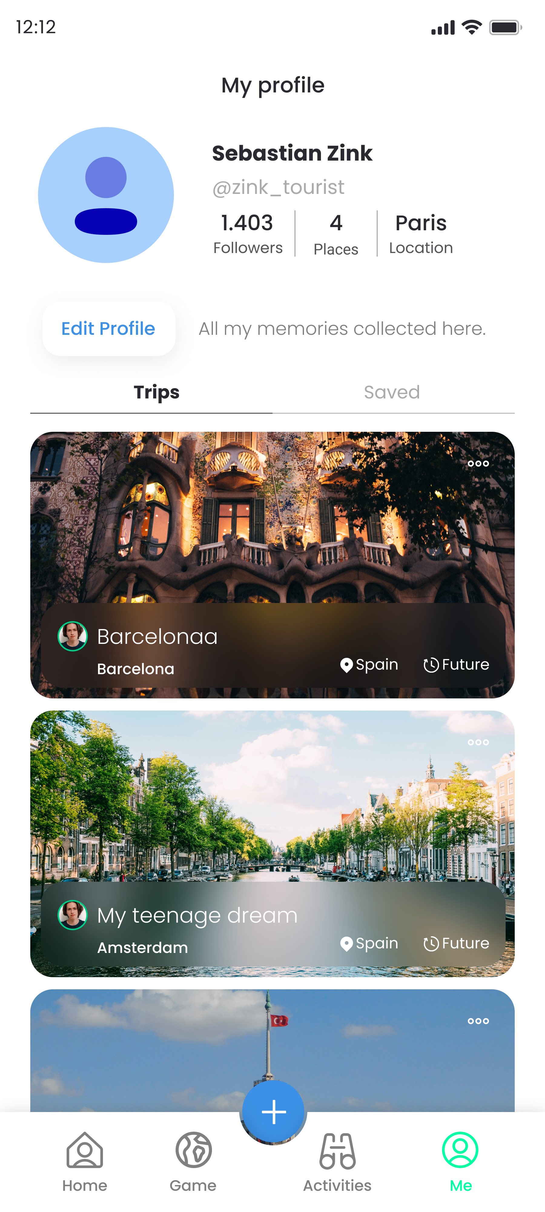
- Plan
The redesign visually lists users' existing trip plans, including booked activities and accommodations. Crucially, when users decide to take action regarding a trip, the "create trip" button is prominently placed visibly at the center for quick action.
- Profile
We merged the former homepage's side menu with the profile section. This change allowed us to integrate profile actions with the formerly underused side menu features in a clear, hierarchical structure.
- Designing a User-Centered Trip Planning Process
The trip planning process needed to be simple, intuitive, and engaging. Previously, the app had no significant design for this process, so I created a new flow that allows users to act directly on their objectives.
I consolidated all essential information -destination, dates, privacy- on a single page. Then, I collected the required information from users by changing the states of the information boxes with relevant animations.
- Restructuring the Destination Flow
There were multiple usability challenges within the destination flow. When users began exploring places to visit in a city, they encountered overly complex lists and an excessive number of locations within those lists, leading to an overwhelming experience. The Firebase and Google Analytics results proved that this approach was not working well since a high ratio of users visiting this page were selecting one of the first three destination lists in each category. Therefore, I introduced a filtering system to the destination flow. Our aim was to narrow down the suggested locations to better match users' preferences. I redesigned the destination flow, making minor adjustments to the overall process and replacing the category list system with the new filtering system.
Before
After
- Usability Enhancements on Planned Trip Flow
Since the Tourist App was already published and there were numerous usability problems, we made a priority list by analyzing the user pain points within the flow obtained from the overall user data and tests. We then, discussed the highest priority points throughout the flow to enhance the user journey overall and brainstormed potential solutions to address these issues.
Problem & Solution
Users were having difficulties to use the plan sub-menu with its horizontal scrolling. Therefore, some features on the menu were staying invisible.
I designed a new submenu that integrates icons with related labels, ensuring all features stay together on the screen.
Problem & Solution
The rearrange feature wasn’t eye-catching enough.
I designed an interactive rearrange button as well as reorganizing the whole rearrange structure. I focused on changing the user journey into an easier one by showing the users what they are doing simultaneously.
Before
After
I, additionally proposed a new use case for the map feature, which previously displayed only pins without explanations. My suggestion was a new design that included the names of added locations, similar to the rearrange page, combined with the map page.
With these modifications, we noticed a substantial rise in the click rate of the rearrange button and a more balanced allocation of places across trip days.
- Promoting Premium Features to Increase Membership Numbers
This was the most challenging task I faced during my tenure at the company. We had to introduce new premium paywalls and convey to users that we offer over 10 pro features without listing them individually. After three to four rounds of design iterations and brainstorming sessions, we devised a strategy to categorize the features into four groups, list these groups, and then represent them with an engaging illustration. I designed different screens to be shown at separate times to the users for two reasons:
- Catching the users’ attention each time they encounter the paywalls
- Personalizing the paywalls to increase the conversion rates.
Additionally, to offer a comprehensive view of all our premium features, I developed a sliding system that encompasses all our premium features. Even in a short time after the paywalls' implementation in the app, we’ve already observed a 350% increase in subscription ratios per user.
As well as the main paywall and premium offer screens’ design, I have designed a set of specific screens as in-app popups. These popups are designed to engage users during specific activities, providing detailed insights into our premium features. By varying these popups, I again aimed to catch users’ attention and to avoid boring them by showing the same screens repeatedly.
- Working On the User Retention
Based on Firebase and Google Analytics data, the first session churn rate was 79%. After assessing the situation, we concluded that our onboarding process failed to engage users effectively or demonstrate the app's value. To address this, I completely redesigned the onboarding experience, incorporating video animations and a following paywall screen. By keeping the onboarding process dynamic and direct, in the initial observation, we found a slight but visible decrease in the first session churn rates.
Before
After
The Website Process
As another important task, I designed a website to perform the most important tasks of the app on a different platform. The app previously had a promotional website featuring a landing page that introduced the app along with a download button. However, the co-founders approached me with the request for a revamped structure that also included several features from the app itself.
I was provided with a base sitemap, previously determined in alignment with the business needs and goals by my project manager. Based on this sitemap, I developed user flows for the specified features:
- Introducing the app and its features
- Showcasing destinations as they appear in the app
- Enabling trip creation from a web browser
For the most crucial pages, I designed a responsive layout that displayed both the desktop and mobile versions of the pages.
- Introducing the App and Its Features - Homepage Design
Even though there was a landing page on the published website, it wasn’t a good fit for our brand and mainly served as an introductory page. Therefore, I designed a new homepage from scratch. While preserving the introductory content, I integrated it with information about our app's key features to emphasize them at the beginning of the user journey. The revamped homepage now showcases example trips, top cities to visit, and top categories from various cities, alongside a brief overview of in-app features.
- Designing the Destination Pages
To enhance the promotion of the Tourist App and the destinations featured within it, I developed a layout for a destination page. This layout acts as a condensed version of the destination features available in the app. It includes lists of the best categories across different segments, top attractions, and guides from other users listed on the destination page to engage users and encourage them to explore the website further.
Regarding the responsive layout, my project manager and I discussed how the extensive space required by destination categories and the horizontal scrolling might overwhelm or disinterest users. Therefore, similar to the app’s existing approach, we decided to guide users to related categories through filters rather than displaying them directly as lists. We aimed to create a more streamlined and engaging user experience.
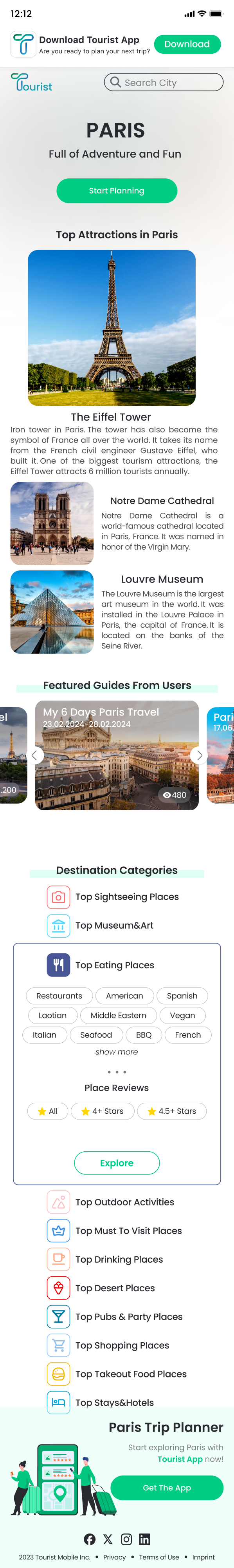
- Showing the Locations in a Destination List
We aimed to retain user interest for those eager to uncover new spots within a chosen destination. To achieve this, we offered a detailed list of locations users could explore, accessible through the destination page by selecting a list. This approach was designed to facilitate discovery and engagement by simplifying access to a wide array of interesting places.
- Designing the Flow to Create a Trip
I've completed the initial design phase for the key pages involved in the user flow. The homepage and destination pages have been constructed and planned to undergo user testing. The primary user journey starts at the homepage, progresses to the destination page, and concludes with either creating a trip or downloading the app. To guide mobile users towards our mobile app, we deliberately chose not to make the "create trip" feature responsive. This decision reflects a strategic choice aligned with our company's objectives. Here you can try the website and check the overall user flow.
Conclusion
Impacts
During my tenure at the company, I have contributed significantly to various aspects of both the app and the website designs. As above mentioned KPIs (key performance indicators) suggest, the alterations I provided are beginning to yield positive outcomes for the company. This progress underscores the user experience improvements on user engagement and satisfaction.
Next Steps
Various aspects of both the website and the mobile app are still under development, and I am awaiting user statistics and feedbacks to further improve the designs I have completed. In summary, the iterative process of enhancement and optimization for both the app and the website will persist with the development and testing processes. - Project is being delivered to the Tourist Founder team now.
Re/Designing Tourist’s Mobile App and Website
Role: UX/UI Designer
Team: Project Manager, Mobile and Web Developers
Client: Tourist Applicaiton
Date: October 2023 - April 2024
Research
Problem & Solution
Tourist App is a travel app used to explore cities and plan trips. The app had several usability issues and lacked designs for new features.
With careful consideration, the two co-founders and I identified the user pain points and business needs. We then looked for possible solutions to these design and usability challenges through an iterative process.
Although there was no dedicated UX Researcher, I occasionally conducted user testing. The app's co-founders supplied me with usability statistics from Firebase and Google Analytics. They also provided me with the results of manual user testing on our existing or newly implemented features. I actively participated in identifying the main user problems and struggles during the process, considering the analyzed data. I examined our competitors' products to gain perspective and conducted literature searches to gain overall insight.
Defining Problems & User Needs
We encountered several key issues with the user flow that complicated the user journey. Also, the users needed more guidance through the app because it had a comprehensive feature set.
- Nav Bar and App Navigation: The existing app navigation and the design of the nav bar concealed the most important features and failed to keep the users’ attention.
- Trip Planning: The planning process was limited to a single page and lacked interactive elements between steps, giving users a sense of non-progressiveness.
- Destination Discovery: Users found the process of discovering destinations within a city from multiple different lists complicated and confusing.
Three main business issues also has been brought to my attention:
- Low user retention rates (CRR)
- Low attention to premium features
- The need for a representative website
Ideate
Competitive Analysis
Since the app’s main features were already defined, I didn’t conduct a traditional usability study. Instead, I listed our direct and indirect competitors, dividing them into four groups. This helped me clearly understand the competitive landscape and determine our main competitors for each feature. During the process, I frequently referred back to this analysis to guide the design and redesign of relevant features.
Challenge 1 : Redesigning selected flows with a modernized look while keeping the visual designs consistent with the former designs and the branding.
Challenge 2 : Trying to cut off additional development costs. In order to do so, I needed to preserve some of the already implemented components in my designs.
Design
Wireframes
I began my design process by identifying usability gaps in the Tourist App, considering live app user data, Firebase analyses, and user feedback. I also studied competitor products and conducted literature searches to gain an overall perspective. Then, I refined my findings, sketched some drafts, tested them, and made revisions as necessary. Below are some of my sketches for a quick overview of my design process.
The Mobile App Process
The design process was quick and iterative. Since the app was already live, we needed to find quick and effective solutions for each problem. Besides solving the above mentioned problems, we added several new features to improve the app's functionality and usability. We also modified several features to align better with the new design.
I addressed each design issue individually, iterating several times with a focus on user feedback, app analytics, and structural adjustments. Throughout this process, I refined numerous UI components to ensure consistency and accessibility.
- Redesigning the App Navigation
After a detailed review with my project manager, we agreed to revise the primary user navigation to enhance usability, particularly for key features like trip planning and destination discovery. The user data indicated that the current flow was confusing for many users. In addition to the navigation flow, the color choice of the existing navigation menu was also not accessible and even not recognizable. I first started by changing the accent color used in the menu to the app’s primary green to enhance readability, then began to redesign the overall navigation flow.
When users first opened the app, they were presented with a homepage featuring a hamburger menu, a bottom navigation bar, and a plus sign button for quick actions. The design was intended to make all features accessible within one click. However, the number of created trips was noticeably lower than the number of active users. This realization led us to analyze the Firebase data of the related page. The analysis revealed that a significant number of users were struggling to find the "create new trip" feature via the plus sign in the bottom menu. With this insight, I streamlined the homepage and user flow to highlight two main features:
- Starting a new plan
- Exploring new destinations
We streamlined the bottom navigation to focus on these main actions and decluttered the homepage to guide users directly to these functions.
Before
After
As a result, we introduced three main pages in the new user navigation:
- Discover
This page directs users to their needs. They can search for a new destination, select one of the featured destinations to explore, or use the bottom menu to plan a new trip or access their existing trips.
- Plan
The redesign visually lists users' existing trip plans, including booked activities and accommodations. Crucially, when users decide to take action regarding a trip, the "create trip" button is prominently placed visibly at the center for quick action.
- Profile
We merged the former homepage's side menu with the profile section. This change allowed us to integrate profile actions with the formerly underused side menu features in a clear, hierarchical structure.
- Designing a User-Centered Trip Planning Process
The trip planning process needed to be simple, intuitive, and engaging. Previously, the app had no significant design for this process, so I created a new flow that allows users to act directly on their objectives.
I consolidated all essential information -destination, dates, privacy- on a single page. Then, I collected the required information from users by changing the states of the information boxes with relevant animations.
- Restructuring the Destination Flow
There were multiple usability challenges within the destination flow. When users began exploring places to visit in a city, they encountered overly complex lists and an excessive number of locations within those lists, leading to an overwhelming experience. The Firebase and Google Analytics results proved that this approach was not working well since a high ratio of users visiting this page were selecting one of the first three destination lists in each category. Therefore, I introduced a filtering system to the destination flow. Our aim was to narrow down the suggested locations to better match users' preferences. I redesigned the destination flow, making minor adjustments to the overall process and replacing the category list system with the new filtering system.
Before
After
- Usability Enhancements on Planned Trip Flow
Since the Tourist App was already published and there were numerous usability problems, we made a priority list by analyzing the user pain points within the flow obtained from the overall user data and tests. We then, discussed the highest priority points throughout the flow to enhance the user journey overall and brainstormed potential solutions to address these issues.
Problem & Solution
Users were having difficulties to use the plan sub-menu with its horizontal scrolling. Therefore, some features on the menu were staying invisible.
I designed a new submenu that integrates icons with related labels, ensuring all features stay together on the screen.
Problem & Solution
The rearrange feature wasn’t eye-catching enough.
I designed an interactive rearrange button as well as reorganizing the whole rearrange structure. I focused on changing the user journey into an easier one by showing the users what they are doing simultaneously.
Before
After
I, additionally proposed a new use case for the map feature, which previously displayed only pins without explanations. My suggestion was a new design that included the names of added locations, similar to the rearrange page, combined with the map page.
With these modifications, we noticed a substantial rise in the click rate of the rearrange button and a more balanced allocation of places across trip days.
- Promoting Premium Features to Increase Membership Numbers
This was the most challenging task I faced during my tenure at the company. We had to introduce new premium paywalls and convey to users that we offer over 10 pro features without listing them individually. After three to four rounds of design iterations and brainstorming sessions, we devised a strategy to categorize the features into four groups, list these groups, and then represent them with an engaging illustration. I designed different screens to be shown at separate times to the users for two reasons:
- Catching the users’ attention each time they encounter the paywalls
- Personalizing the paywalls to increase the conversion rates.
Additionally, to offer a comprehensive view of all our premium features, I developed a sliding system that encompasses all our premium features. Even in a short time after the paywalls' implementation in the app, we’ve already observed a 350% increase in subscription ratios per user.
As well as the main paywall and premium offer screens’ design, I have designed a set of specific screens as in-app popups. These popups are designed to engage users during specific activities, providing detailed insights into our premium features. By varying these popups, I again aimed to catch users’ attention and to avoid boring them by showing the same screens repeatedly.
- Working On the User Retention
Based on Firebase and Google Analytics data, the first session churn rate was 79%. After assessing the situation, we concluded that our onboarding process failed to engage users effectively or demonstrate the app's value. To address this, I completely redesigned the onboarding experience, incorporating video animations and a following paywall screen. By keeping the onboarding process dynamic and direct, in the initial observation, we found a slight but visible decrease in the first session churn rates.
Before
After
The Website Process
As another important task, I designed a website to perform the most important tasks of the app on a different platform. The app previously had a promotional website featuring a landing page that introduced the app along with a download button. However, the co-founders approached me with the request for a revamped structure that also included several features from the app itself.
I was provided with a base sitemap, previously determined in alignment with the business needs and goals by my project manager. Based on this sitemap, I developed user flows for the specified features:
- Introducing the app and its features
- Showcasing destinations as they appear in the app
- Enabling trip creation from a web browser
For the most crucial pages, I designed a responsive layout that displayed both the desktop and mobile versions of the pages.
- Introducing the App and Its Features - Homepage Design
Even though there was a landing page on the published website, it wasn’t a good fit for our brand and mainly served as an introductory page. Therefore, I designed a new homepage from scratch. While preserving the introductory content, I integrated it with information about our app's key features to emphasize them at the beginning of the user journey. The revamped homepage now showcases example trips, top cities to visit, and top categories from various cities, alongside a brief overview of in-app features.
- Designing the Destination Pages
To enhance the promotion of the Tourist App and the destinations featured within it, I developed a layout for a destination page. This layout acts as a condensed version of the destination features available in the app. It includes lists of the best categories across different segments, top attractions, and guides from other users listed on the destination page to engage users and encourage them to explore the website further.
Regarding the responsive layout, my project manager and I discussed how the extensive space required by destination categories and the horizontal scrolling might overwhelm or disinterest users. Therefore, similar to the app’s existing approach, we decided to guide users to related categories through filters rather than displaying them directly as lists. We aimed to create a more streamlined and engaging user experience.
- Showing the Locations in a Destination List
We aimed to retain user interest for those eager to uncover new spots within a chosen destination. To achieve this, we offered a detailed list of locations users could explore, accessible through the destination page by selecting a list. This approach was designed to facilitate discovery and engagement by simplifying access to a wide array of interesting places.
- Designing the Flow to Create a Trip
I've completed the initial design phase for the key pages involved in the user flow. The homepage and destination pages have been constructed and planned to undergo user testing. The primary user journey starts at the homepage, progresses to the destination page, and concludes with either creating a trip or downloading the app. To guide mobile users towards our mobile app, we deliberately chose not to make the "create trip" feature responsive. This decision reflects a strategic choice aligned with our company's objectives. Here you can try the website and check the overall user flow.
Conclusion
Impacts
During my tenure at the company, I have contributed significantly to various aspects of both the app and the website designs. As above mentioned KPIs (key performance indicators) suggest, the alterations I provided are beginning to yield positive outcomes for the company. This progress underscores the user experience improvements on user engagement and satisfaction.
Next Steps
Various aspects of both the website and the mobile app are still under development, and I am awaiting user statistics and feedbacks to further improve the designs I have completed. In summary, the iterative process of enhancement and optimization for both the app and the website will persist with the development and testing processes. - Project is being delivered to the Tourist Founder team now.