Ödeal User Dashboard: Ultimate Fintech Experience
Role: UX/UI Designer
Team: Fırat Sorgucu (Sr. Product Designer), Internal Product Team, Development Team
Client: Ödeal
Date: May 2024 - Nov 2024
Research
ÖDEAL is a Turkish FinTech startup providing smart point-of-sale (POS) solutions tailored specifically for small and medium-sized businesses. Founded to democratize access to financial technologies, ÖDEAL helps merchants—especially those excluded from traditional banking POS systems—accept card payments easily through their mobile devices. By offering a fast, secure, commission-based payment infrastructure, ÖDEAL empowers businesses to grow without complex hardware or restrictive bank agreements. It also offers additional business-management features, acting as an all-in-one financial assistant for entrepreneurs across Turkey.
Problem & Solution
The existing user portal wasn’t receiving much engagement from ÖDEAL’s product users. While the overall flow was mostly clear, the screens and features in place weren’t meeting user needs. As a result, the call center was receiving a high volume of support requests.
To solve this, we redesigned the entire portal with a user-first approach. We mapped out all possible user flows, translated them into usable wireframes, and rebuilt the interface from scratch—supported by a new design system tailored to ÖDEAL’s brand and user base.
Defining Problems & User Needs
Our project included two phases:
Phase 1: User research & identifying user needs
Phase 2: Dashboard design and improvements
We began Phase 2 already equipped with valuable insights from Phase 1, knowing exactly what users struggled with in their previous experiences. Research showed that users needed a straightforward and comprehensive daily platform. They wanted to quickly check their account status, track income and expenses, and easily access detailed POS transaction records.
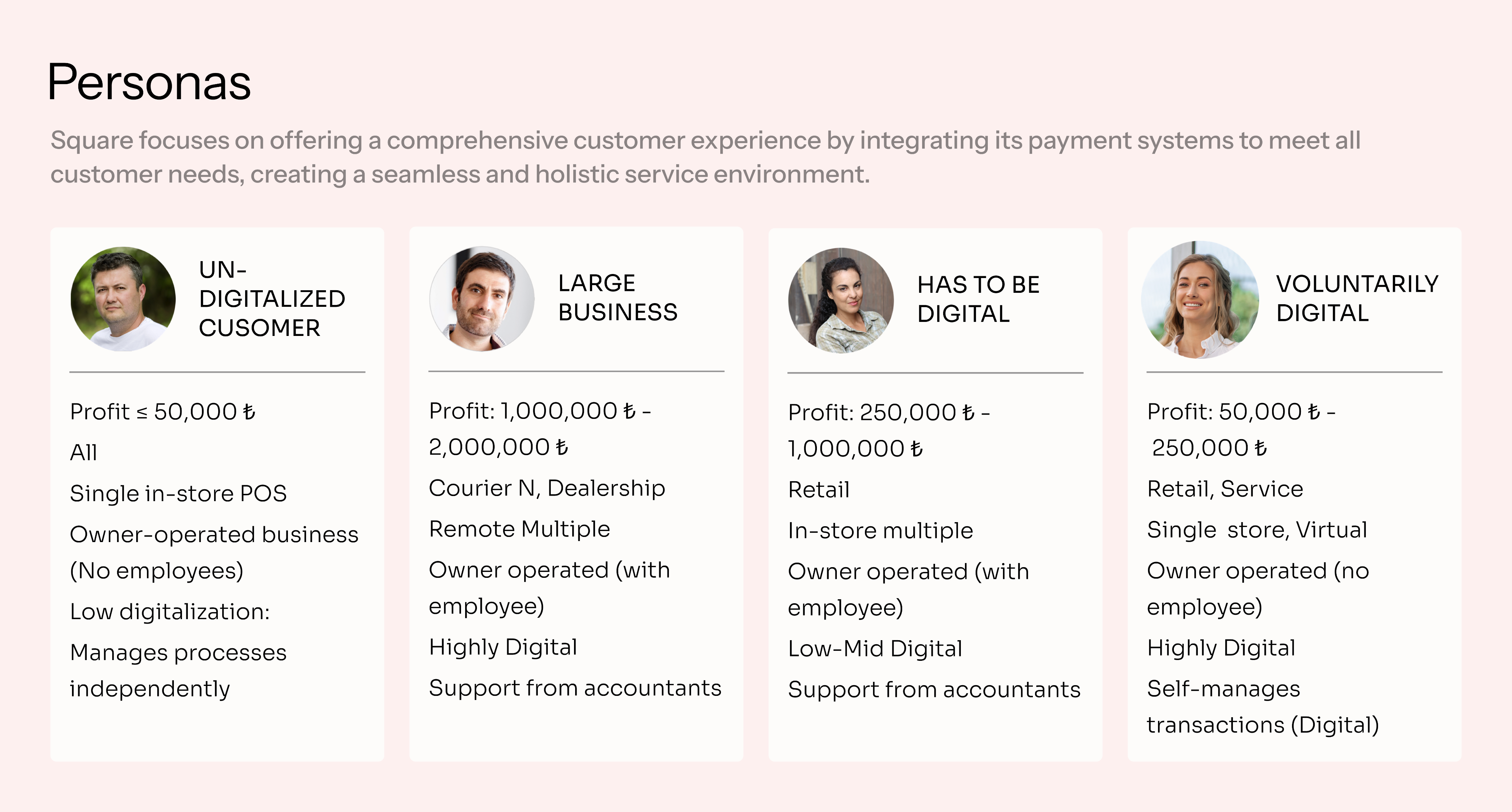
In Phase 1 the product team conducted 30 in-depth, one-hour interviews covering six initial archetypes (user groups), each represented by five participants. After careful analysis, my teammates distilled these archetypes into four clear user personas, accurately reflecting our diverse user base.
Credit: Phase 1. User Research by Fırat Sorgucu.
Ideate
Competitive Analysis
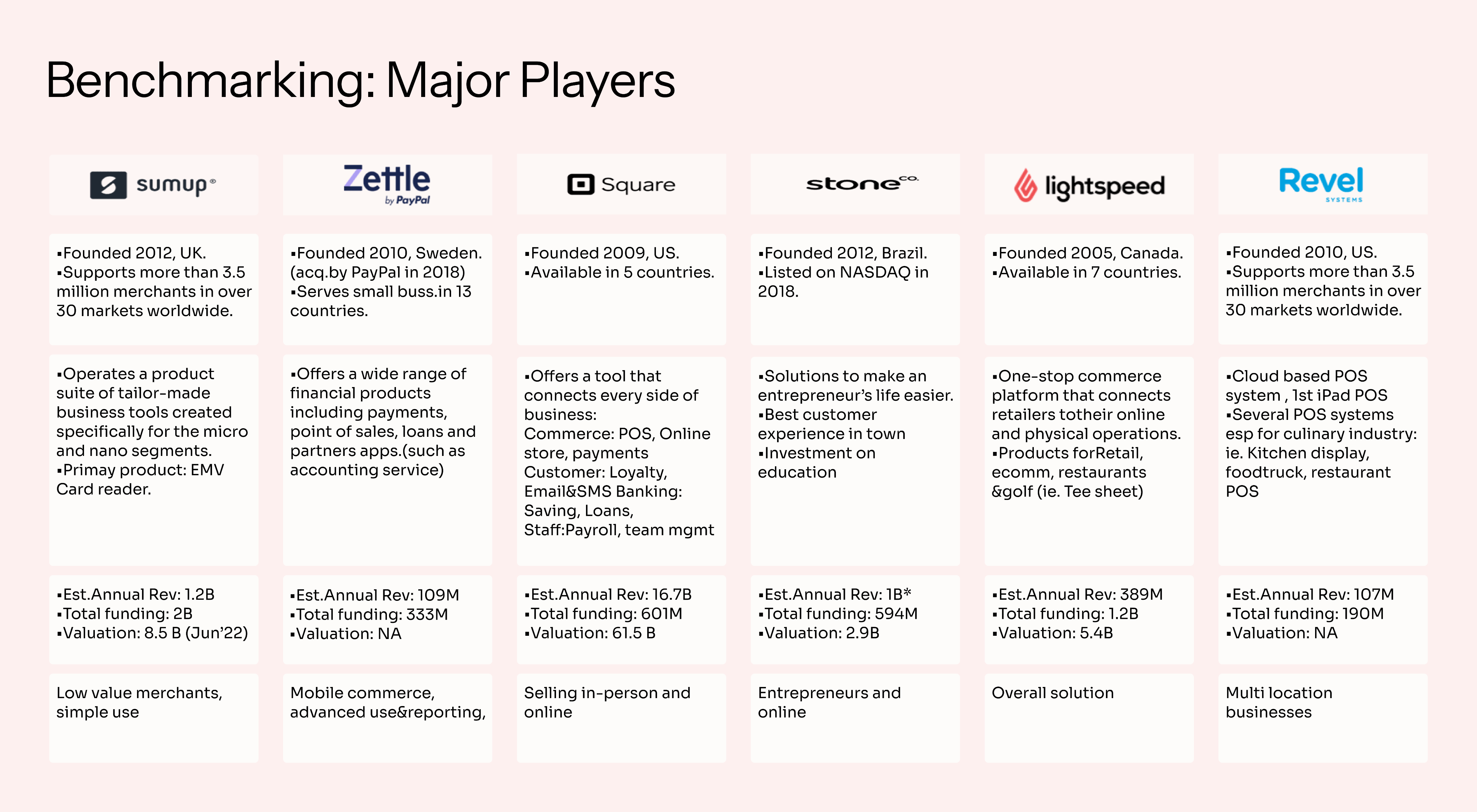
My associate, Fırat Sorgucu, completed an international competitor benchmark analysis based on the initial user research. We closely observed dashboards from major global players. Most competitors had traditional interfaces and user experiences. However, Zettel and SumUp stood out, offering modern interfaces with simpler dashboard architectures. These two platforms inspired our final design goals, particularly considering our low-tech-savvy audience.
Credit: Competitor Benchmark Analysis by Fırat Sorgucu.
Challenge 1 : Create simple, intuitive user flows tailored specifically to ÖDEAL’s less tech-savvy clientele (primarily mid-sized companies).
Challenge 2 : Develop adaptive mobile and tablet designs, since most users do not have regular computer access at their workplaces.
Design
User Flows
To clearly understand user struggles, we mapped the existing user flow. ÖDEAL already had a functioning dashboard, but it was missing critical features and had an unappealing interface. The platform was difficult to navigate, reducing user engagement. To improve usability, we redesigned user flows from scratch. To boost desirability, we developed a fresh design system aligned with ÖDEAL’s brand guidelines.
After wireframing, we dove into the design process for each enhancement. Since we had comprehensive analytics tools like Firebase, Smartlook (for session recordings), and Mixpanel, we postponed usability testing until after development. We tested the new improvements by monitoring user activity and observing changes in app usage.
Process / Design Routine
We organized our design tasks into two-week sprints. Once we finalized the detailed user flows, we began building a brand-aligned design system from the ground up. With two designers on the team, we focused on two complete feature flows per sprint. Our process followed a clear and structured roadmap grounded in design thinking—starting with ideation and wireframes, moving through feedback and iterations, and ending with development handoff.
To ensure consistency and quality across all touch points, we also conducted a final design review after the initial frontend implementation, refining the outcome and aligning it with both user expectations and technical requirements.
- Creating a Brand-Aligned Design System

We started our design system using ÖDEAL’s existing brand colors and logo, selecting new typography and foundational elements to match. Using the atomic design approach, we first defined basic UI elements (colors, typography, and icons). More complex components were designed later, ensuring accuracy and consistency during UI phases.

- Deciding the Overall UI Concept
After setting foundational design variables, we created two distinct design concepts for the dashboard homepage.
Collaborating with the internal project team, we eventually blended these ideas into a third, final design. This new concept combined semi-flat design with flat elements, using rounded corners, subtle shadow effects, semi-transparent dividers, balanced white space, and a mix of outlined and filled icons.
- Running the Design Sprints
Following our structured process, Fırat and I tackled separate user flows each sprint, starting with onboarding and the main dashboard page. Each sprint involved:
- High-Fidelity Wireframes
- Feedback Sessions
- High-Fidelity UI Designs
- Feedbacks & Iterative Revisions
- User Testing in Batches
- Development Handoff

We adjusted our screens incrementally, refining the designs until reaching a balance of user satisfaction, product expectations, and developer needs.
- Usability Testing
Before finalizing our designs, we conducted two rounds of usability testing with ÖDEAL’s actual users. We created both desktop and mobile prototypes, letting users choose their preferred device. The tests uncovered small but meaningful UX improvements, such as:
- Updating menu button icons for clarity
- Reordering menus to highlight frequently-used features
- Adjusting dashboard components based on user preferences
Additionally, we resolved UX copy and wording issues in collaboration with ÖDEAL’s internal marketing team, enhancing clarity and user comprehension.
We carefully documented all test sessions, noting user actions, success rates, task durations, and overall user feedback.
- Finalizing the Design Process and Design Review
Following the structure above we have designed the following flows:
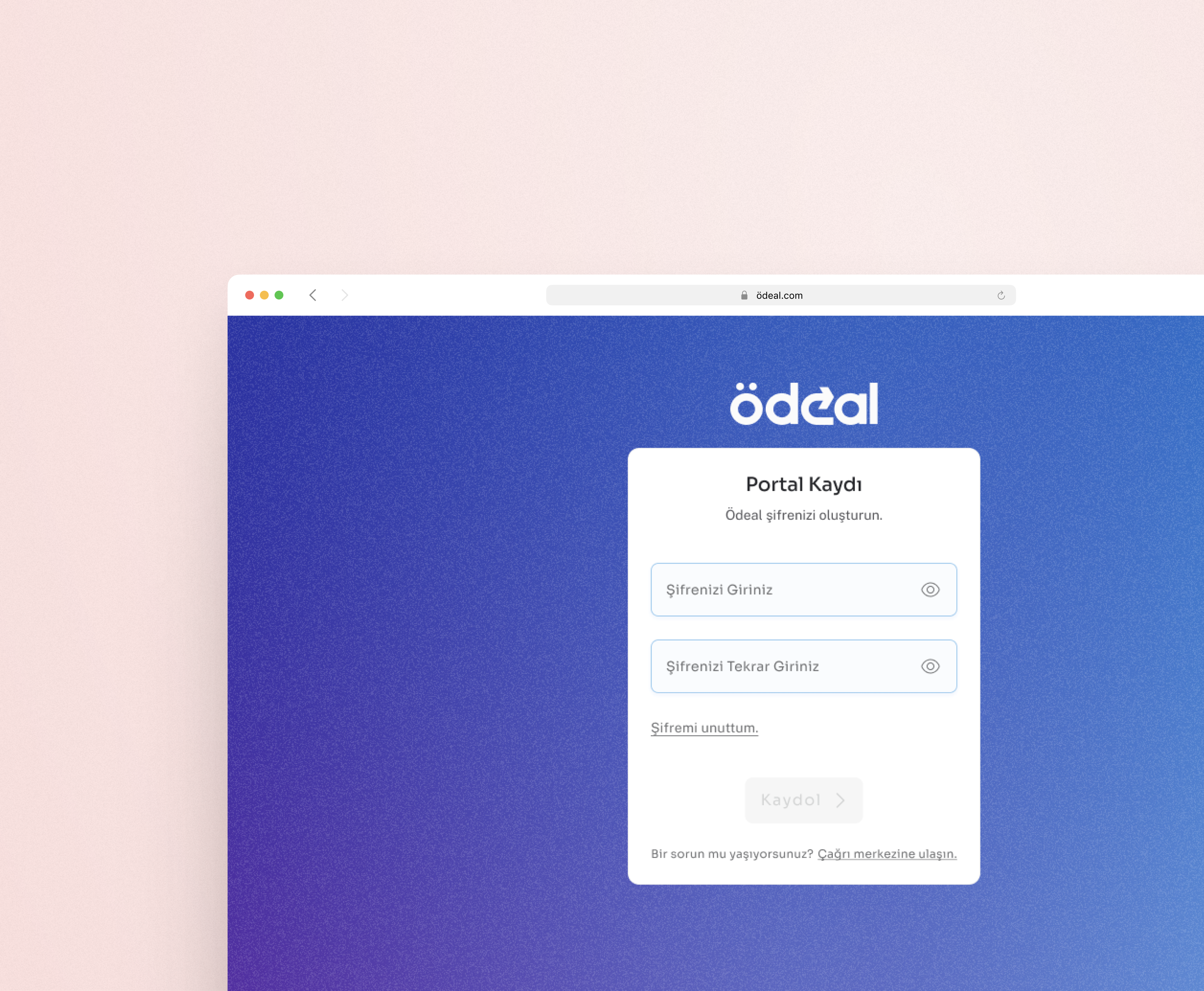
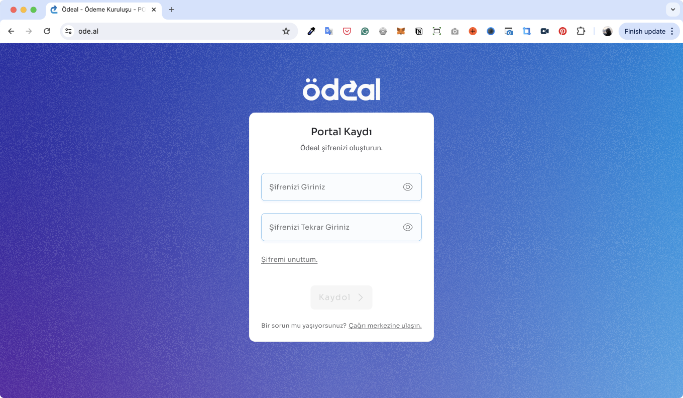
- Registration & Login
- Dashboard Home Page
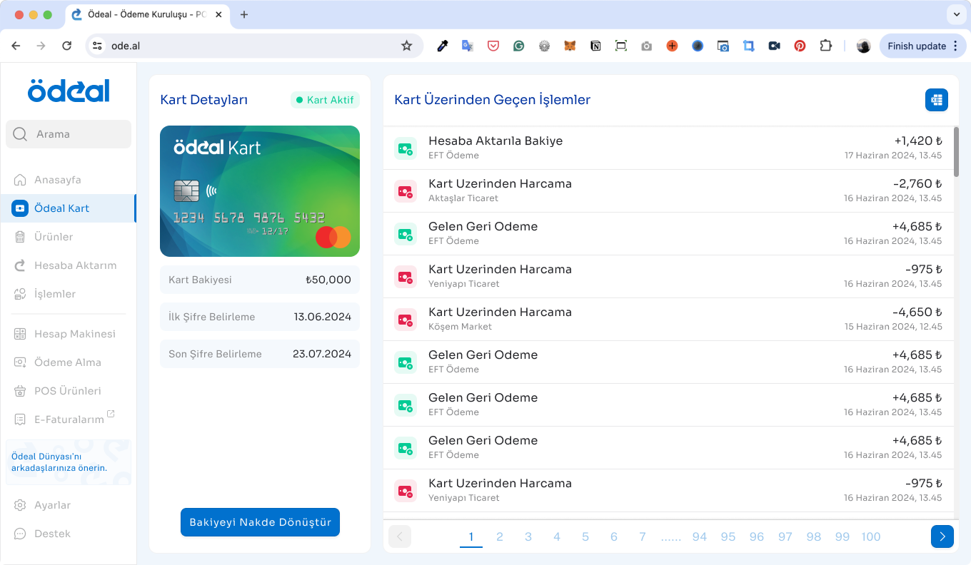
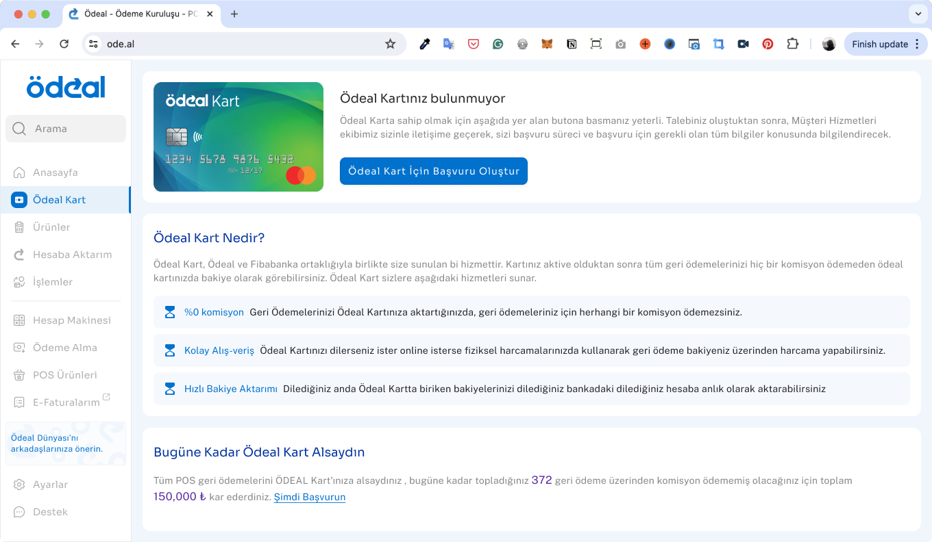
- Ödeal Card (branded payment card service)
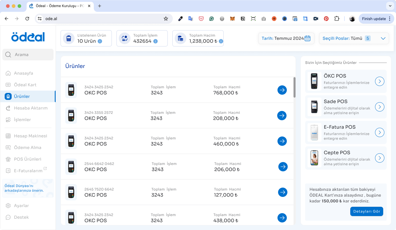
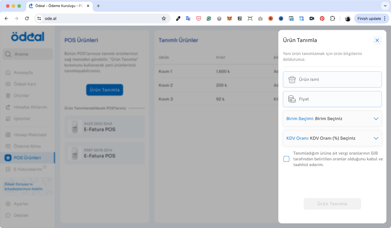
- Products
- Refunds
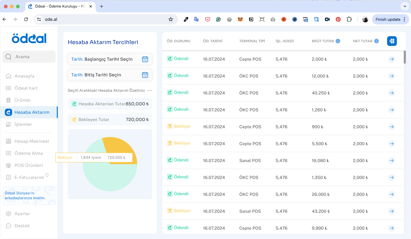
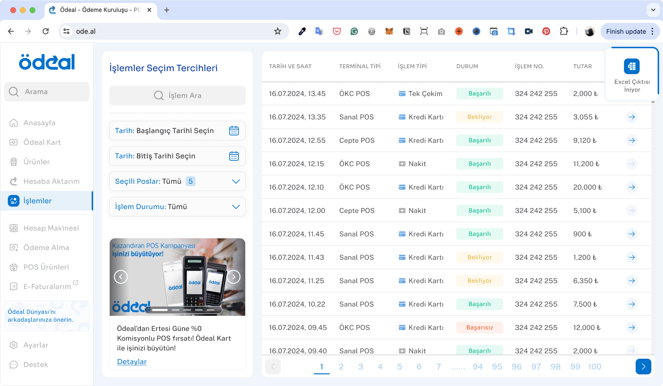
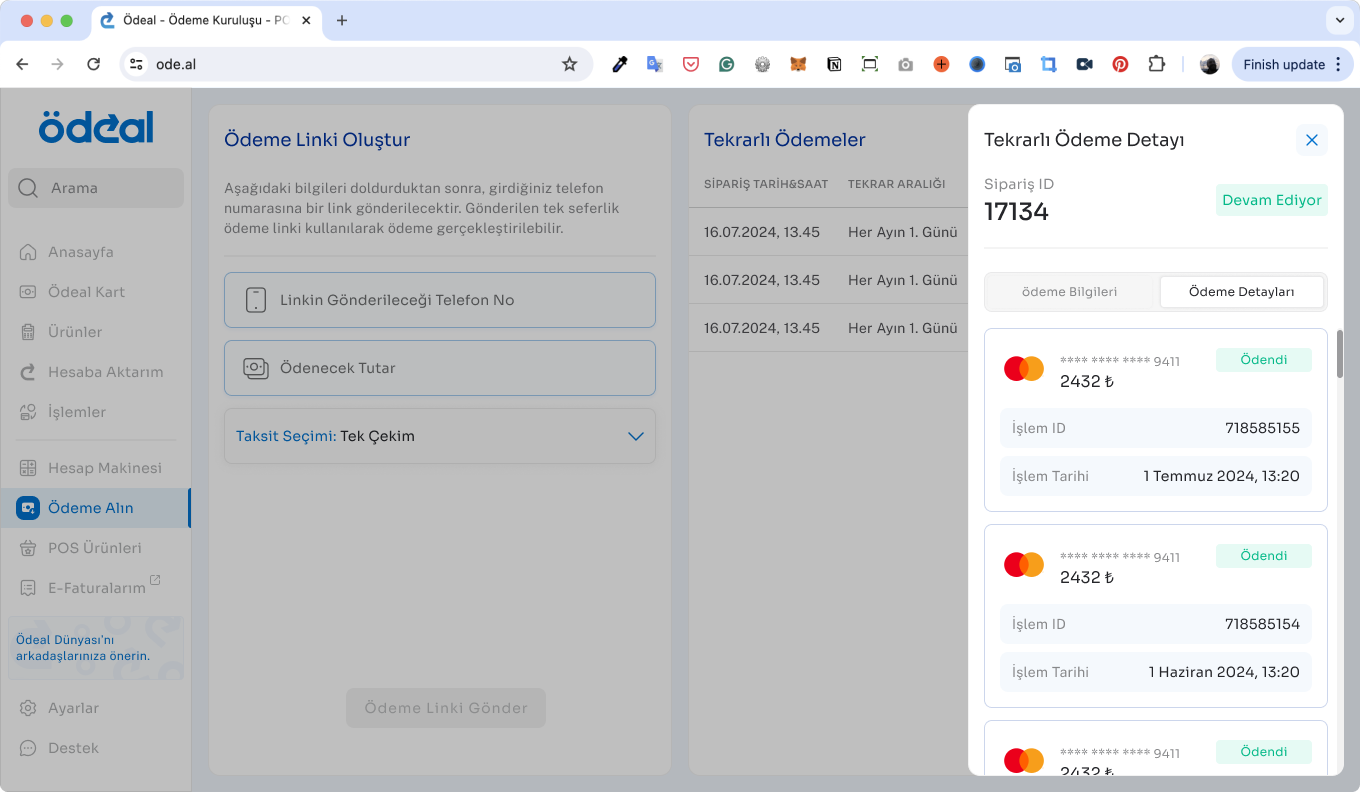
- Transactions
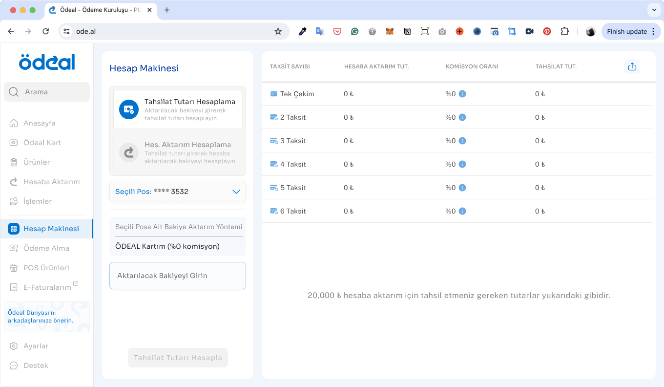
- Calculator (financial calculations)
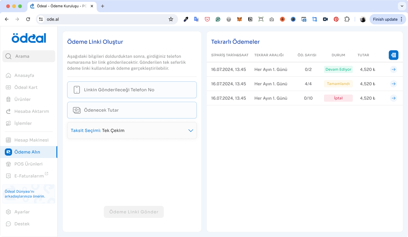
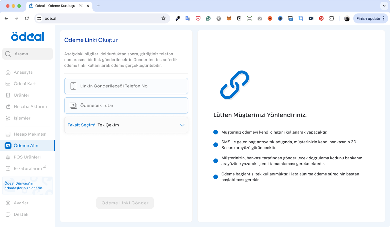
- Accept Payments (payment initiation)
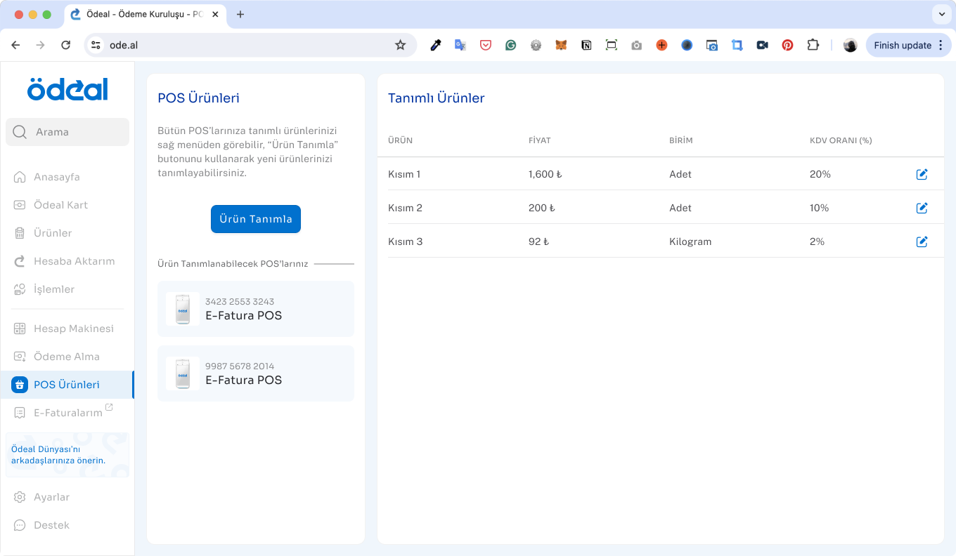
- POS Products (terminals/devices)
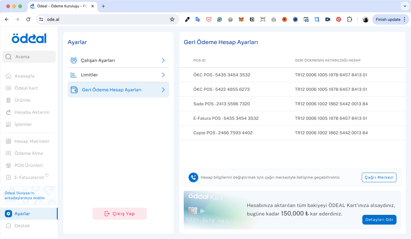
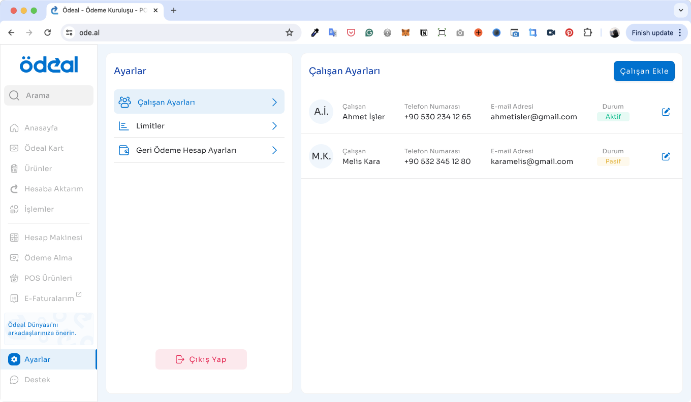
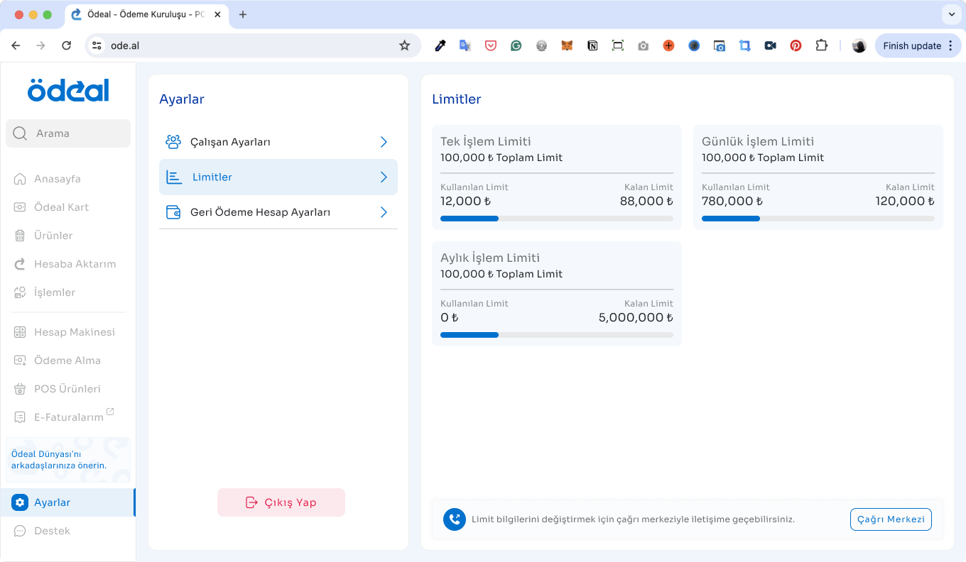
- Settings
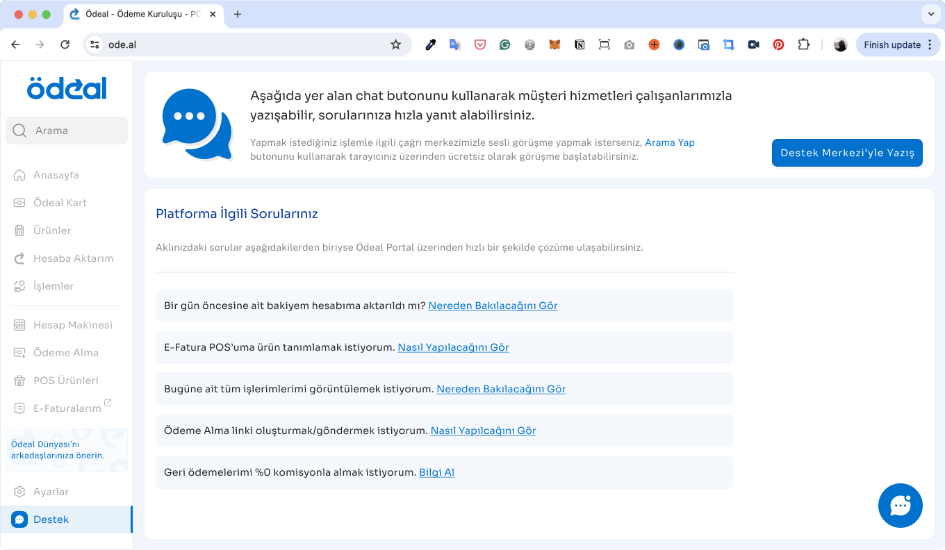
- Support
- Dashboard Walkthrough (onboarding guide)
After finalizing our designs, we reviewed the initial frontend implementations and provided detailed feedback and revision suggestions to the development team. While the team addressed some issues immediately, others were scheduled for the second round of updates following the MVP launch. Currently, the development team continues to work on these remaining improvements.
Conclusion
Impacts
In June 2024, AWA Creative conducted a survey with 100 upper-middle-class users. The survey covered several question groups, ranging from demographics to reading habits and mobile learning experiences.
Based on the survey, we found that UI problems and a lack of quality content in book summary apps were significant setbacks in the market. We also identified our two major competitors in the Turkish market: Kitup and Blinkist.
User expectations indicated a definite need for interaction with the app during their progress, as well as personalized features and customization options.
In addition to the survey, supporting user feedback from the App Store/Play Store and our user email system showed that users wanted to rely on Bitely. However, the lack of content and misunderstandings about how to use certain features dampened their enthusiasm.
Next Steps
In June 2024, AWA Creative conducted a survey with 100 upper-middle-class users. The survey covered several question groups, ranging from demographics to reading habits and mobile learning experiences.
Based on the survey, we found that UI problems and a lack of quality content in book summary apps were significant setbacks in the market. We also identified our two major competitors in the Turkish market: Kitup and Blinkist.
User expectations indicated a definite need for interaction with the app during their progress, as well as personalized features and customization options.
In addition to the survey, supporting user feedback from the App Store/Play Store and our user email system showed that users wanted to rely on Bitely. However, the lack of content and misunderstandings about how to use certain features dampened their enthusiasm.
Ödeal User Dashboard: Ultimate Fintech Experience
Role: UX/UI Designer
Team: Fırat Sorgucu (Sr. Product Designer), Internal Product Team, Development Team
Client: Ödeal
Date: May 2024 - Nov 2024
Research
ÖDEAL is a Turkish FinTech startup providing smart point-of-sale (POS) solutions tailored specifically for small and medium-sized businesses. Founded to democratize access to financial technologies, ÖDEAL helps merchants—especially those excluded from traditional banking POS systems—accept card payments easily through their mobile devices. By offering a fast, secure, commission-based payment infrastructure, ÖDEAL empowers businesses to grow without complex hardware or restrictive bank agreements. It also offers additional business-management features, acting as an all-in-one financial assistant for entrepreneurs across Turkey.
Problem & Solution
The existing user portal wasn’t receiving much engagement from ÖDEAL’s product users. While the overall flow was mostly clear, the screens and features in place weren’t meeting user needs. As a result, the call center was receiving a high volume of support requests.
To solve this, we redesigned the entire portal with a user-first approach. We mapped out all possible user flows, translated them into usable wireframes, and rebuilt the interface from scratch—supported by a new design system tailored to ÖDEAL’s brand and user base.
Defining Problems & User Needs
Our project included two phases:
Phase 1: User research & identifying user needs
Phase 2: Dashboard design and improvements
We began Phase 2 already equipped with valuable insights from Phase 1, knowing exactly what users struggled with in their previous experiences. Research showed that users needed a straightforward and comprehensive daily platform. They wanted to quickly check their account status, track income and expenses, and easily access detailed POS transaction records.
In Phase 1 the product team conducted 30 in-depth, one-hour interviews covering six initial archetypes (user groups), each represented by five participants. After careful analysis, my teammates distilled these archetypes into four clear user personas, accurately reflecting our diverse user base.
Credit: Phase 1. User Research by Fırat Sorgucu.
Ideate
Competitive Analysis
My associate, Fırat Sorgucu, completed an international competitor benchmark analysis based on the initial user research. We closely observed dashboards from major global players. Most competitors had traditional interfaces and user experiences. However, Zettel and SumUp stood out, offering modern interfaces with simpler dashboard architectures. These two platforms inspired our final design goals, particularly considering our low-tech-savvy audience.
Credit: Competitor Benchmark Analysis by Fırat Sorgucu.
Challenge 1 : Create simple, intuitive user flows tailored specifically to ÖDEAL’s less tech-savvy clientele (primarily mid-sized companies).
Challenge 2 : Develop adaptive mobile and tablet designs, since most users do not have regular computer access at their workplaces.
Design
User Flows
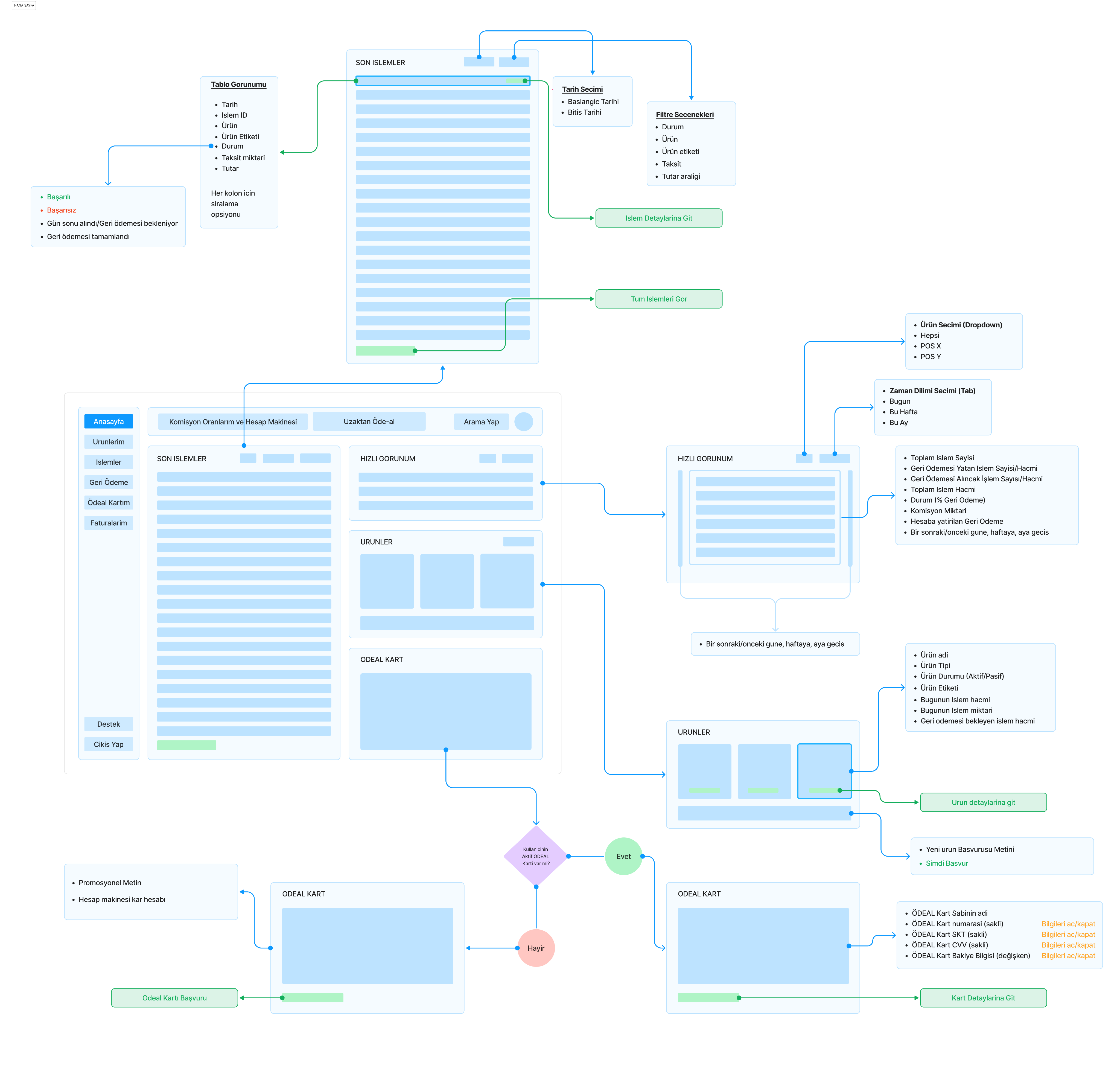
To clearly understand user struggles, we mapped the existing user flow. ÖDEAL already had a functioning dashboard, but it was missing critical features and had an unappealing interface. The platform was difficult to navigate, reducing user engagement. To improve usability, we redesigned user flows from scratch. To boost desirability, we developed a fresh design system aligned with ÖDEAL’s brand guidelines.
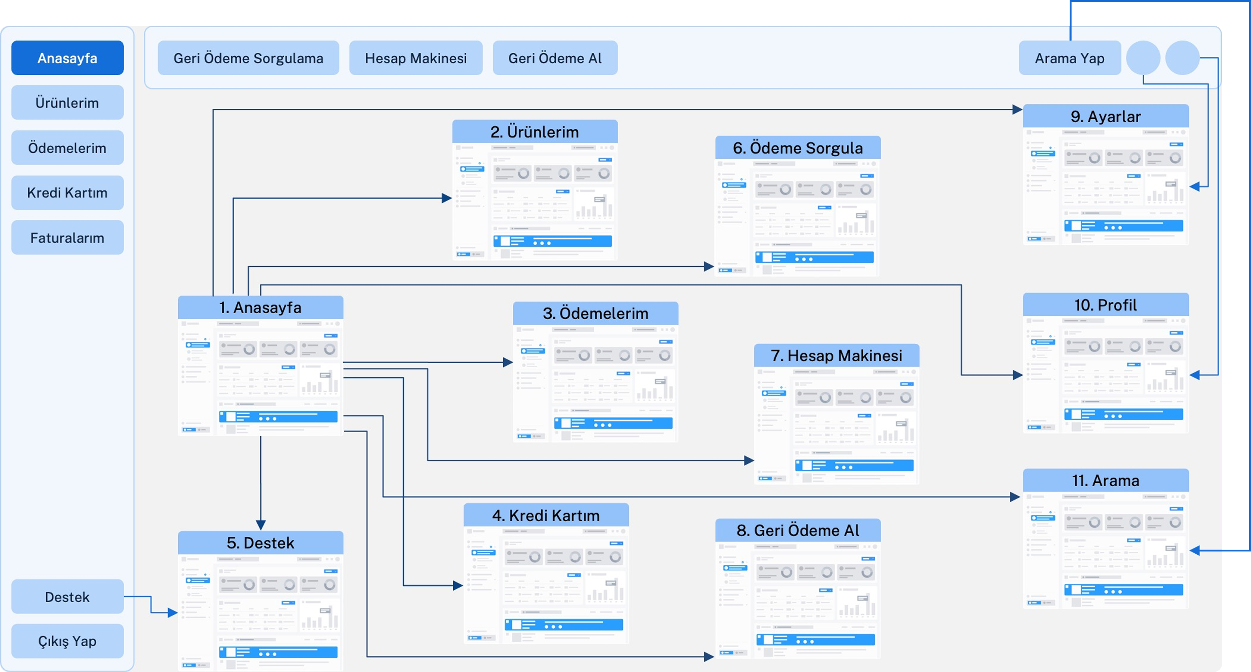
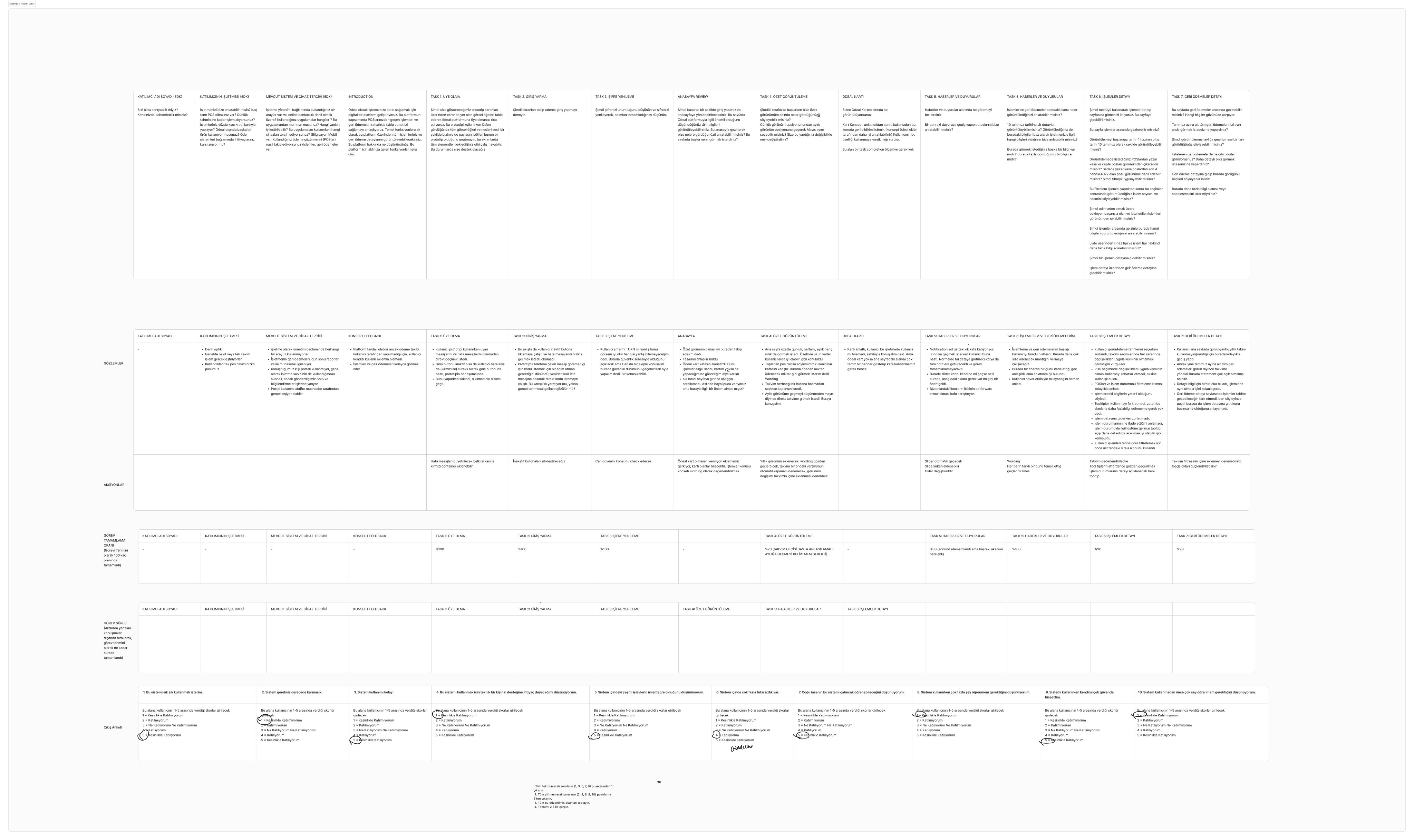
We carefully mapped out new user flows based on user insights, collaborating closely with Fırat and the internal ÖDEAL project team. Together, we distributed key features page by page, ensuring each aligned with user expectations.
On the left, you'll see a detailed example mapping of the Transactions page, showcasing its wireframes alongside the planned features within the user flow diagrams. This level of detail was applied consistently across all flows and features throughout the project.
Process / Design Routine
We organized our design tasks into two-week sprints. Once we finalized the detailed user flows, we began building a brand-aligned design system from the ground up. With two designers on the team, we focused on two complete feature flows per sprint. Our process followed a clear and structured roadmap grounded in design thinking—starting with ideation and wireframes, moving through feedback and iterations, and ending with development handoff.
To ensure consistency and quality across all touch points, we also conducted a final design review after the initial frontend implementation, refining the outcome and aligning it with both user expectations and technical requirements.
- Creating a Brand-Aligned Design System
We started our design system using ÖDEAL’s existing brand colors and logo, selecting new typography and foundational elements to match. Using the atomic design approach, we first defined basic UI elements (colors, typography, and icons). More complex components were designed later, ensuring accuracy and consistency during UI phases.
- Deciding the Overall UI Concept
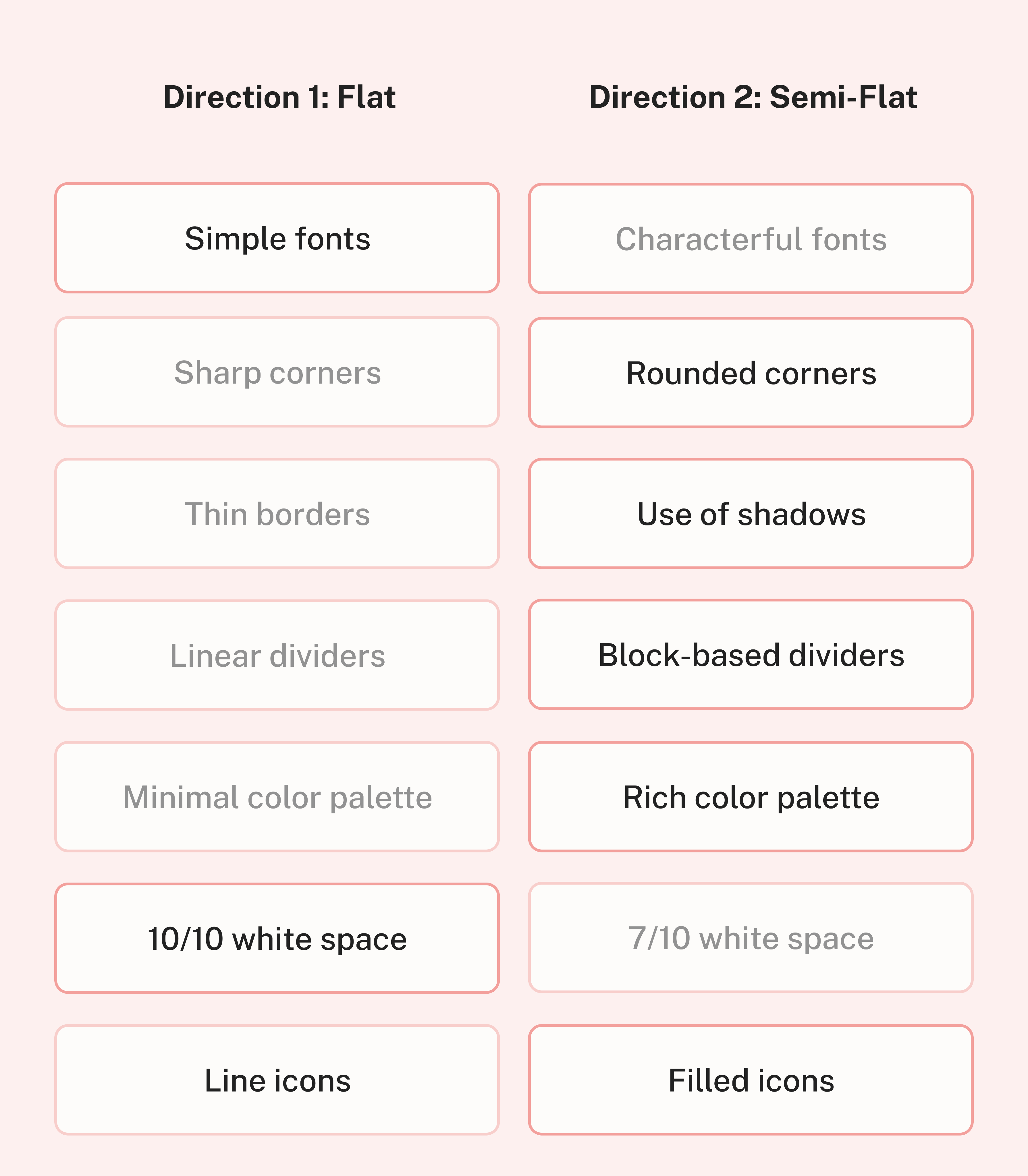
After setting foundational design variables, we created two distinct design concepts for the dashboard homepage.
Collaborating with the internal project team, we eventually blended these ideas into a third, final design. This new concept combined semi-flat design with flat elements, using rounded corners, subtle shadow effects, semi-transparent dividers, balanced white space, and a mix of outlined and filled icons.
- Running the Design Sprints
Following our structured process, Fırat and I tackled separate user flows each sprint, starting with onboarding and the main dashboard page. Each sprint involved:
- High-Fidelity Wireframes
- Feedback Sessions
- High-Fidelity UI Designs
- Feedbacks & Iterative Revisions
- User Testing in Batches
- Development Handoff
We adjusted our screens incrementally, refining the designs until reaching a balance of user satisfaction, product expectations, and developer needs.
- Usability Testing
Before finalizing our designs, we conducted two rounds of usability testing with ÖDEAL’s actual users. We created both desktop and mobile prototypes, letting users choose their preferred device. The tests uncovered small but meaningful UX improvements, such as:
- Updating menu button icons for clarity
- Reordering menus to highlight frequently-used features
- Adjusting dashboard components based on user preferences
Additionally, we resolved UX copy and wording issues in collaboration with ÖDEAL’s internal marketing team, enhancing clarity and user comprehension.
We carefully documented all test sessions, noting user actions, success rates, task durations, and overall user feedback.
- Finalizing the Design Process and Design Review
Following the structure above we have designed the following flows:
- Registration & Login
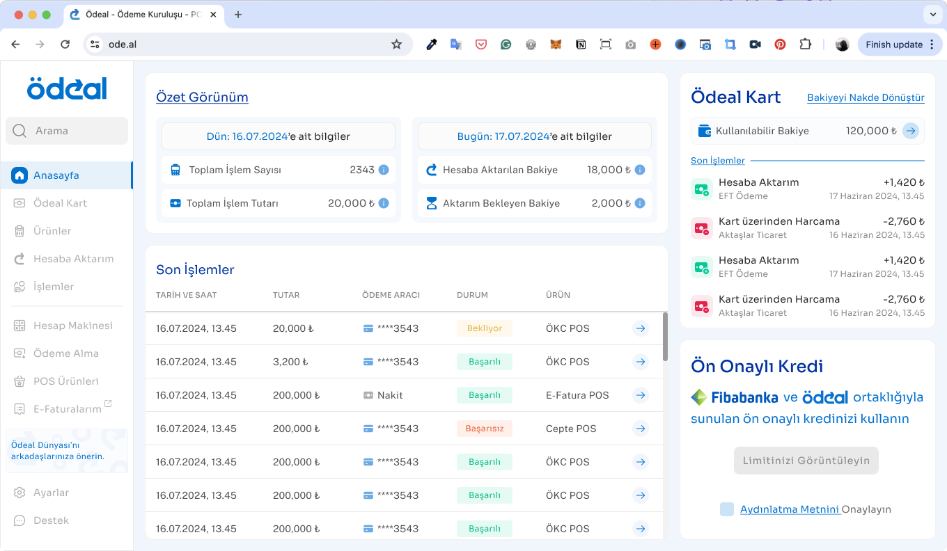
- Dashboard Home Page
- Ödeal Card (branded payment card service)
- Products
- Refunds
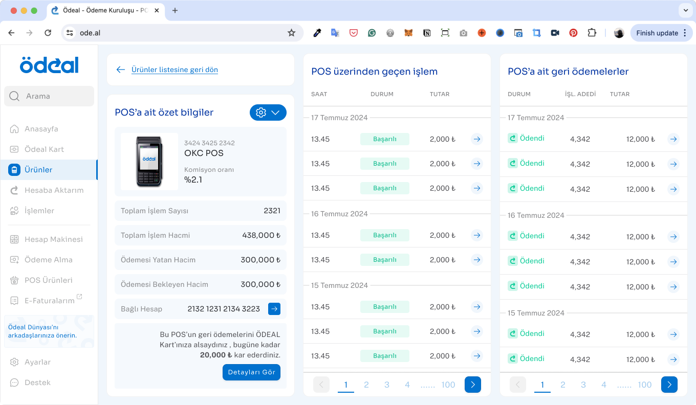
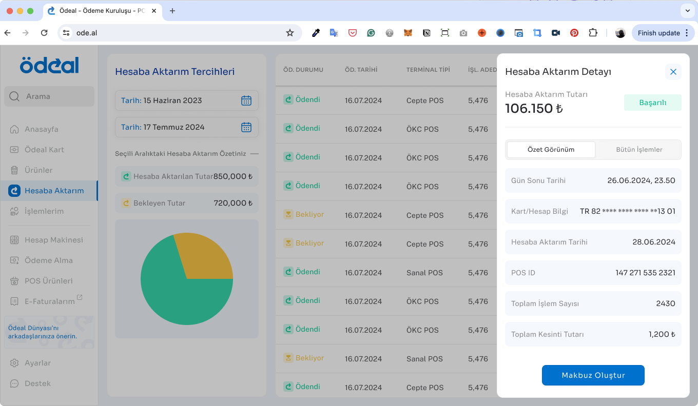
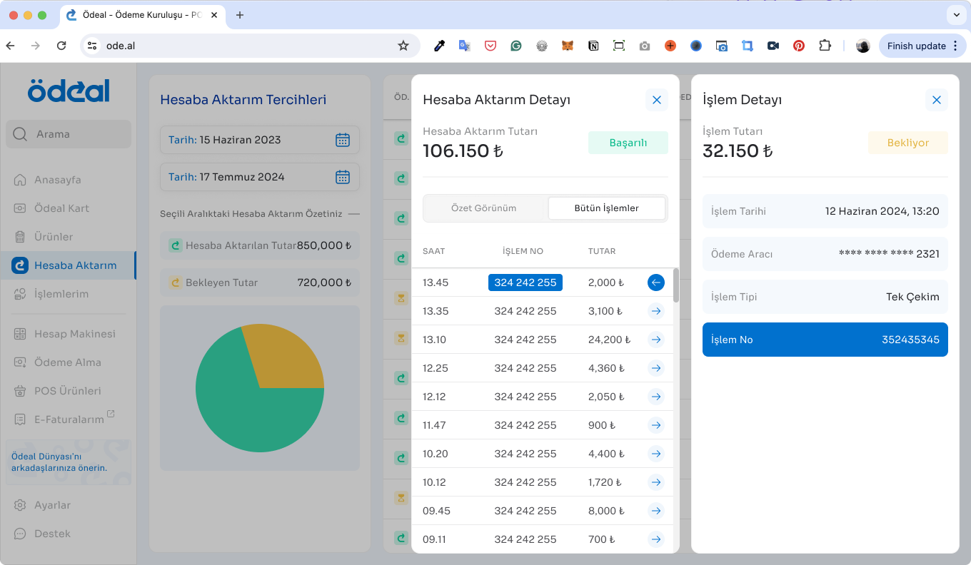
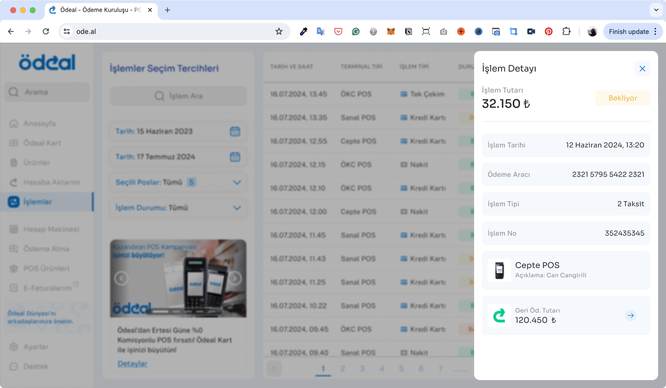
- Transactions
- Calculator (financial calculations)
- Accept Payments (payment initiation)
- POS Products (terminals/devices)
- Settings
- Support
- Dashboard Walkthrough (onboarding guide)
After finalizing our designs, we reviewed the initial frontend implementations and provided detailed feedback and revision suggestions to the development team. While the team addressed some issues immediately, others were scheduled for the second round of updates following the MVP launch. Currently, the development team continues to work on these remaining improvements.
Conclusion
Impacts
In June 2024, AWA Creative conducted a survey with 100 upper-middle-class users. The survey covered several question groups, ranging from demographics to reading habits and mobile learning experiences.
Based on the survey, we found that UI problems and a lack of quality content in book summary apps were significant setbacks in the market. We also identified our two major competitors in the Turkish market: Kitup and Blinkist.
User expectations indicated a definite need for interaction with the app during their progress, as well as personalized features and customization options.
In addition to the survey, supporting user feedback from the App Store/Play Store and our user email system showed that users wanted to rely on Bitely. However, the lack of content and misunderstandings about how to use certain features dampened their enthusiasm.
Next Steps
In June 2024, AWA Creative conducted a survey with 100 upper-middle-class users. The survey covered several question groups, ranging from demographics to reading habits and mobile learning experiences.
Based on the survey, we found that UI problems and a lack of quality content in book summary apps were significant setbacks in the market. We also identified our two major competitors in the Turkish market: Kitup and Blinkist.
User expectations indicated a definite need for interaction with the app during their progress, as well as personalized features and customization options.
In addition to the survey, supporting user feedback from the App Store/Play Store and our user email system showed that users wanted to rely on Bitely. However, the lack of content and misunderstandings about how to use certain features dampened their enthusiasm.
Ödeal User Dashboard: Ultimate Fintech Experience
Role: UX/UI Designer
Team: Fırat Sorgucu (Sr. Product Designer), Internal Product Team, Development Team
Client: Ödeal
Date: May 2024 - Nov 2024
Research
ÖDEAL is a Turkish FinTech startup providing smart point-of-sale (POS) solutions tailored specifically for small and medium-sized businesses. Founded to democratize access to financial technologies, ÖDEAL helps merchants—especially those excluded from traditional banking POS systems—accept card payments easily through their mobile devices. By offering a fast, secure, commission-based payment infrastructure, ÖDEAL empowers businesses to grow without complex hardware or restrictive bank agreements. It also offers additional business-management features, acting as an all-in-one financial assistant for entrepreneurs across Turkey.
Problem & Solution
The existing user portal wasn’t receiving much engagement from ÖDEAL’s product users. While the overall flow was mostly clear, the screens and features in place weren’t meeting user needs. As a result, the call center was receiving a high volume of support requests.
To solve this, we redesigned the entire portal with a user-first approach. We mapped out all possible user flows, translated them into usable wireframes, and rebuilt the interface from scratch—supported by a new design system tailored to ÖDEAL’s brand and user base.
Defining Problems & User Needs
Our project included two phases:
Phase 1: User research & identifying user needs
Phase 2: Dashboard design and improvements
We began Phase 2 already equipped with valuable insights from Phase 1, knowing exactly what users struggled with in their previous experiences. Research showed that users needed a straightforward and comprehensive daily platform. They wanted to quickly check their account status, track income and expenses, and easily access detailed POS transaction records.
In Phase 1 the product team conducted 30 in-depth, one-hour interviews covering six initial archetypes (user groups), each represented by five participants. After careful analysis, my teammates distilled these archetypes into four clear user personas, accurately reflecting our diverse user base.
Credit: Phase 1. User Research by Fırat Sorgucu.
Ideate
Competitive Analysis
My associate, Fırat Sorgucu, completed an international competitor benchmark analysis based on the initial user research. We closely observed dashboards from major global players. Most competitors had traditional interfaces and user experiences. However, Zettel and SumUp stood out, offering modern interfaces with simpler dashboard architectures. These two platforms inspired our final design goals, particularly considering our low-tech-savvy audience.
Credit: Competitor Benchmark Analysis by Fırat Sorgucu.
Challenge 1 : Create simple, intuitive user flows tailored specifically to ÖDEAL’s less tech-savvy clientele (primarily mid-sized companies).
Challenge 2 : Develop adaptive mobile and tablet designs, since most users do not have regular computer access at their workplaces.
Design
User Flows
To clearly understand user struggles, we mapped the existing user flow. ÖDEAL already had a functioning dashboard, but it was missing critical features and had an unappealing interface. The platform was difficult to navigate, reducing user engagement. To improve usability, we redesigned user flows from scratch. To boost desirability, we developed a fresh design system aligned with ÖDEAL’s brand guidelines.
After wireframing, we dove into the design process for each enhancement. Since we had comprehensive analytics tools like Firebase, Smartlook (for session recordings), and Mixpanel, we postponed usability testing until after development. We tested the new improvements by monitoring user activity and observing changes in app usage.
Process / Design Routine
We organized our design tasks into two-week sprints. Once we finalized the detailed user flows, we began building a brand-aligned design system from the ground up. With two designers on the team, we focused on two complete feature flows per sprint. Our process followed a clear and structured roadmap grounded in design thinking—starting with ideation and wireframes, moving through feedback and iterations, and ending with development handoff.
To ensure consistency and quality across all touch points, we also conducted a final design review after the initial frontend implementation, refining the outcome and aligning it with both user expectations and technical requirements.
- Creating a Brand-Aligned Design System
We started our design system using ÖDEAL’s existing brand colors and logo, selecting new typography and foundational elements to match. Using the atomic design approach, we first defined basic UI elements (colors, typography, and icons). More complex components were designed later, ensuring accuracy and consistency during UI phases.
- Deciding the Overall UI Concept
After setting foundational design variables, we created two distinct design concepts for the dashboard homepage.
Collaborating with the internal project team, we eventually blended these ideas into a third, final design. This new concept combined semi-flat design with flat elements, using rounded corners, subtle shadow effects, semi-transparent dividers, balanced white space, and a mix of outlined and filled icons.
- Running the Design Sprints
Following our structured process, Fırat and I tackled separate user flows each sprint, starting with onboarding and the main dashboard page. Each sprint involved:
- High-Fidelity Wireframes
- Feedback Sessions
- High-Fidelity UI Designs
- Feedbacks & Iterative Revisions
- User Testing in Batches
- Development Handoff
We adjusted our screens incrementally, refining the designs until reaching a balance of user satisfaction, product expectations, and developer needs.
- Usability Testing
Before finalizing our designs, we conducted two rounds of usability testing with ÖDEAL’s actual users. We created both desktop and mobile prototypes, letting users choose their preferred device. The tests uncovered small but meaningful UX improvements, such as:
- Updating menu button icons for clarity
- Reordering menus to highlight frequently-used features
- Adjusting dashboard components based on user preferences
Additionally, we resolved UX copy and wording issues in collaboration with ÖDEAL’s internal marketing team, enhancing clarity and user comprehension.
We carefully documented all test sessions, noting user actions, success rates, task durations, and overall user feedback.
- Finalizing the Design Process and Design Review
Following the structure above we have designed the following flows:
- Registration & Login
- Dashboard Home Page
- Ödeal Card (branded payment card service)
- Products
- Refunds
- Transactions
- Calculator (financial calculations)
- Accept Payments (payment initiation)
- POS Products (terminals/devices)
- Settings
- Support
- Dashboard Walkthrough (onboarding guide)
After finalizing our designs, we reviewed the initial frontend implementations and provided detailed feedback and revision suggestions to the development team. While the team addressed some issues immediately, others were scheduled for the second round of updates following the MVP launch. Currently, the development team continues to work on these remaining improvements.
Conclusion
Impacts
Feedback from ÖDEAL’s internal team indicated significant positive impacts from our redesigned dashboard. We successfully reduced calls to the customer support center, a key goal from project initiation. Users increasingly adopted the self-service portal, becoming more confident managing their accounts independently.
Although some users still found the portal slightly challenging due to limited technical experience, overall user satisfaction and adoption rates improved dramatically. Reduced call volume clearly indicated the new design effectively resolved previous usability and navigation issues.
Next Steps
Following our project’s completion, the internal ÖDEAL team decided to expand dashboard features by integrating open banking services in partnership with selected banks. At this point, our direct contributions concluded, leaving the redesigned dashboard ready for its next growth phase.